![]()
Correlation Visualization
Correlogram using GGally Package
Scatterplot matrix using ggpairs()
# library("GGally")

# Create data
data <- data.frame( var1 = 1:100 + rnorm(100,sd=20),
                    v2 = 1:100 + rnorm(100,sd=27),
                    v3 = rep(1, 100) + rnorm(100, sd = 1))
data$v4 = data$var1 ** 2
data$v5 = -(data$var1 ** 2)

# Check correlations (as scatterplots), distribution and print corrleation coefficient
ggpairs(data, title="correlogram with ggpairs()") 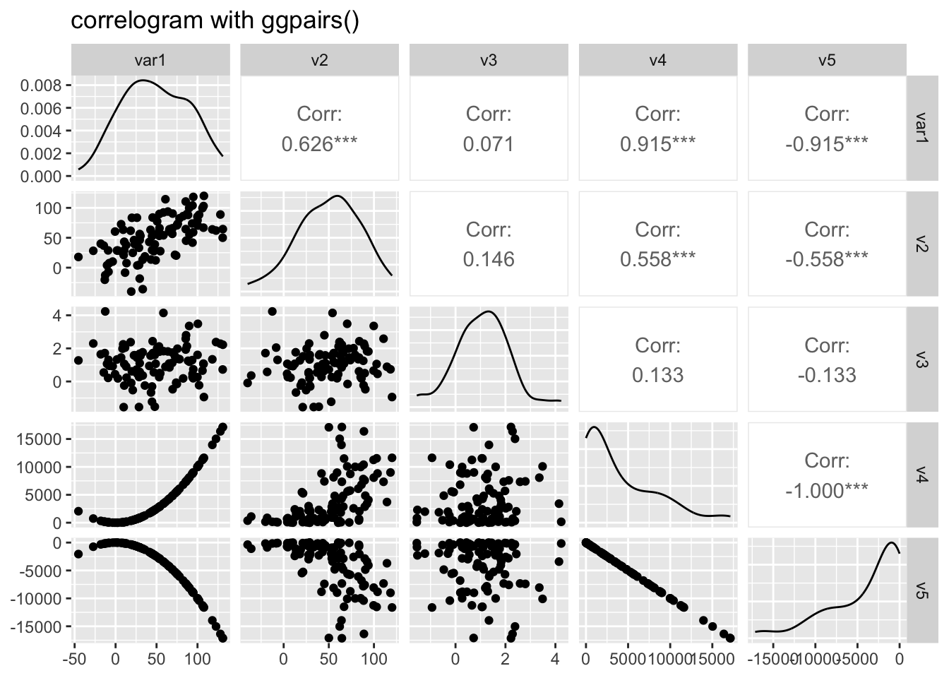
# Split by group
data(flea)
ggpairs(flea, columns = 2:4, ggplot2::aes(colour=species)) 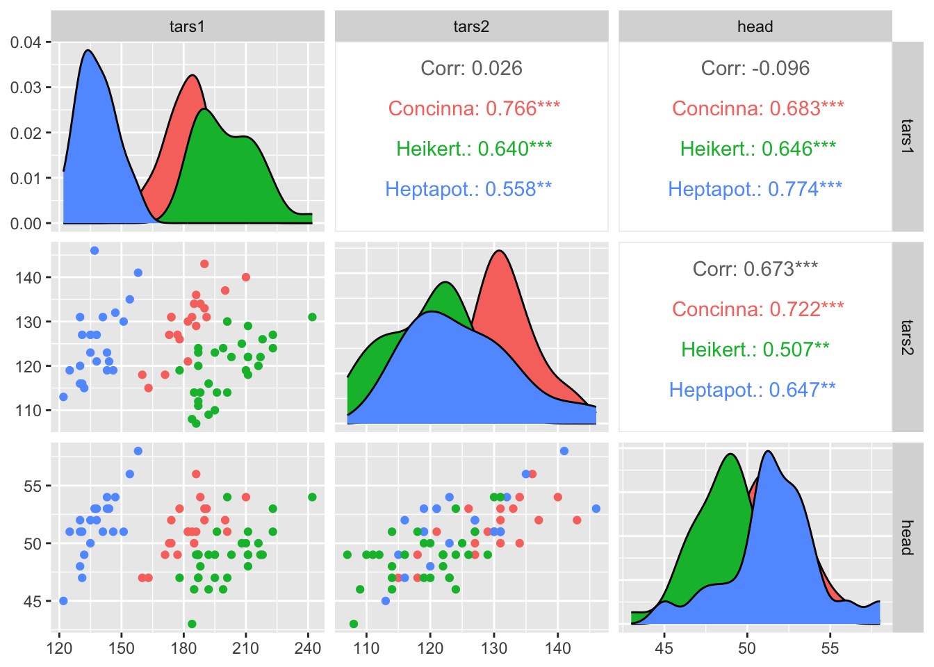
Visualize correlation using ggcorr()
# library("GGally")

# Create data
data <- data.frame( var1 = 1:100 + rnorm(100,sd=20),
                    v2 = 1:100 + rnorm(100,sd=27),
                    v3 = rep(1, 100) + rnorm(100, sd = 1))
data$v4 = data$var1 ** 2
data$v5 = -(data$var1 ** 2)

# Check correlation between variables
#cor(data)

# Nice visualization of correlations
ggcorr(data, method = c("everything", "pearson")) 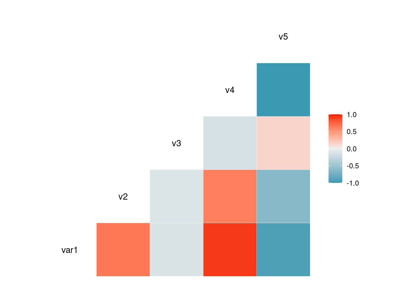
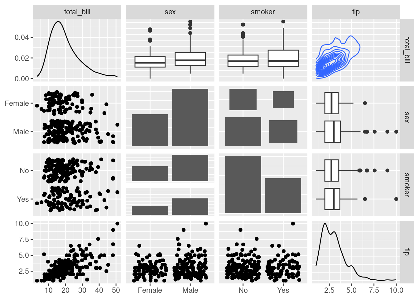
Change plot types
# From the help page:
data(tips, package = "reshape")
ggpairs(
  tips[, c(1, 3, 4, 2)],
  upper = list(continuous = "density", combo = "box_no_facet"),
  lower = list(continuous = "points", combo = "dot_no_facet")
)
Correlogram using corrgram/corrplot Package
Scatterplot matrix with ggpairs()
Relationship can be visualized with different methods:
- panel.ellipse to display ellipses
- panel.shade for coloured squares
- panel.pie for pie charts
- panel.pts for scatterplots
# Corrgram library
# library("corrgram")

# mtcars dataset is natively available in R
# head(mtcars)

# First
corrgram(mtcars,
         order=TRUE,
         lower.panel=panel.shade,
         upper.panel=panel.pie,
         text.panel=panel.txt,
main="Car Milage Data in PC2/PC1 Order") 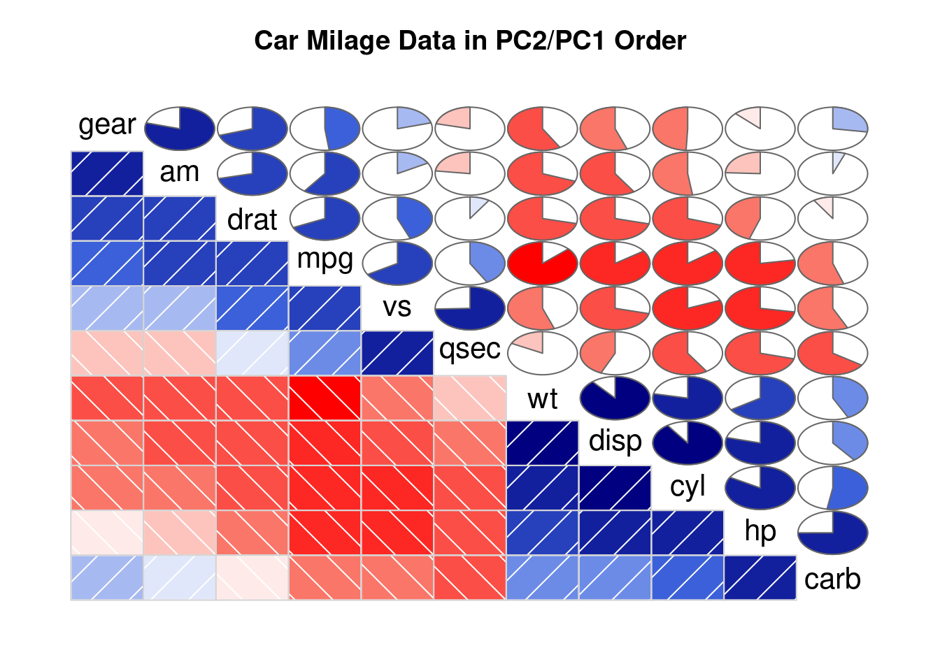
# Second
corrgram(mtcars,
         order=TRUE,
         lower.panel=panel.ellipse,
         upper.panel=panel.pts,
         text.panel=panel.txt,
         diag.panel=panel.minmax,
main="Car Milage Data in PC2/PC1 Order") 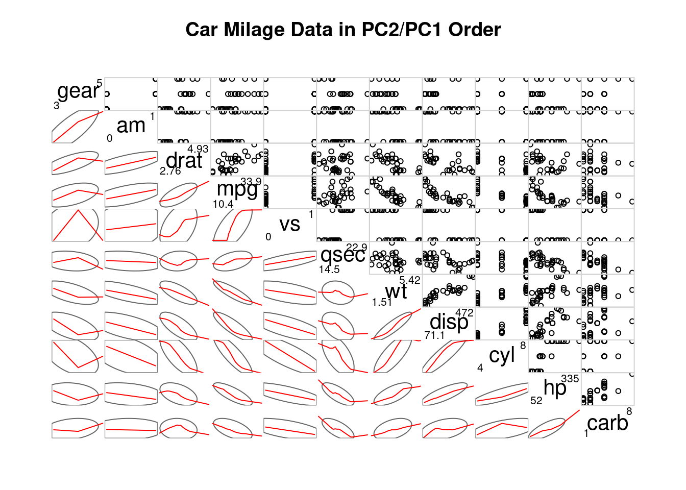
# Third
corrgram(mtcars,
         order=NULL,
         lower.panel=panel.shade,
         upper.panel=NULL,
         text.panel=panel.txt,
         main="Car Milage Data (unsorted)")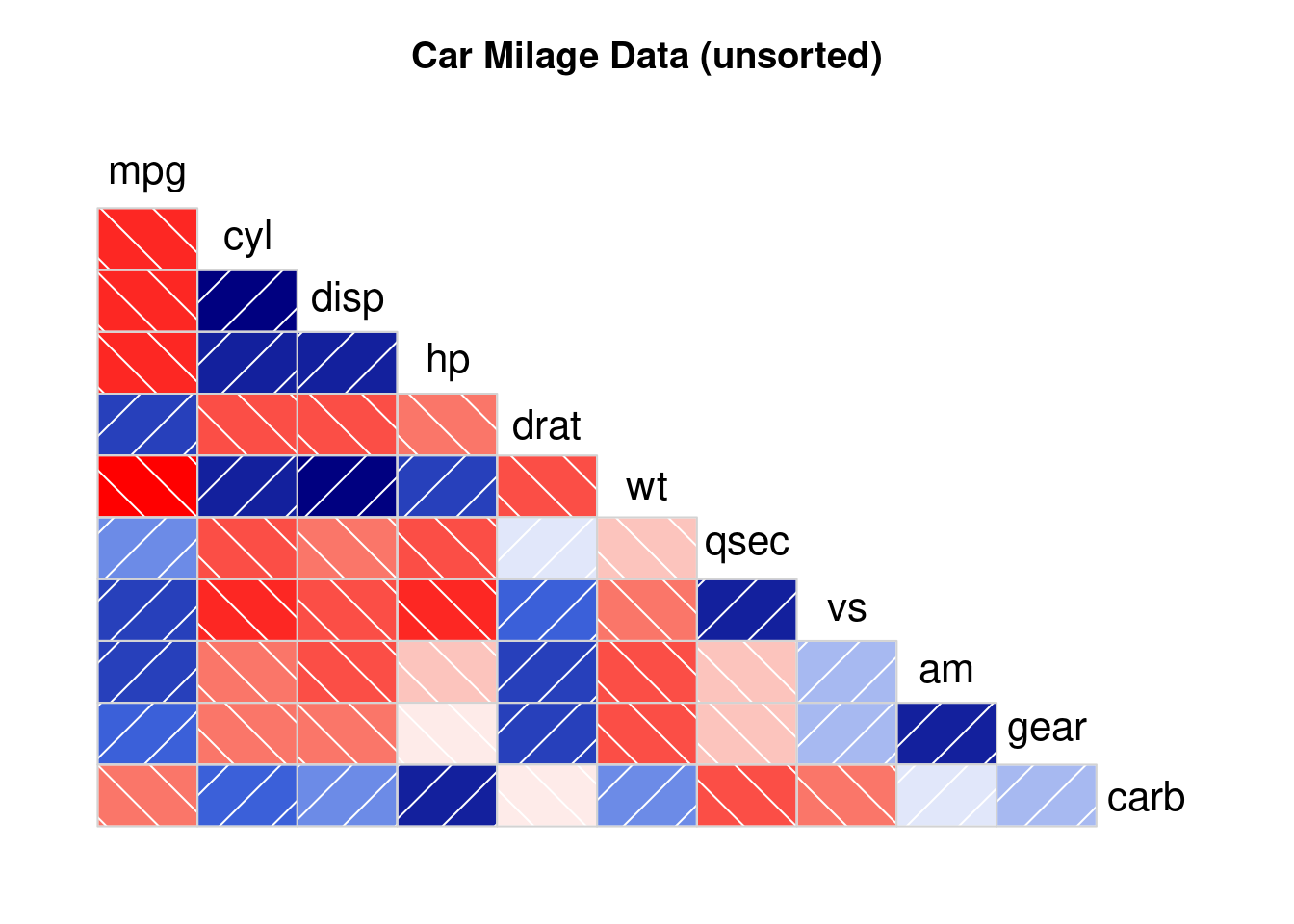
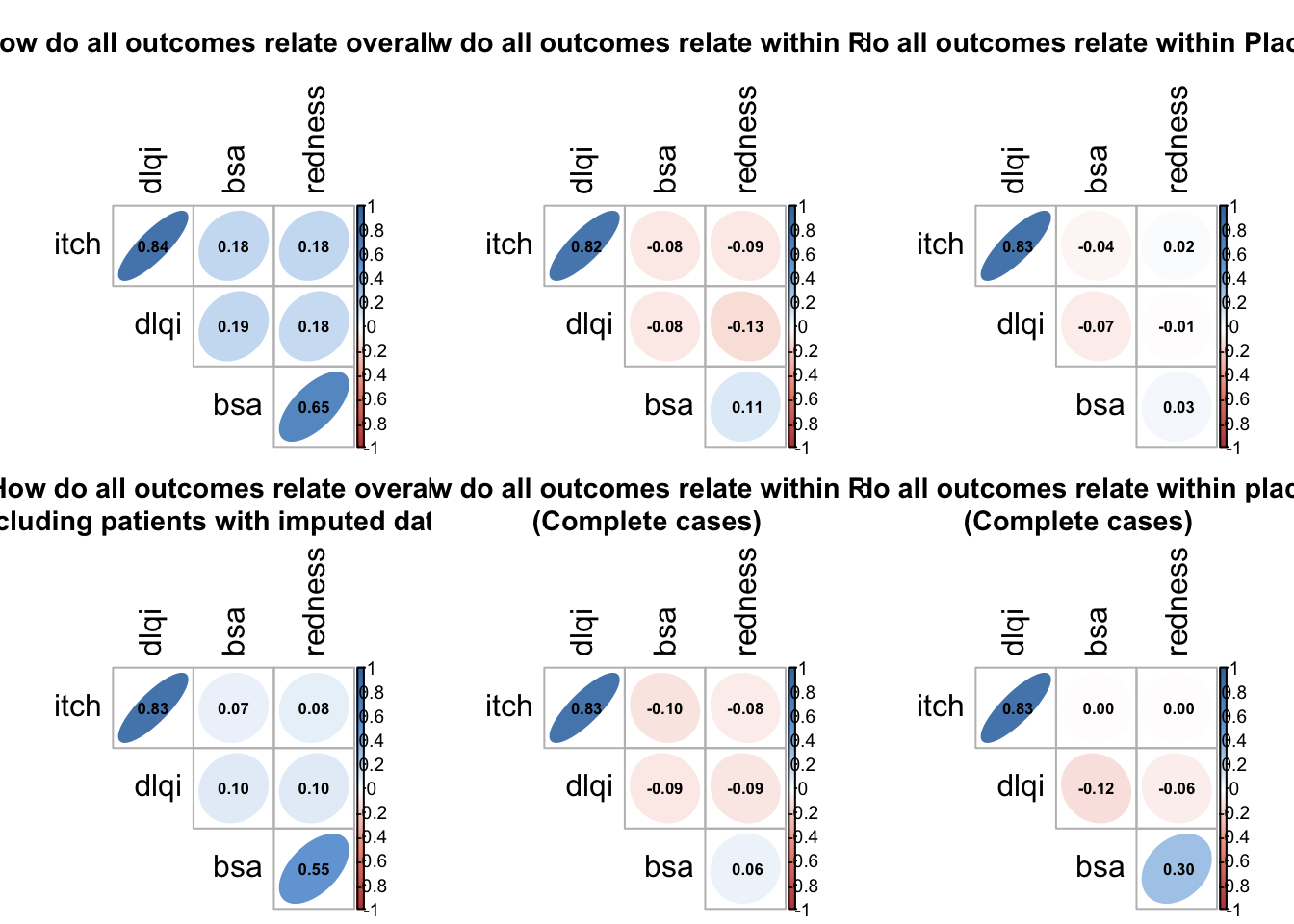
Succinct summary of the correlations between all of the variables
This is a succinct summary of the correlations between all of the variables, whether they are based on all data including LOCF imputed or just completers. The use of color in addition to shave of the ellipses is a nice application of redundancy. You do not need to read a legend to realize that blue encodes a positive correlation and red encodes a negative correlation and the level of transparency encodes the magnitude of the correlation.
# read in data
final_in <- read.csv("./01_Datasets/mediation_data.csv")

#plot on one page
par(mfrow = c(2, 3))
par(cex = 0.75)

##-----------------------------------------------------
# Overall correlations
title <- "How do all outcomes relate overall?"

corrs <- final_in %>%
  dplyr::select("itch", "bsa", "redness", "dlqi") %>%
  filter(complete.cases(.)) %>%
  dplyr::mutate_all(as.numeric)

M <- cor(corrs)
col <-
  colorRampPalette(c("#BB4444", "#EE9988", "#FFFFFF", "#77AADD", "#4477AA"))
corrplot(
  M,
  method = "ellipse",
  col = col(200), tl.cex = 1/par("cex"),
  type = "upper",
  order = "hclust",
  number.cex = .7,
  title = title,
  addCoef.col = "black",
  # Add coefficient of correlation
  tl.col = "black",
  tl.srt = 90,
  # Text label color and rotation
  # hide correlation coefficient on the principal diagonal
  diag = FALSE,
  mar = c(0, 0, 3, 0)
)


##-----------------------------------------------------
## - By Rx arm
title <- "How do all outcomes relate within Rx?"

corrs <- final_in %>%
  filter(trt == "Rx") %>%
  dplyr::select("itch", "bsa", "redness", "dlqi") %>%
  dplyr::mutate_all(as.numeric)
M <- cor(corrs)
col <-
  colorRampPalette(c("#BB4444", "#EE9988", "#FFFFFF", "#77AADD", "#4477AA"))

corrplot(
  M,
  method = "ellipse",
  col = col(200), tl.cex = 1/par("cex"),
  type = "upper",
  order = "hclust",
  number.cex = .7,
  title = title,
  addCoef.col = "black",
  # Add coefficient of correlation
  tl.col = "black",
  tl.srt = 90,
  diag = FALSE,
  mar = c(0, 0, 3, 0)
)


##-----------------------------------------------------
# By Placebo
corrs <- final_in %>%
  filter(trt == "placebo") %>%
  dplyr::select("itch", "bsa", "redness", "dlqi") %>%
  dplyr::mutate_all(as.numeric)
M <- cor(corrs)
col <-
  colorRampPalette(c("#BB4444", "#EE9988", "#FFFFFF", "#77AADD", "#4477AA"))

title <- "How do all outcomes relate within Placebo?"
corrplot(
  M,
  method = "ellipse",
  col = col(200), tl.cex = 1/par("cex"),
  type = "upper",
  order = "hclust",
  number.cex = .7,
  title = title,
  addCoef.col = "black",
  # Add coefficient of correlation
  tl.col = "black",
  tl.srt = 90,
  # Text label color and rotation
  # hide correlation coefficient on the principal diagonal
  diag = FALSE,
  mar = c(0, 0, 3, 0)
)


##-----------------------------------------------------
# Overall and complete cases

corrs <- final_in %>%
  filter(itch_locf == FALSE &
           bsa_locf == FALSE & redness_locf == FALSE & dlqi_locf == FALSE) %>%
  filter(complete.cases(.)) %>%
  dplyr::select("itch", "bsa", "redness", "dlqi") %>%
  dplyr::mutate_all(as.numeric)

M <- cor(corrs)

col <-
  colorRampPalette(c("#BB4444", "#EE9988", "#FFFFFF", "#77AADD", "#4477AA"))


title <-
  "How do all outcomes relate overall\n(excluding patients with imputed data)?"
corrplot(
  M,
  method = "ellipse",
  col = col(200), tl.cex = 1/par("cex"),
  type = "upper",
  order = "hclust",
  number.cex = .7,
  title = title,
  addCoef.col = "black",
  # Add coefficient of correlation
  tl.col = "black",
  tl.srt = 90,
  # Text label color and rotation
  # hide correlation coefficient on the principal diagonal
  diag = FALSE,
  mar = c(0, 0, 3, 0)
)


##-----------------------------------------------------
## By Rx and complete cases
corrs <- final_in %>%
  filter(trt == "Rx") %>%
  filter(itch_locf == FALSE &
           bsa_locf == FALSE & redness_locf == FALSE & dlqi_locf == FALSE) %>%
  filter(complete.cases(.)) %>%
  dplyr::select("itch", "bsa", "redness", "dlqi") %>%
  dplyr::mutate_all(as.numeric)
M <- cor(corrs)
col <-
  colorRampPalette(c("#BB4444", "#EE9988", "#FFFFFF", "#77AADD", "#4477AA"))

title <- "How do all outcomes relate within Rx?\n(Complete cases)"
corrplot(
  M,
  method = "ellipse",
  col = col(200), tl.cex = 1/par("cex"),
  type = "upper",
  order = "hclust",
  number.cex = .7,
  title = title,
  addCoef.col = "black",
  # Add coefficient of correlation
  tl.col = "black",
  tl.srt = 90,
  # Text label color and rotation
  # hide correlation coefficient on the principal diagonal
  diag = FALSE,
  mar = c(0, 0, 3, 0)
)


##-----------------------------------------------------
## Placebo and complete cases

corrs <- final_in %>%
  filter(trt == "placebo") %>%
  filter(itch_locf == FALSE &
           bsa_locf == FALSE & redness_locf == FALSE & dlqi_locf == FALSE) %>%
  filter(complete.cases(.)) %>%
  dplyr::select("itch", "bsa", "redness", "dlqi") %>%
  dplyr::mutate_all(as.numeric)
M <- cor(corrs)
col <-
  colorRampPalette(c("#BB4444", "#EE9988", "#FFFFFF", "#77AADD", "#4477AA"))

title <-
  "How do all outcomes relate within placebo?\n(Complete cases)"
corrplot(
  M,
  method = "ellipse",
  col = col(200), tl.cex = 1/par("cex"),
  type = "upper",
  order = "hclust",
  number.cex = .7,
  title = title,
  addCoef.col = "black",
  # Add coefficient of correlation
  tl.col = "black",
  tl.srt = 90,
  # Text label color and rotation
  # hide correlation coefficient on the principal diagonal
  diag = FALSE,
  mar = c(0, 0, 3, 0)
) 
Scatter matrices
These 3 graphics provide an exhaustive amount of information. The 3 graphics address the different ways of treating the missing data. Each graph is a matrix where the upper triangle models the data by treatment and covariate, the lower triangle shows the individual data and the diagonal shows the marginal distributions. The title clearly leads the reader to the conclusion the DLQI is highly correlated with itch and when the reader looks at the panel with two splines, one for each treatment, of DLQI against itch the reader can see that the treatment effect on DLQI is neglible once itch is included in the model.
## Save plot
page_width <- 350
page_height <- 250
d_dpi <- 400

## read in data
final_in <- read.csv("./01_Datasets/mediation_data.csv")


## Plot overall
ggplot(final_in, aes(x = .panel_x, y = .panel_y, colour = trt, fill = trt)) +
  geom_autopoint(alpha = 0.6) +
  geom_autodensity(alpha = 0.2) +
  geom_smooth(method = lm, formula = y ~ splines::bs(x, 3)) +
  facet_matrix(vars(dlqi, itch, redness, bsa), layer.diag = 2, layer.upper = 3,
               grid.y.diag = FALSE) +
  labs(title = "Itch has a strong positive association with DLQI.",
       subtitle = "There is evidence that the DLQI treatment effect is mediated through itch.",
       caption = "\n Cubic splines are presented in the top-right layer regressing y on x.\nScatter-plots of the same relationship are displayed in the bottom-left later.\nThe marginal distribution by treatment are displayed on the diagonal.") +
  theme_light(base_size = 14) +
  theme(legend.position = "bottom")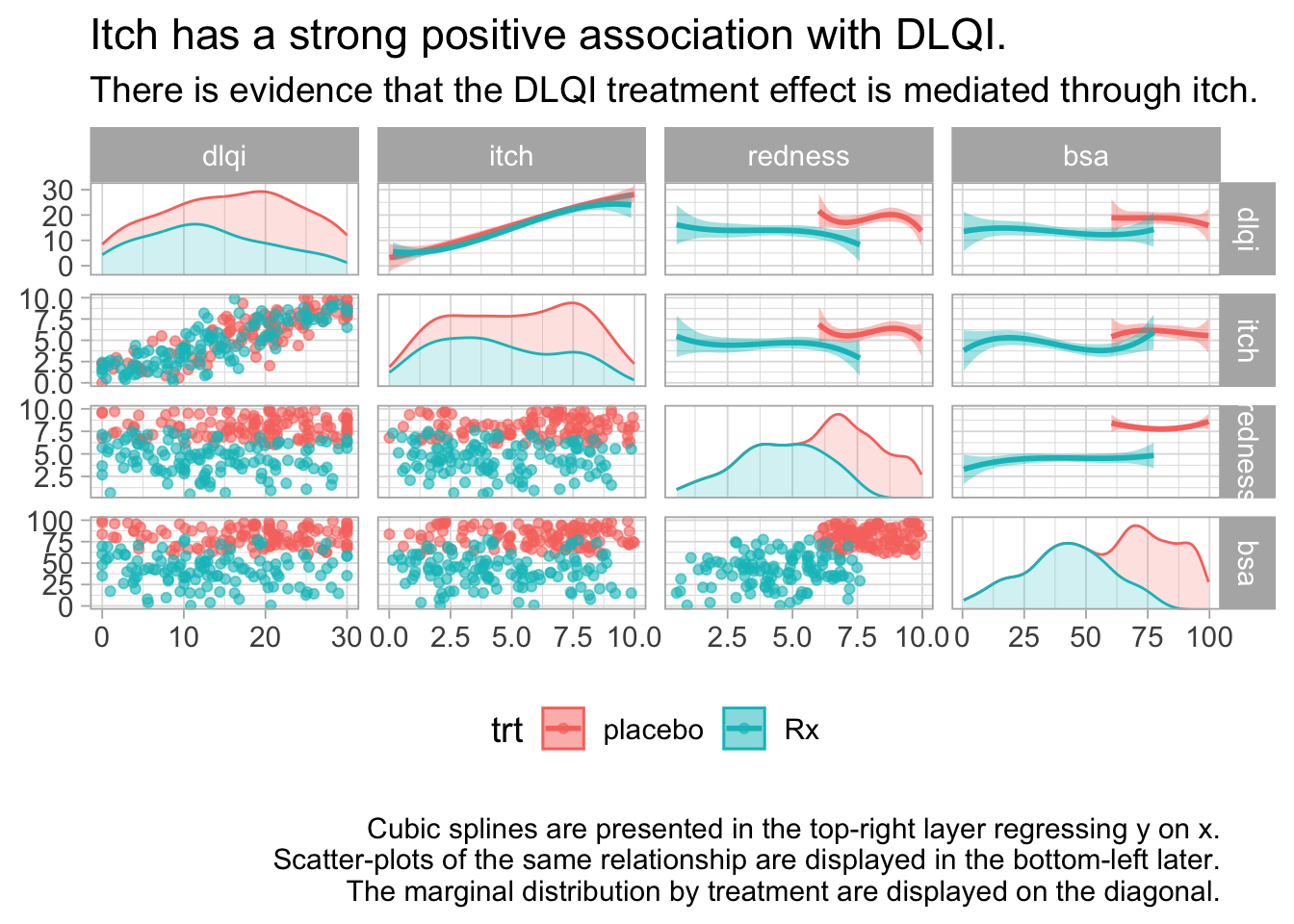
Interactive trellis plot (plotly Package)
# library(plotly)
adsl <- read_xpt("./01_Datasets/adsl.xpt")
pl_colorscale=list(c(0.0, '#19d3f3'),
c(0.333, '#19d3f3'),
c(0.333, '#e763fa'),
c(0.666, '#e763fa'),
c(0.666, '#636efa'),
c(1, '#636efa'))
fig <- adsl %>%
plot_ly()
fig <- fig %>%
add_trace(
type = 'splom',
dimensions = list(
list(label='Age', values=~AGE),
list(label='Height', values=~HEIGHTBL),
list(label='Weight', values=~WEIGHTBL),
list(label='BMI', values=~BMIBL)
),
text=~TRT01P,
marker = list(
color = as.integer(adsl$TRT01PN),
colorscale = pl_colorscale,
size = 7,
line = list(
width = 1,
color = 'rgb(230,230,230)'
)
)
)
fig <- fig %>%
layout(
title= 'ADSL Data set',
plot_bgcolor='rgba(240,240,240, 0.95)'
)
fig2 <- fig %>% style(diagonal = list(visible = F))
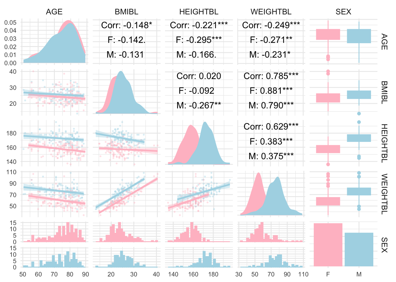
fig2# htmlwidgets::saveWidget(as_widget(fig2), "./02_Plots/Visualization/WW Dec2023b.html")GGally Package
# library(GGally)

adsl <- read_xpt("./01_Datasets/adsl.xpt")
adsl_data <- adsl[, c("AGE", "BMIBL", "HEIGHTBL", "WEIGHTBL","SEX")]


# Convert SEX to a factor if it’s not already
adsl_data$SEX <- as.factor(adsl_data$SEX)

# Create a pair plot with grouping by SEX
ggpairs(
  adsl_data,
  aes(color = SEX, fill = SEX),  # Color by SEX
  lower = list(continuous = wrap("smooth", alpha = 0.3, size = 0.5)),
  diag = list(continuous = wrap("densityDiag")),
  upper = list(continuous = wrap("cor", size = 4, color = "black"))
) +
  theme_minimal() +
  theme(
    strip.text = element_text(size = 10),
    axis.text = element_text(size = 8)
  ) +
  scale_fill_manual(values = c("pink", "lightblue")) +  # Customize colors if desired
  scale_color_manual(values = c("pink", "lightblue"))