![]()
Some Interesting Plots
Map
# library(maps)
# library(mapproj)

####make some data for painting the map

my_world_map <- map_data("world")

countries <- unique(my_world_map$region)

set.seed(987)
some_data_values <- data.frame(
  "region"=countries,
  "Score"=runif(252,0,100)
  )

my_data_combined <- left_join(my_world_map,some_data_values,by="region")
ggplot(data = my_data_combined,
       mapping = aes(x = long, y = lat, group = group, fill = Score)) +
  geom_polygon() +
  scale_fill_distiller(palette = "YlOrRd")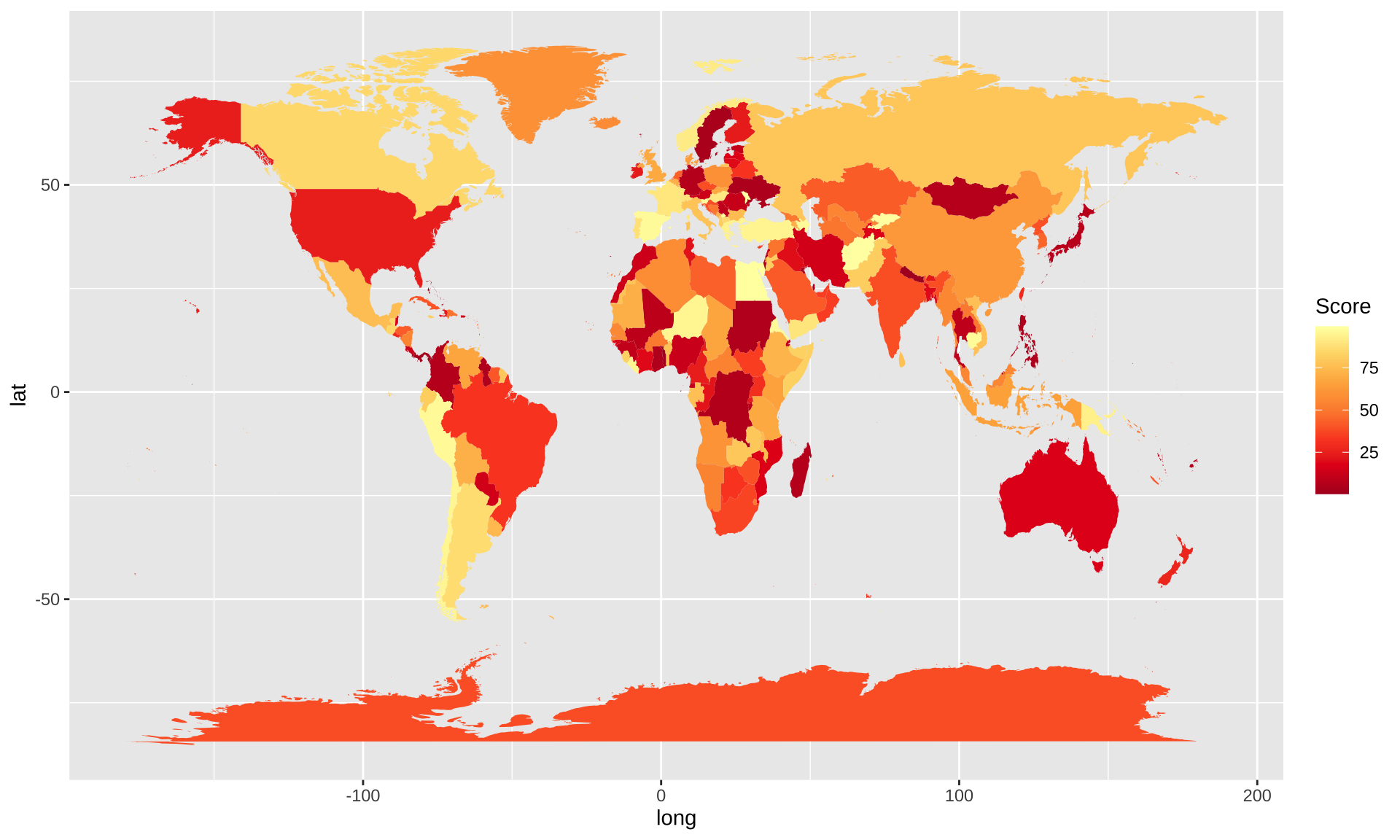
set.seed(15)
Measurement<-rnorm(32,50,1)


####Make sure you load any necessary libraries

####HINT: Use a filter command to get just maps of Costa Rica, Panama, and Nicaragua

####Hint: Use a filter command to put in points only for cities with a population of greater than 40,000. This should leave you with 32 cities.

####Hint: Use add_column to attach the "Measurement" variable to your data, and set that to the color aesthetic when you draw the points.

####Hint: set the colors for the city points with scale_color_distiller(palette=7)

####Hint: set the size of all points to the value 5

CRPA <- my_world_map %>% filter(region =="Costa Rica" | region =="Panama" | region =="Nicaragua")

data2 <- world.cities %>% filter(country.etc =="Costa Rica" | country.etc == "Panama" | country.etc == "Nicaragua")

CRPA2 <- data2 %>% filter(pop > 40000) %>% add_column(Measurement)

ggplot(data=CRPA,mapping=aes(x=long,y=lat,group=group))+geom_polygon(fill="white",color="black")+geom_point(data=CRPA2,aes(x=long,y=lat,group=NULL,color=Measurement,size=5))+scale_color_distiller(palette=7)+guides(size=FALSE)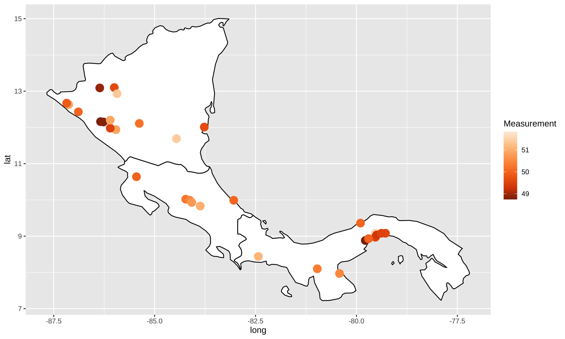
#####INSTALL THESE PACKAGES IF NECESSARY
# library(sf)
# library(rnaturalearth)
# library(rnaturalearthdata)
# library(rgeos)

####DO NOT MODIFY
s_america<-ne_countries(scale="medium",continent='south america',returnclass="sf")

####HINT: the s_america object created in the chunk above is a simple features object with many columns. Identify the correct column based on the solution figure and use it to color in the choropleth.

####HINT: Use scale_fill_distiller and palette 10 to the match the colors.

ggplot()+ geom_sf(data=s_america,aes(fill=pop_est))+scale_fill_distiller(palette=10)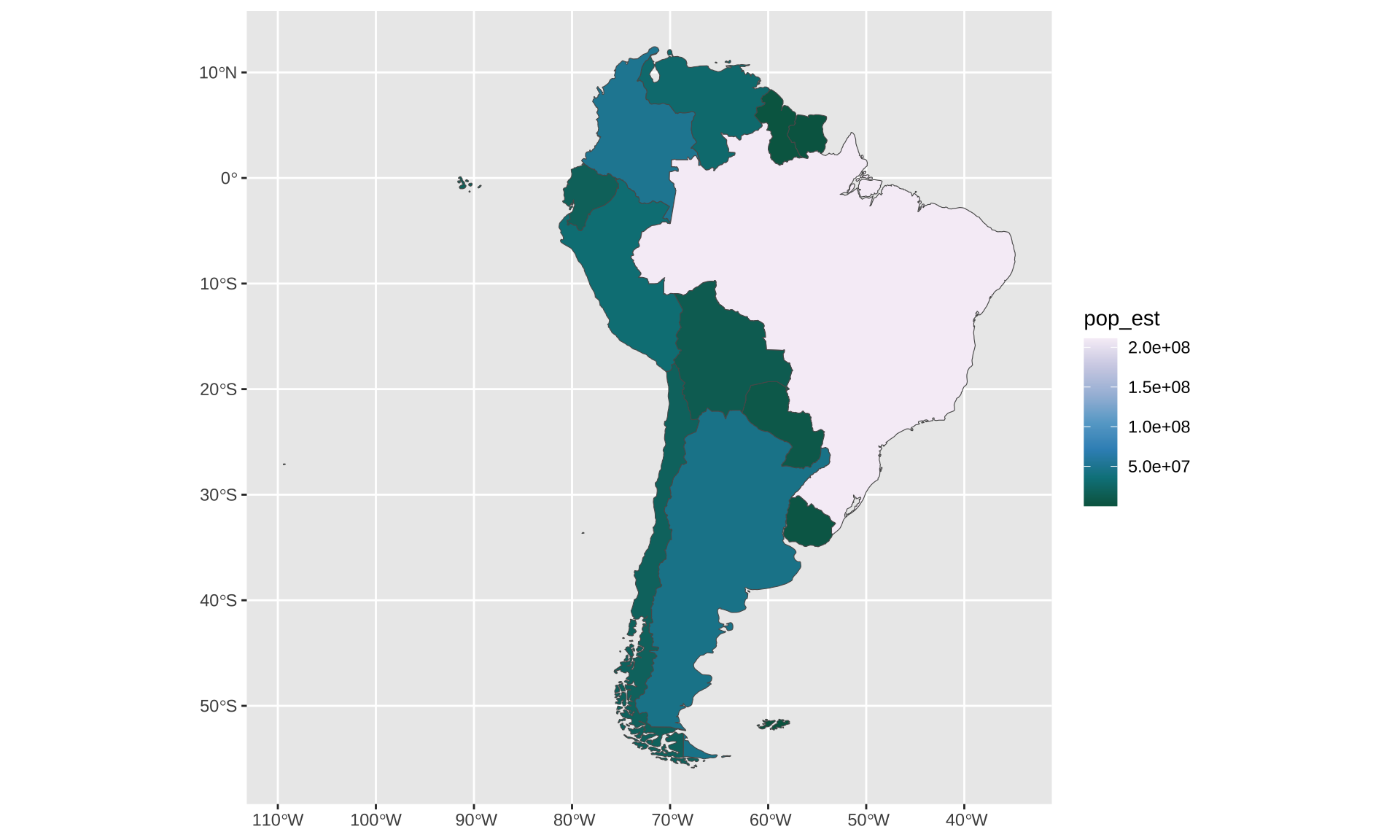
Animated Plot
Animated Scatter Chart
# Make a ggplot, but add frame=year: one image per year
ggplot(gapminder, aes(gdpPercap, lifeExp, size = pop, color = continent)) +
  geom_point() +
  scale_x_log10() +
  theme_bw() +
  # gganimate specific bits:
  labs(title = 'Year: {frame_time}', x = 'GDP per capita', y = 'life expectancy') +
  transition_time(year) +
  ease_aes('linear')
# Save at gif:
# anim_save("271-ggplot2-animated-gif-chart-with-gganimate1.gif")
Animated Bubble Chart
ggplot(gapminder, aes(gdpPercap, lifeExp, size = pop, colour = country)) +
  geom_point(alpha = 0.7, show.legend = FALSE) +
  scale_colour_manual(values = country_colors) +
  scale_size(range = c(2, 12)) +
  scale_x_log10() +
  facet_wrap(~continent) +
  # Here comes the gganimate specific bits
  labs(title = 'Year: {frame_time}', x = 'GDP per capita', y = 'life expectancy') +
  transition_time(year) +
  ease_aes('linear')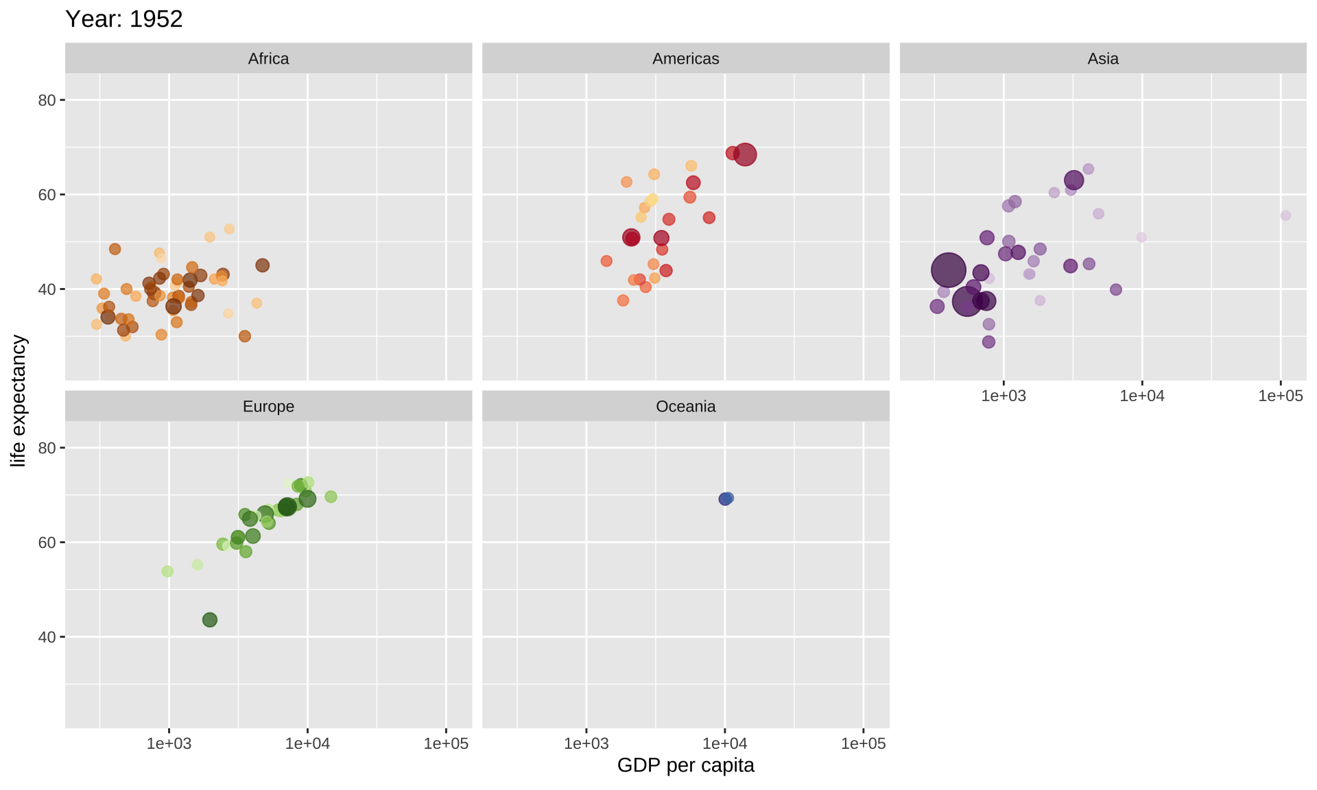
Dragon
# library(emojifont)
# library(ggplot2)
data_df <- data.frame(x = 1,
                      y = 0.75,
                      label=c("2024, Happy New Year"))

ggplot(data_df, aes(x, y)) +
  geom_text(aes(label = label, size = 10, color = '#ede69a' )) +
  geom_emoji ("dragon", color='#ede69a', size = 125, vjust = 0.7) +
  labs(x = NULL, y = NULL) +
  ylim(0, 1) +
  theme (legend.position = "none") +
  theme(panel.background = element_rect(fill = "#992615"),
        panel.grid = element_blank(),
        axis.text.x = element_blank(),
        axis.ticks.x = element_blank(),
        axis.text.y = element_blank(),
        axis.ticks.y = element_blank())
Endless Horse
# library(cowsay)
endless_horse(
  what = "Hello Zehui!",
  endless = F,
  wait = 0.5,
  what_color = "green",
horse_color = "white") | Hello Zehui! |
\
 \
  \
   ,
_,,)\.~,,._
 (()`  ``)\))),,_
  |     \ ''((\)))),,_          ____
  |6`   |   ''((\())) "-.____.-"    `-.-,
  |    .'\    ''))))'                  \)))
  |   |   `.     ''                     ((((
  \, _)     \/                          |))))
   `'        |                          (((((
             \                  |       ))))))
              `|    |           ,\     /((((((
               |   / `-.______.<  \   |  )))))
               |   |  /         `. \  \  ((((
               |  / \ |           `.\  | (((
               \  | | |             )| |  ))
                | | | |             || |  '   [endless.horse]
                | | | |             || |