![]()
Pie Chart
BarChart circular with coord_polar()
# Create Data
data <- data.frame(
  group=LETTERS[1:5],
  value=c(13,7,9,21,2)
)

# Basic piechart
ggplot(data, aes(x="", y=value, fill=group)) +
  geom_bar(stat="identity", width=1, color="white") +
  coord_polar("y", start=0) +
  theme_void() # remove background, grid, numeric labels
# Basic piechart
ggplot(data, aes(x="", y=value, fill=group)) +
  geom_bar(stat="identity", width=1) +
  coord_polar("y", start=0) +
  labs(title="Add Title Here...",
       x="",
       y="") +
  theme(axis.line = element_blank(),
        axis.ticks = element_blank(),
        panel.grid  = element_blank())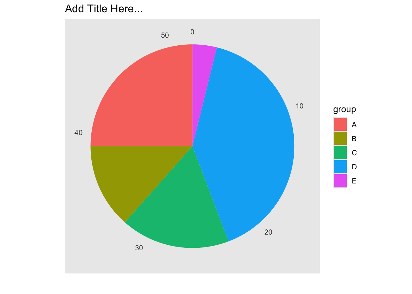
Adding labels with geom_text()
# Create Data
data <- data.frame(
  group=LETTERS[1:5],
  value=c(13,7,9,21,2)
)

# Compute the position of labels
data <- data %>%
  arrange(desc(group)) %>%
  mutate(prop = value / sum(data$value) *100) %>%
  mutate(ypos = cumsum(prop)- 0.5*prop )

# Basic piechart
ggplot(data, aes(x="", y=prop, fill=group)) +
  geom_bar(stat="identity", width=1, color="white") +
  coord_polar("y", start=0) +
  theme_void() +
  theme(legend.position="none") +

  geom_text(aes(y = ypos, label = group), color = "white", size=6) +
  scale_fill_brewer(palette="Pastel1")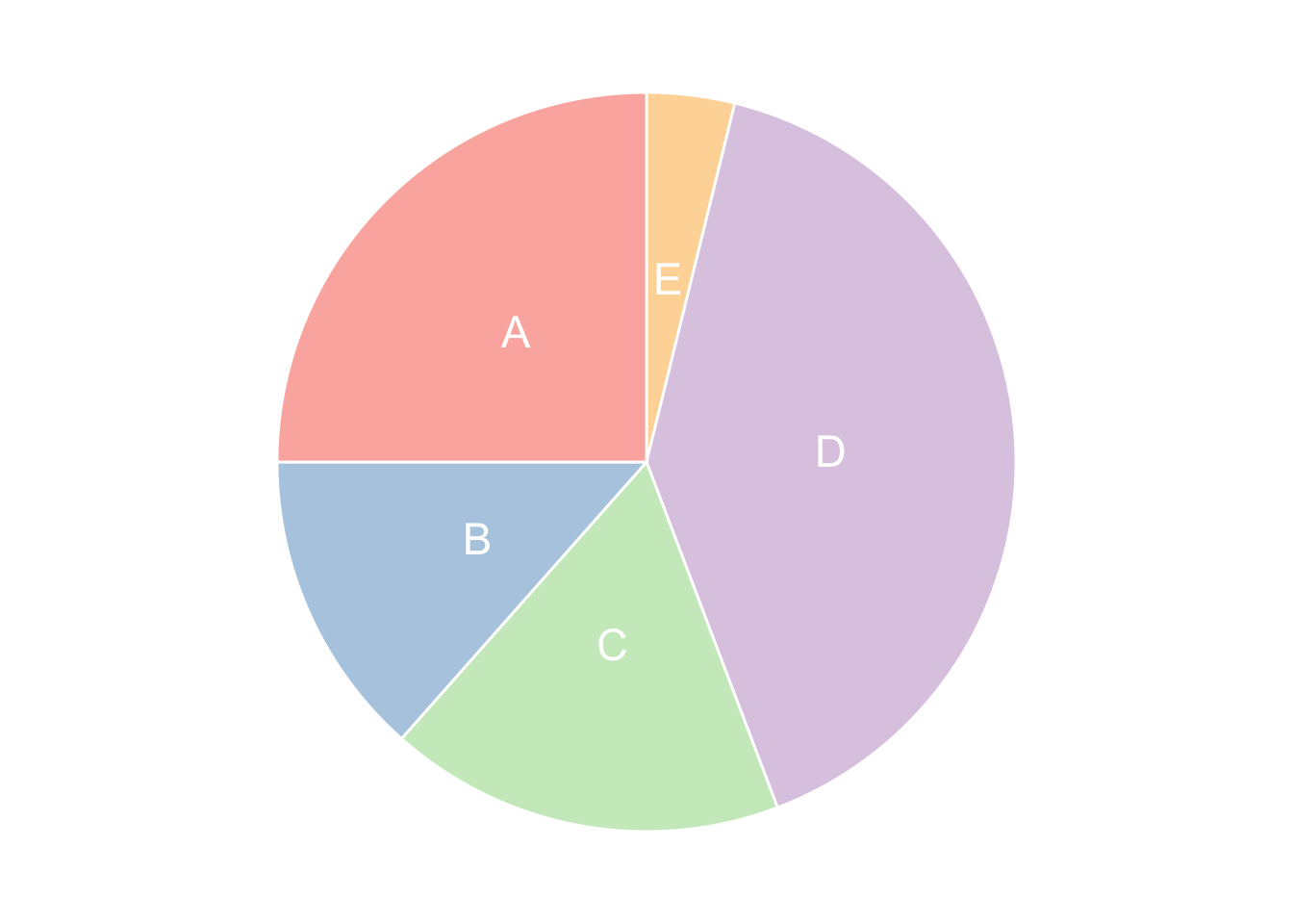
Add Lable in Legend
data <- data.frame(
  group=c("Severe retinal detachments",
          "Traumatic retinal detachments",
          "Giant retinal tears",
          "Other retinal detachments",
          "Lifting of the subluxated lens",
          "Other diseases"),
  value=c(7468 , 2843 , 2889 ,827 ,1320 ,235 )
)
# Compute the position of labels
data <- data %>%
  arrange(desc(group)) %>%
  mutate(prop = paste(round(value / sum(data$value) *100,1),"%"),
         group = paste(group,"(",prop, ")"))
### Converting all chr variables
data[sapply(data, is.character)] <- lapply(data[sapply(data, is.character)], as.factor)

data$group
## [1] Traumatic retinal detachments ( 18.2 % )
## [2] Severe retinal detachments ( 47.9 % )
## [3] Other retinal detachments ( 5.3 % )
## [4] Other diseases ( 1.5 % )
## [5] Lifting of the subluxated lens ( 8.5 % )
## [6] Giant retinal tears ( 18.5 % )
## 6 Levels: Giant retinal tears ( 18.5 % ) ...# Basic piechart
ggplot(data, aes(x="", y=value, fill=group)) +
geom_bar(stat="identity", width=1, color="white") +
coord_polar("y", start=0) +
scale_color_brewer(palette="Dark2") +
scale_fill_discrete(name = "Disease",
breaks=c("Severe retinal detachments ( 47.9 % )",
"Traumatic retinal detachments ( 18.2 % )",
"Giant retinal tears ( 18.5 % )",
"Other retinal detachments ( 5.3 % )",
"Lifting of the subluxated lens ( 8.5 % )",
"Giant retinal tears ( 18.5 % )",
"Other diseases ( 1.5 % )")) +
labs(title="Add Title Here...",
x="",
y="") +
theme(legend.position="right")+
theme(axis.line = element_blank(),
axis.text = element_blank(),
axis.ticks = element_blank(),
panel.grid = element_blank())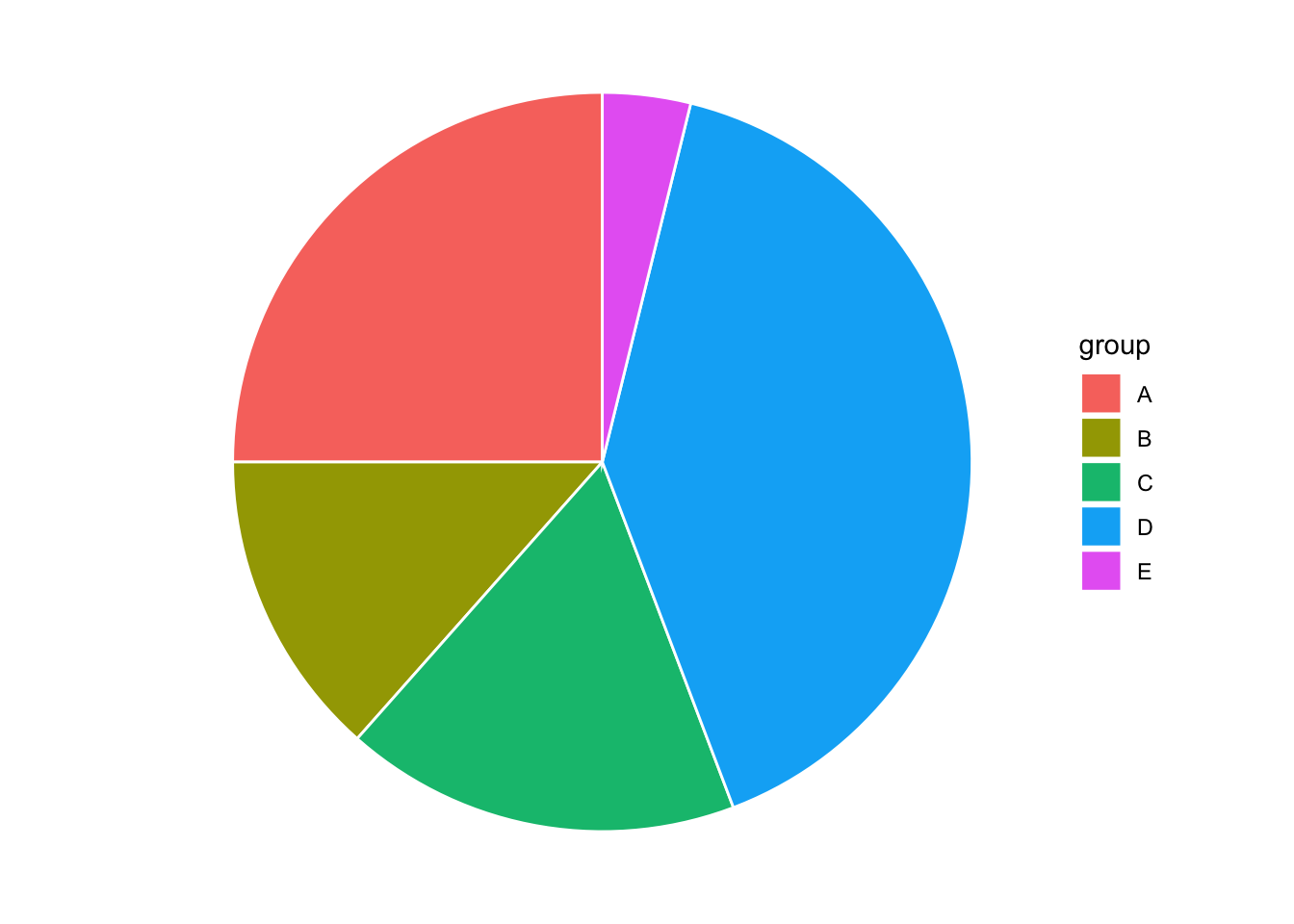
Interactive Pie Chart
# library(plotly)
# Create fake data
df <- data.frame(
  genre=c("Pop", "HipHop", "Latin", "Jazz"),
  values = c(33,22,25,20)
)

plot_ly(data=df,labels=~genre, values=~values, type="pie") %>%
    layout(title = 'United States Music Genre Prevalent in 1999',
           xaxis = list(showgrid = FALSE, zeroline = FALSE, showticklabels = FALSE),
           yaxis = list(showgrid = FALSE, zeroline = FALSE, showticklabels = FALSE))
Donut chart
Basic Doughnut
# Create test data.
data <- data.frame(
  category=c("A", "B", "C"),
  count=c(10, 60, 30)
)

# Compute percentages
data$fraction = data$count / sum(data$count)

# Compute the cumulative percentages (top of each rectangle)
data$ymax = cumsum(data$fraction)

# Compute the bottom of each rectangle
data$ymin = c(0, head(data$ymax, n=-1))

# Make the plot
ggplot(data, aes(ymax=ymax, ymin=ymin, xmax=4, xmin=3, fill=category)) +
  geom_rect() +
  coord_polar(theta="y") + # Try to remove that to understand how the chart is built initially
  xlim(c(2, 4)) +
  theme_bw()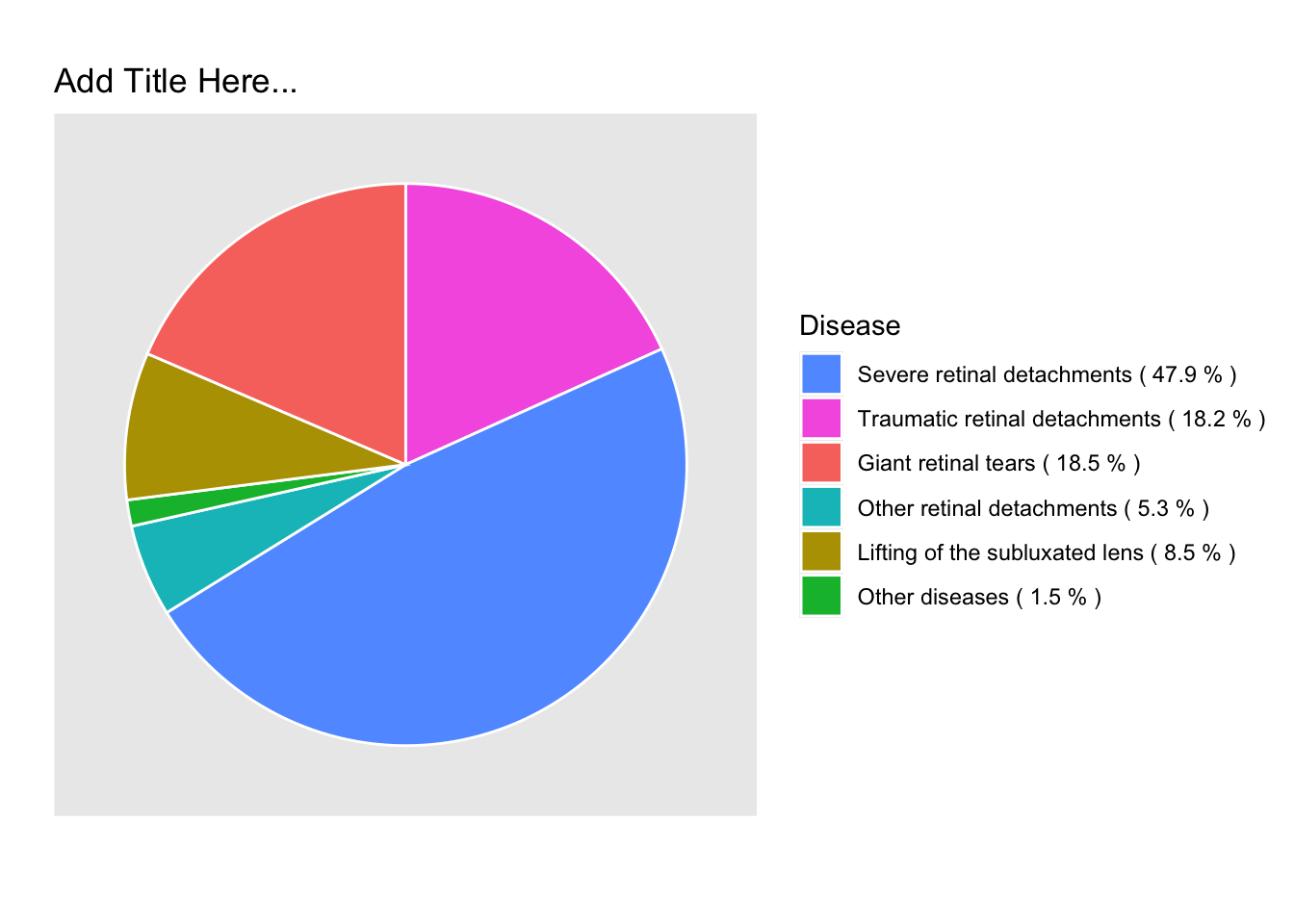
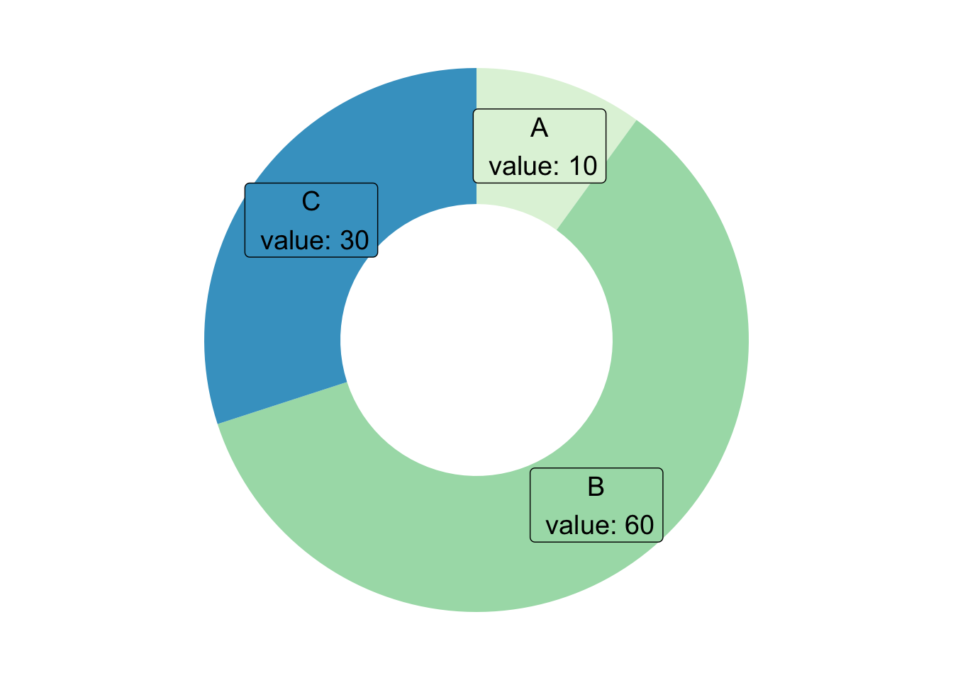
Customization
# Create test data.
data <- data.frame(
  category=c("A", "B", "C"),
  count=c(10, 60, 30)
)

# Compute percentages
data$fraction <- data$count / sum(data$count)

# Compute the cumulative percentages (top of each rectangle)
data$ymax <- cumsum(data$fraction)

# Compute the bottom of each rectangle
data$ymin <- c(0, head(data$ymax, n=-1))

# Compute label position
data$labelPosition <- (data$ymax + data$ymin) / 2

# Compute a good label
data$label <- paste0(data$category, "\n value: ", data$count)

# Make the plot
ggplot(data, aes(ymax=ymax, ymin=ymin, xmax=4, xmin=3, fill=category)) +
  geom_rect() +
  geom_label( x=3.5, aes(y=labelPosition, label=label), size=5) +
  scale_fill_brewer(palette=4) +
  coord_polar(theta="y") +
  xlim(c(2, 4)) +
  theme_void() +
  theme(legend.position = "none")
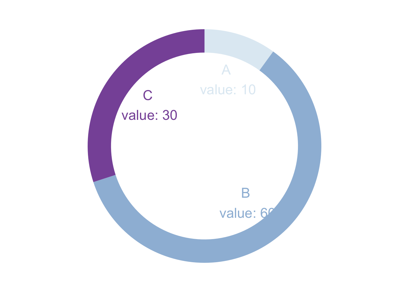
Donut Thickness
# Create test data.
data <- data.frame(
  category=c("A", "B", "C"),
  count=c(10, 60, 30)
)

# Compute percentages
data$fraction <- data$count / sum(data$count)

# Compute the cumulative percentages (top of each rectangle)
data$ymax <- cumsum(data$fraction)

# Compute the bottom of each rectangle
data$ymin <- c(0, head(data$ymax, n=-1))

# Compute label position
data$labelPosition <- (data$ymax + data$ymin) / 2

# Compute a good label
data$label <- paste0(data$category, "\n value: ", data$count)

# Make the plot
ggplot(data, aes(ymax=ymax, ymin=ymin, xmax=4, xmin=3, fill=category)) +
  geom_rect() +
  geom_text( x=2, aes(y=labelPosition, label=label, color=category), size=6) + # x here controls label position (inner / outer)
  scale_fill_brewer(palette=3) +
  scale_color_brewer(palette=3) +
  coord_polar(theta="y") +
  xlim(c(-1, 4)) +
  theme_void() +
  theme(legend.position = "none")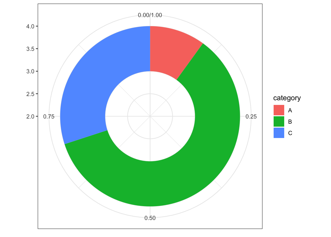
Treemap
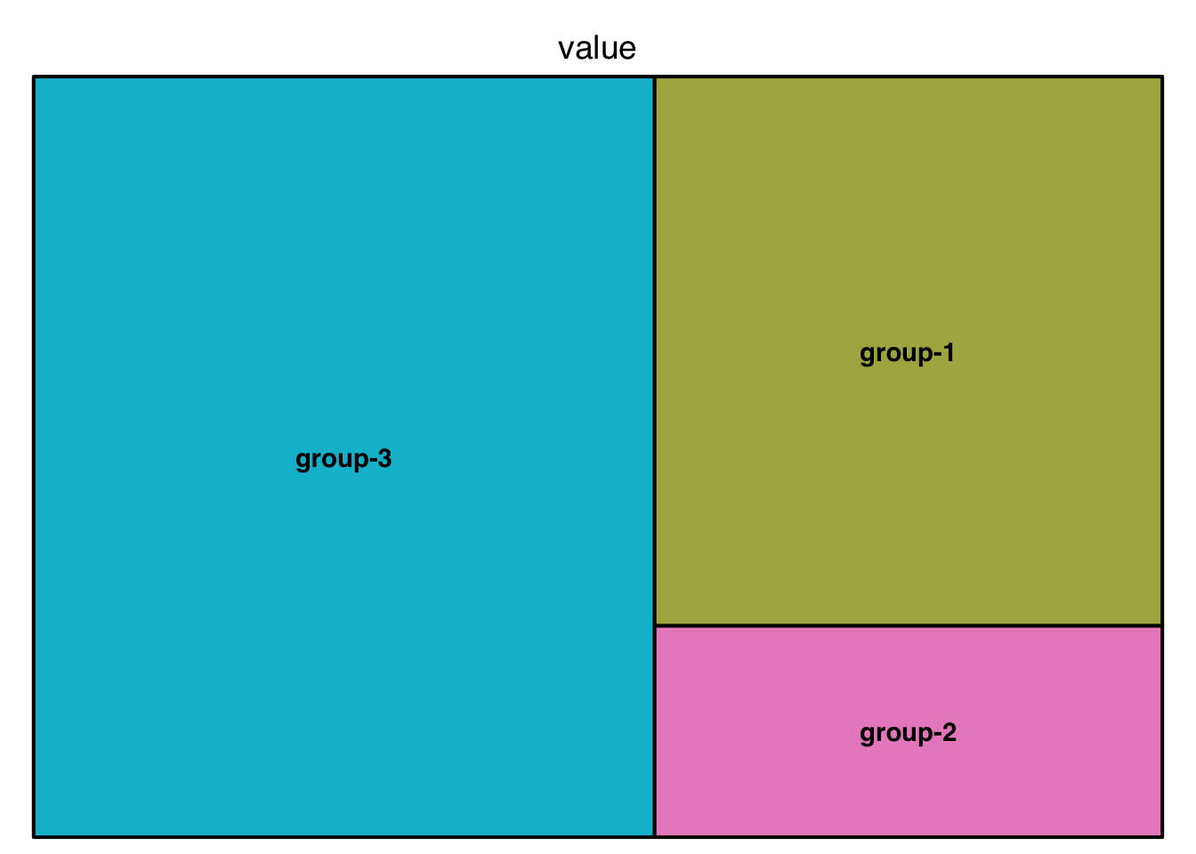
Basic Treemap
# library("treemap")
group <- c("group-1","group-2","group-3")
value <- c(13,5,22)
data <- data.frame(group,value)
data %>% gt()| group | value |
|---|---|
| group-1 | 13 |
| group-2 | 5 |
| group-3 | 22 |
# treemap
treemap(data,
        index="group",
        vSize="value",
        type="index"
        )
Treemap with subgroups
# Build Dataset
group <- c(rep("group-1",4),rep("group-2",2),rep("group-3",3))
subgroup <- paste("subgroup" , c(1,2,3,4,1,2,1,2,3), sep="-")
value <- c(13,5,22,12,11,7,3,1,23)
data <- data.frame(group,subgroup,value)
data %>% gt()| group | subgroup | value |
|---|---|---|
| group-1 | subgroup-1 | 13 |
| group-1 | subgroup-2 | 5 |
| group-1 | subgroup-3 | 22 |
| group-1 | subgroup-4 | 12 |
| group-2 | subgroup-1 | 11 |
| group-2 | subgroup-2 | 7 |
| group-3 | subgroup-1 | 3 |
| group-3 | subgroup-2 | 1 |
| group-3 | subgroup-3 | 23 |
# General features:
treemap(data, index=c("group","subgroup"),
        vSize="value",
        type="index",
        palette = "Set1",
        title="My Treemap",
        fontsize.title=11,                       # Size of the title
) 
Interactive Treemap
## devtools::install_github("sada1993/d3treeR")
# library(d3treeR)

# dataset
group <- c(rep("group-1",4),rep("group-2",2),rep("group-3",3))
subgroup <- paste("subgroup" , c(1,2,3,4,1,2,1,2,3), sep="-")
value <- c(13,5,22,12,11,7,3,1,23)
data <- data.frame(group,subgroup,value)

# basic treemap
p <- treemap(data,
            index=c("group","subgroup"),
            vSize="value",
            type="index",
            palette = "Set2",
            bg.labels=c("white"),
            align.labels=list(
              c("center", "center"),
              c("right", "bottom")
            )
) 
# make it interactive ("rootname" becomes the title of the plot):
inter <- d3tree2( p ,  rootname = "General" )
inter