![]()
Scatter Plot
Grouping Aesthetic
- Color Aesthetic
- Size Aesthetic
- Alpha Aesthetic
- Shape Aesthetic
# Color Aesthetic
ggplot(data = mpg) +
  geom_point(mapping = aes(x = displ, y = hwy, color = class))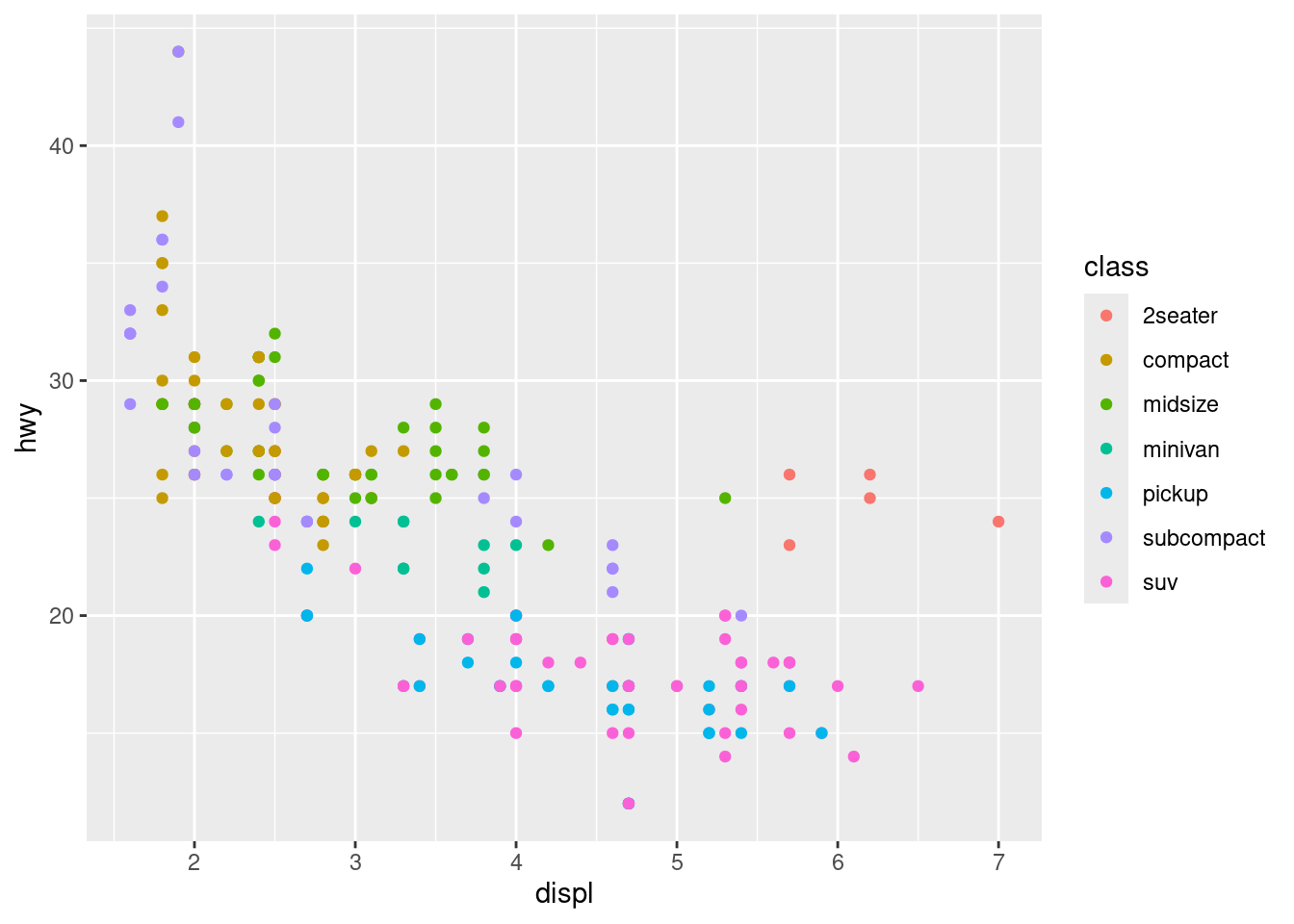
# Set the aesthetic properties of your geom manually
ggplot(data = mpg) +
  geom_point(mapping = aes(x = displ, y = hwy), color = "blue")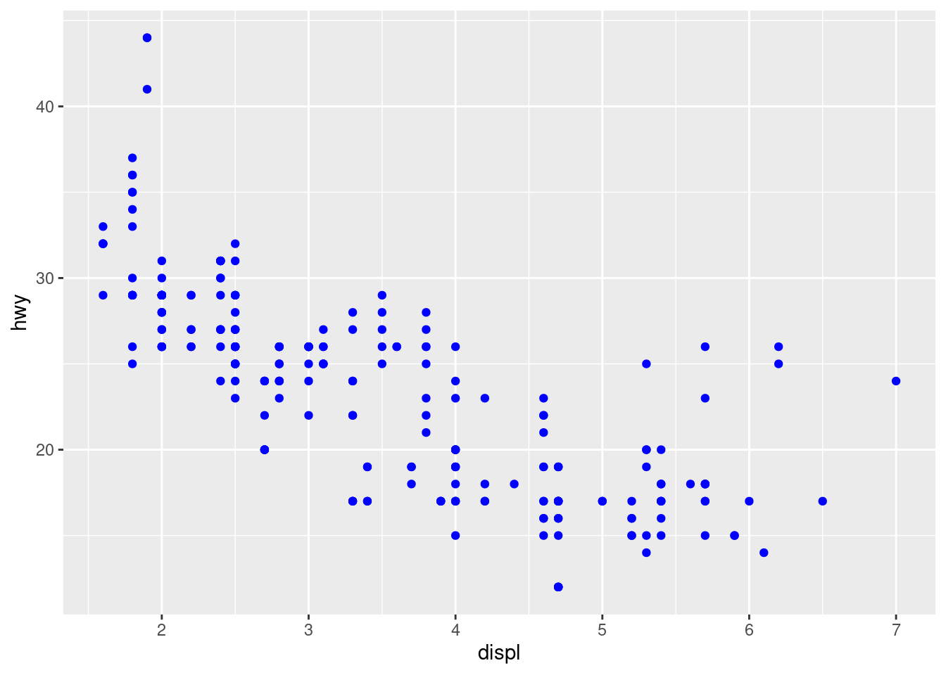
# Size Aesthetic
ggplot(data = mpg) +
  geom_point(mapping = aes(x = displ, y = hwy, size = class))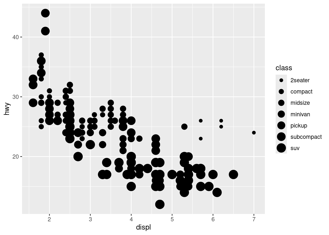
# Alpha aesthetic, which controls the transparency of the points
ggplot(data = mpg) +
  geom_point(mapping = aes(x = displ, y = hwy, alpha = class))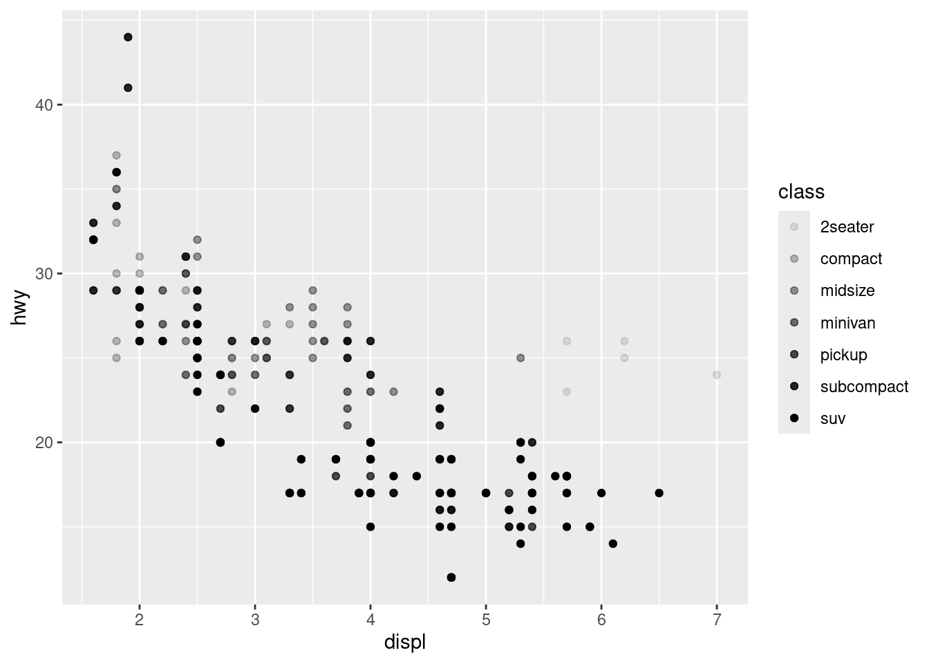
# shape aesthetic
ggplot(data = mpg) +
  geom_point(mapping = aes(x = displ, y = hwy, shape = class))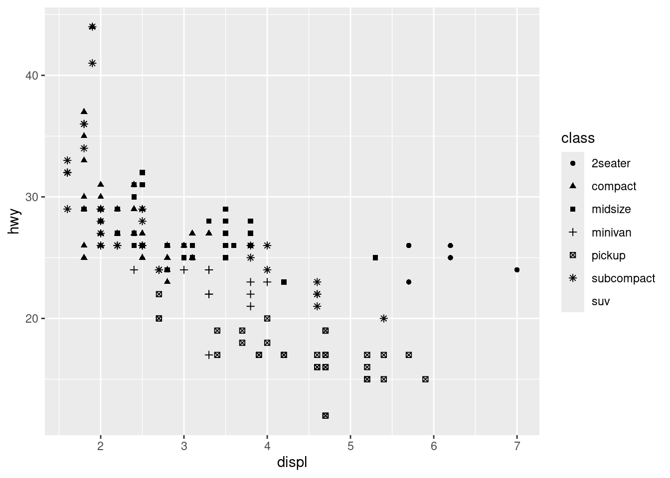
data(iris)
theme_set(theme_bw())
ggplot(data = iris, mapping = aes(x = Petal.Length, y = Petal.Width, shape = Species)) +
  geom_point(aes(color = Species), size = 3) +
  scale_colour_manual(values=c("#3399CC","#33FF33","#FFCC33"))+
  scale_shape_manual(values = c(1,2,3)) +
  xlab("Petal Length") +  ylab("Petal Width") +
  ylim(0, 3)+
  ggtitle("Petal Width and Length") +
  theme(plot.title = element_text(hjust = 0.5,face = "bold"),
        legend.title = element_blank(),
        legend.position = c(0.1, 0.85))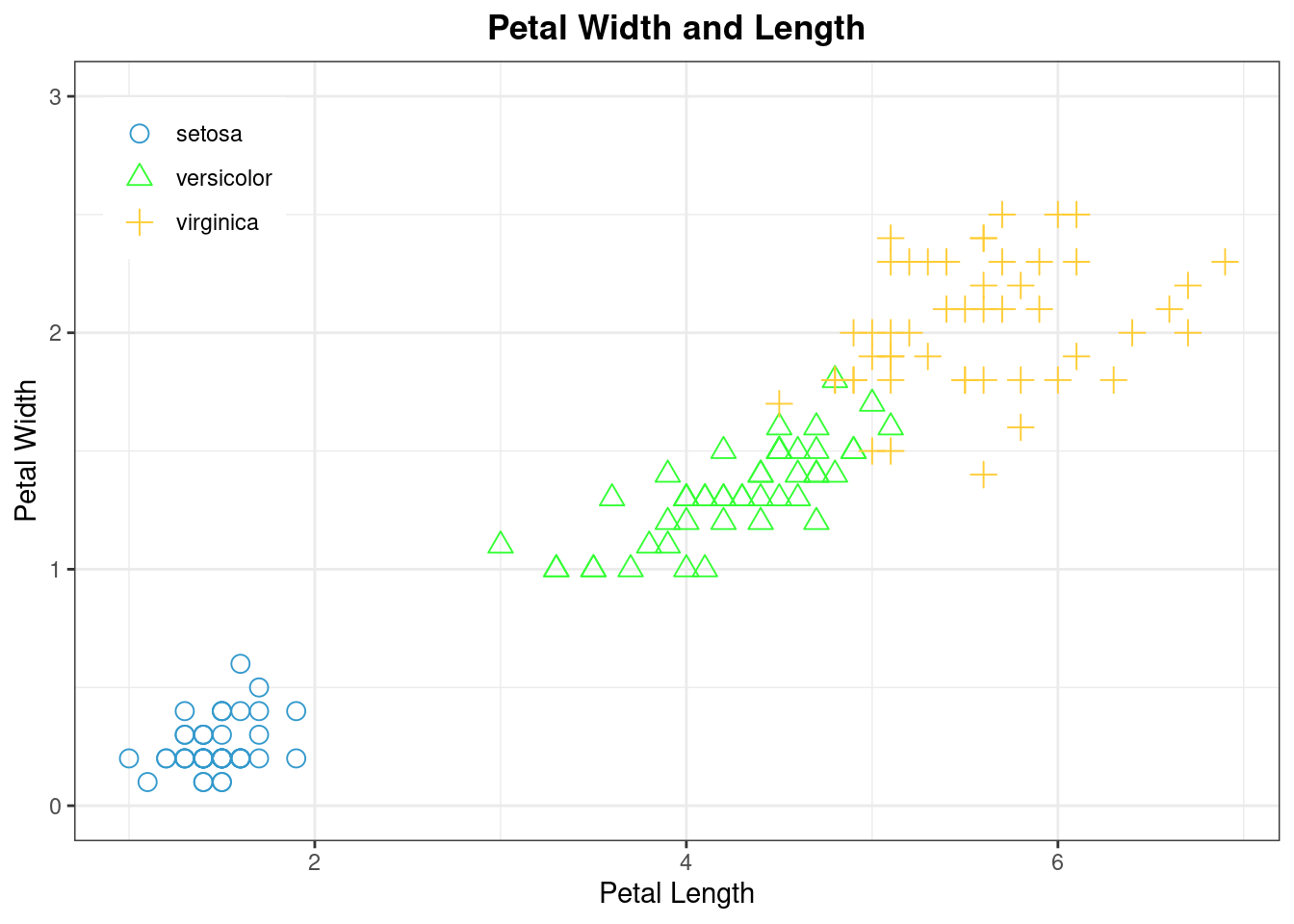
Smooth Line
geom_smooth
# display different aesthetics in different layers
ggplot(data = mpg, mapping = aes(x = displ, y = hwy)) +
  geom_point(mapping = aes(color = class)) +
  geom_smooth()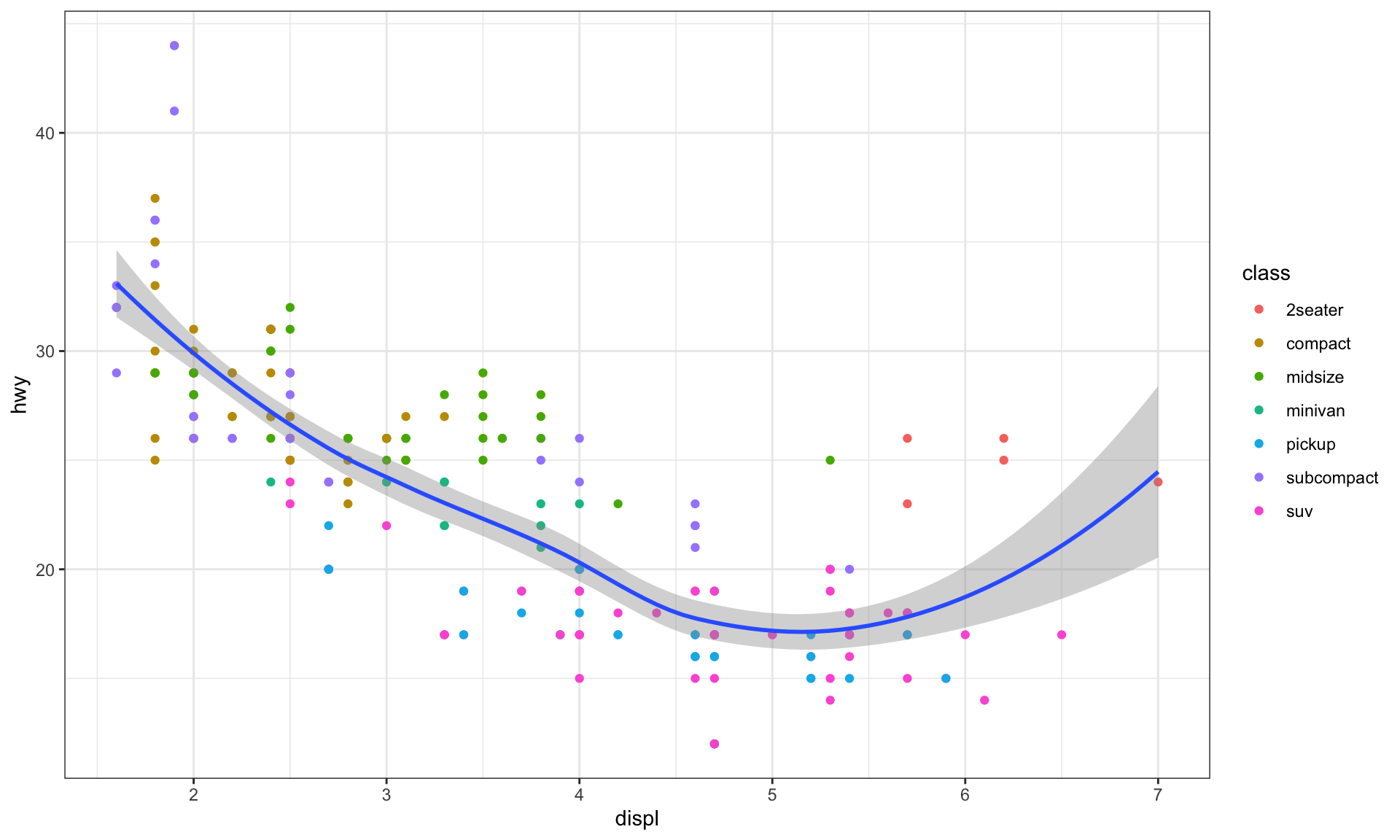
# no aesthetic just grouping
ggplot(data = mpg) +
  geom_smooth(mapping = aes(x = displ, y = hwy, group = drv)) +
  geom_point(mapping = aes(x = displ, y = hwy, color = class))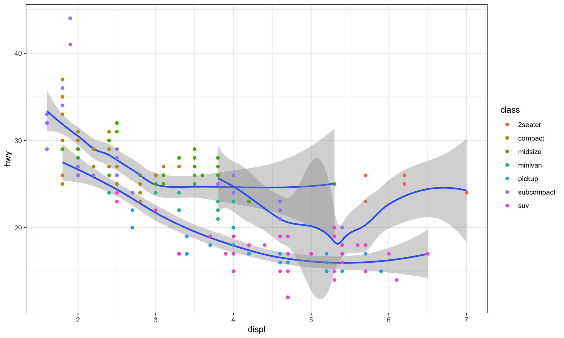
# linetype aesthetic set the shape of a point
ggplot(data = mpg) +
  geom_smooth(mapping = aes(x = displ, y = hwy, linetype = drv))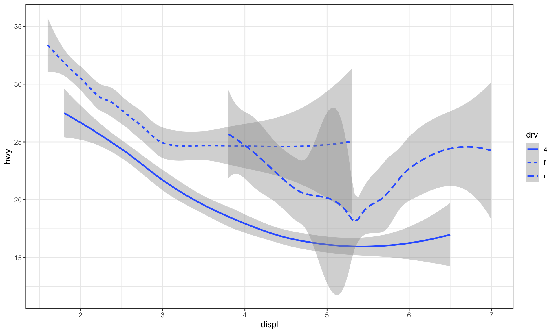
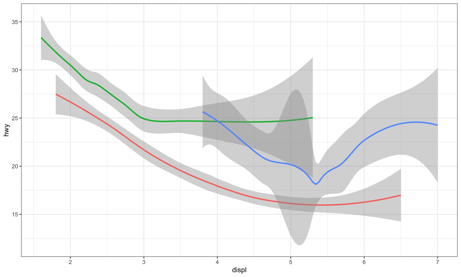
# color aesthetic
ggplot(data = mpg) +
  geom_smooth(
    mapping = aes(x = displ, y = hwy, color = drv),
    show.legend = FALSE
  )
# Linear line
ggplot(mpg, aes(cty, hwy))+
  geom_point() +
  geom_smooth(method="lm", se=F) +
  theme_bw()+
  labs(subtitle="mpg: city vs highway mileage",
       y="hwy",
       x="cty",
       title="Scatterplot with overlapping points",
       caption="Source: midwest")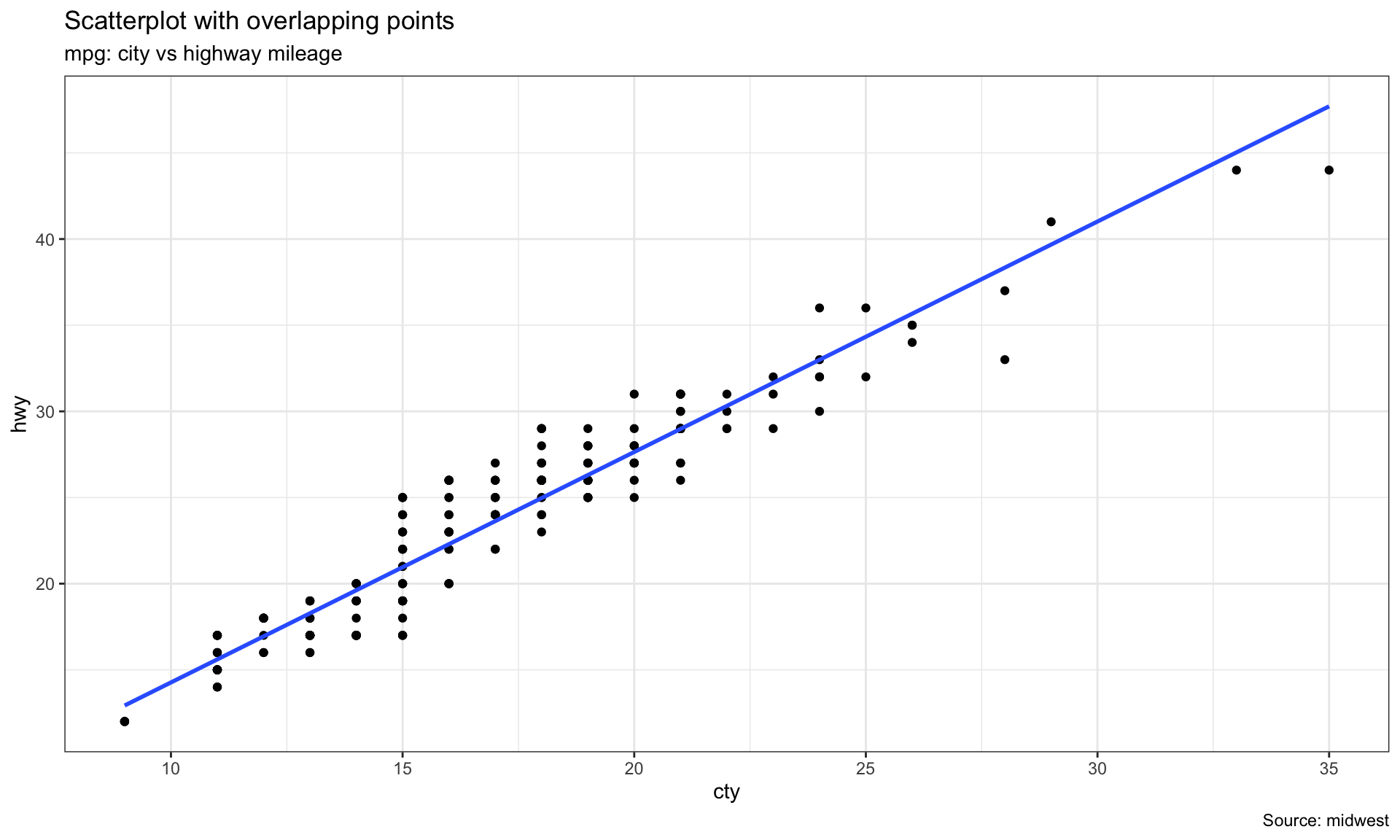
# The raw dataset has 234 observations, but shown in figure fewer, because some points lay together, the jitter plot could be used in this case by applying jitter_geom
ggplot(mpg, aes(cty, hwy))+
  geom_point() +
  theme_bw()+
  geom_jitter(width = .5, size=1) +
  labs(subtitle="mpg: city vs highway mileage",
       y="hwy",
       x="cty",
       title="Jittered Points")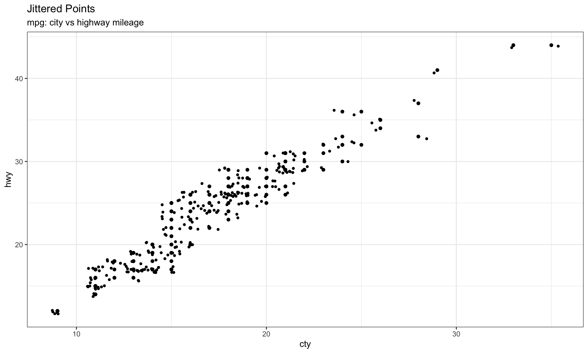
Exploratory exposure-response analysis
# Read in data
my_data <-
  read_csv("./01_Datasets/401_case1_PKPDdataset_ard.csv") %>%
  filter(CYCLE == 1)

# Plot response vs exposure
my_data %>%
  ggplot(aes(x = AUC, y = sCHG)) +
  geom_point() +
  scale_y_continuous(breaks = seq(-800, 800, 200)) +
  theme_gray(base_size = 10) +
  labs(x = "RESN", y = "LIDV", title = "")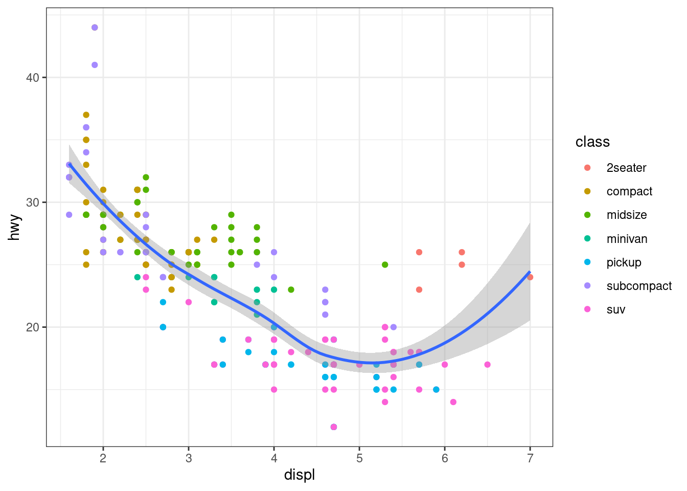
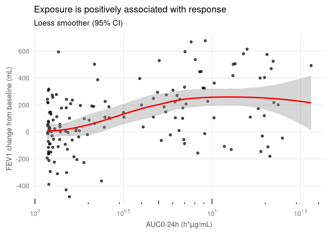
# Define custom breaks and labels
lbr <- scales::trans_breaks("log10", function(x) 10^x)
llb <- scales::trans_format("log10", scales::math_format(10^.x))
source('./03_Functions/paper_theme.R')

my_data %>%
  ggplot(aes(x = AUC, y = sCHG)) +
  geom_point(alpha = 0.7) +
  geom_smooth(method = "loess", colour = "red") +
  scale_x_log10(
    breaks = lbr,  # Set custom breaks
    labels = llb  # Set custom labels
  ) +
  scale_y_continuous(breaks = seq(-800, 800, 200)) +
  annotation_logticks(sides = "b") +
  labs(
    x = expression(paste("AUC0-24h (h*",mu,"g/mL)", sep = "")),
    y = "FEV1 change from baseline (mL)",
    title = "Exposure is positively associated with response",
    subtitle = "Loess smoother (95% CI)"
    ) +
paper_theme() 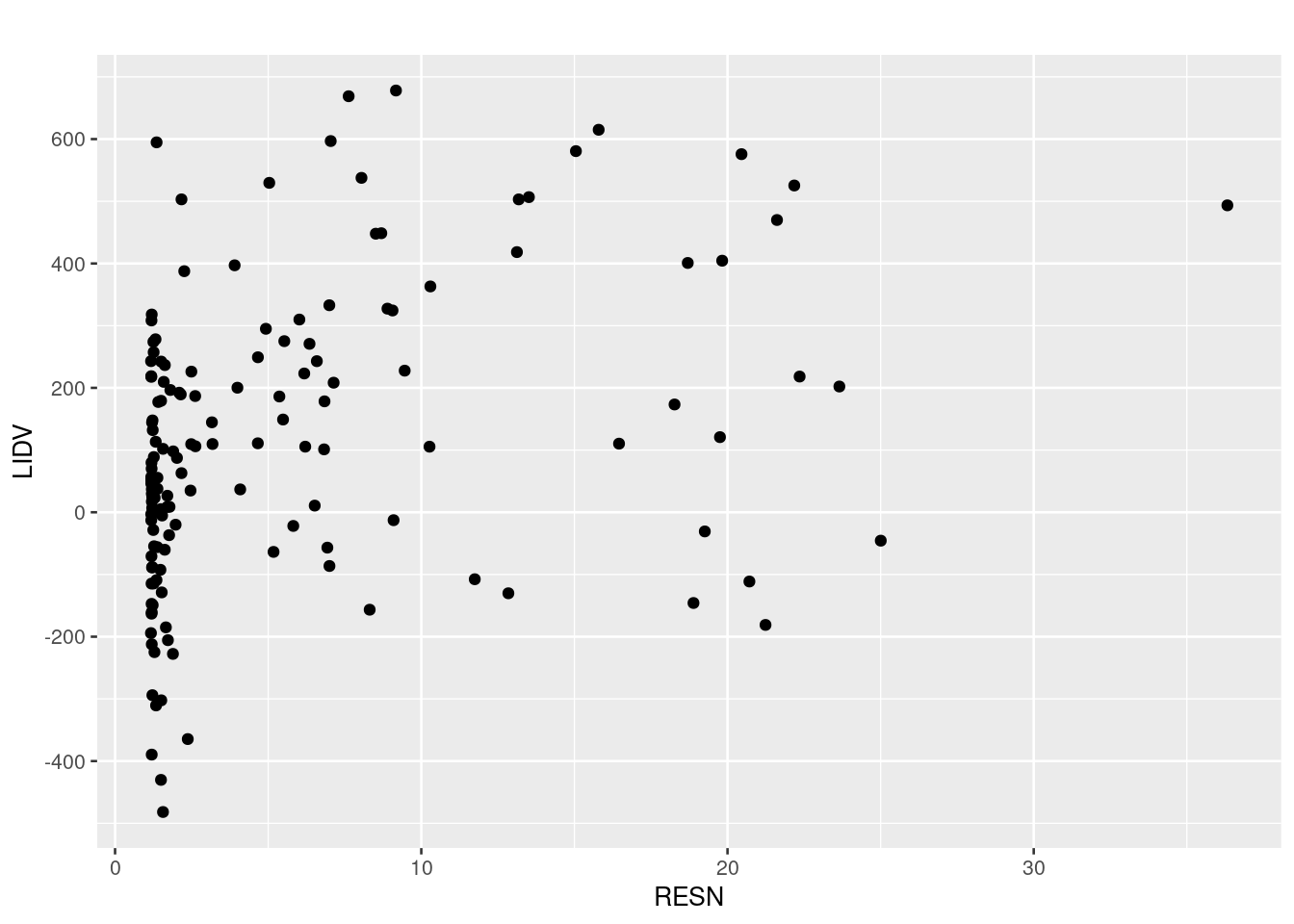
# Cleveland, William S. 1979. “Robust Locally Weighted Regression and Smoothing Scatterplots.” Journal of the American Statistical Association 74 (368): 829–36. https://doi.org/10.1080/01621459.1979.10481038
# https://graphicsprinciples.github.io/tutorial-case-studies/posts/401-case1-eda/401-case1-eda.html
my_data %>%
  ggplot(aes(x = AUC, y = sCHG, colour = factor(DOSE))) +
  geom_point(alpha = 0.5) +
  geom_smooth(method = "lm", se = FALSE) +
  scale_colour_brewer(palette = "Set2" , name = "Dose (mg)") +
  scale_x_log10(breaks = lbr, labels = llb) +
  scale_y_continuous(breaks = seq(-800, 800, 200)) +
  annotation_logticks(sides = "b") +
  labs(
    x = expression(paste("AUC0-24h (h*", mu, "g/mL)", sep = "")),
    y = "FEV1 change from baseline (mL)",
    title = "Exposure is not a better predictor of response than dose") +
  paper_theme() +
  theme(
    legend.position = c("right"),
    legend.title = element_text(size = 10)
    )
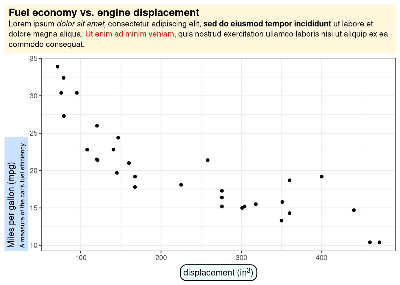
Change the Title rendering using ggtext::element_textbox()
# library("ggtext")
ggplot(mtcars, aes(disp, mpg)) +
  geom_point() +
  labs(
    title = "<b>Fuel economy vs. engine displacement</b><br>
    <span style = 'font-size:10pt'>Lorem ipsum *dolor sit amet,*
    consectetur adipiscing elit, **sed do eiusmod tempor incididunt** ut
    labore et dolore magna aliqua. <span style = 'color:red;'>Ut enim
    ad minim veniam,</span> quis nostrud exercitation ullamco laboris nisi
    ut aliquip ex ea commodo consequat.</span>",
    x = "displacement (in<sup>3</sup>)",
    y = "Miles per gallon (mpg)<br><span style = 'font-size:8pt'>A measure of
    the car's fuel efficiency.</span>"
  ) +
  theme(
    plot.title.position = "plot",
    plot.title = element_textbox_simple(
      size = 13,
      lineheight = 1,
      padding = margin(5.5, 5.5, 5.5, 5.5),
      margin = margin(0, 0, 5.5, 0),
      fill = "cornsilk"
    ),
    axis.title.x = element_textbox_simple(
      width = NULL,
      padding = margin(4, 4, 4, 4),
      margin = margin(4, 0, 0, 0),
      linetype = 1,
      r = grid::unit(8, "pt"),
      fill = "azure1"
    ),
    axis.title.y = element_textbox_simple(
      hjust = 0,
      orientation = "left-rotated",
      minwidth = unit(1, "in"),
      maxwidth = unit(2, "in"),
      padding = margin(4, 4, 2, 4),
      margin = margin(0, 0, 2, 0),
      fill = "lightsteelblue1"
    )
  )
Quadrant Counts
# library(ggpp)

set.seed(4321)
x <- -50:50
y <- rnorm(length(x), mean = 0)
my.data <- data.frame(x, y)

# whole panel
ggplot(my.data, aes(x, y)) +
  geom_point() +
  stat_quadrant_counts(quadrants = 0, label.x = "left", label.y = "bottom") +
  scale_y_continuous(expand = expansion(mult = c(0.15, 0.05)))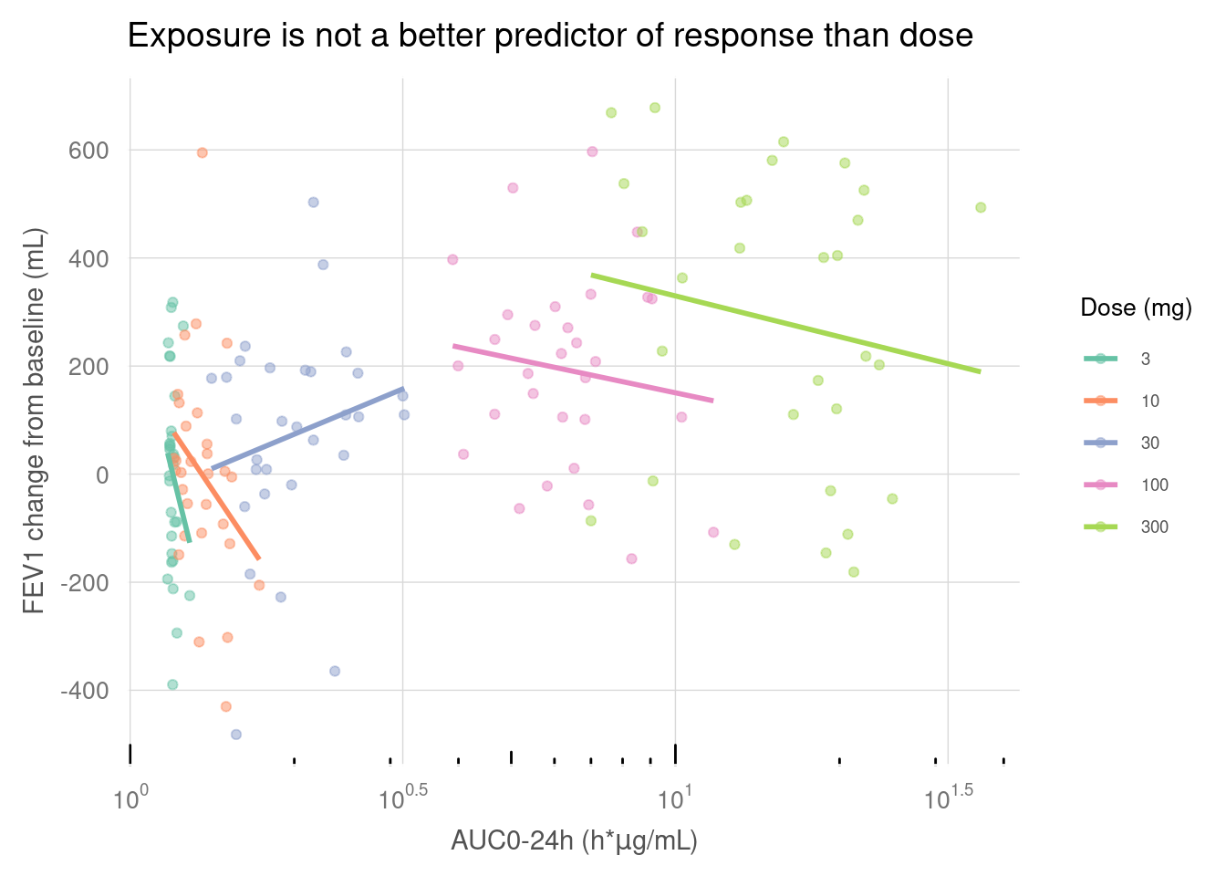
ggplot(my.data, aes(x, y)) +
  geom_point() +
  geom_quadrant_lines(xintercept = 0, yintercept = 0) +
  stat_quadrant_counts(aes(label = after_stat(pc.label)))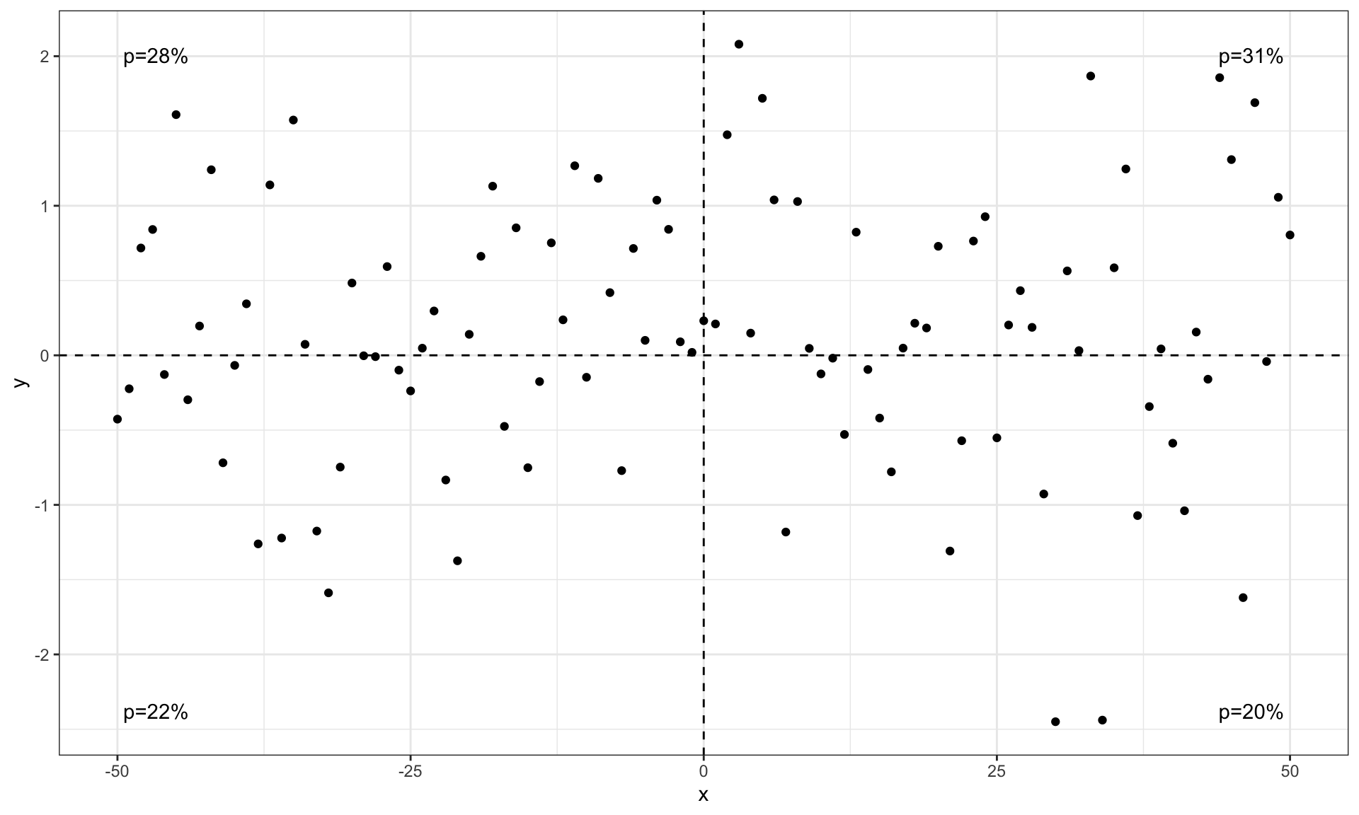
ggplot(my.data, aes(x, y)) +
  geom_point() +
  geom_quadrant_lines() +
  stat_quadrant_counts(aes(label = after_stat(fr.label)))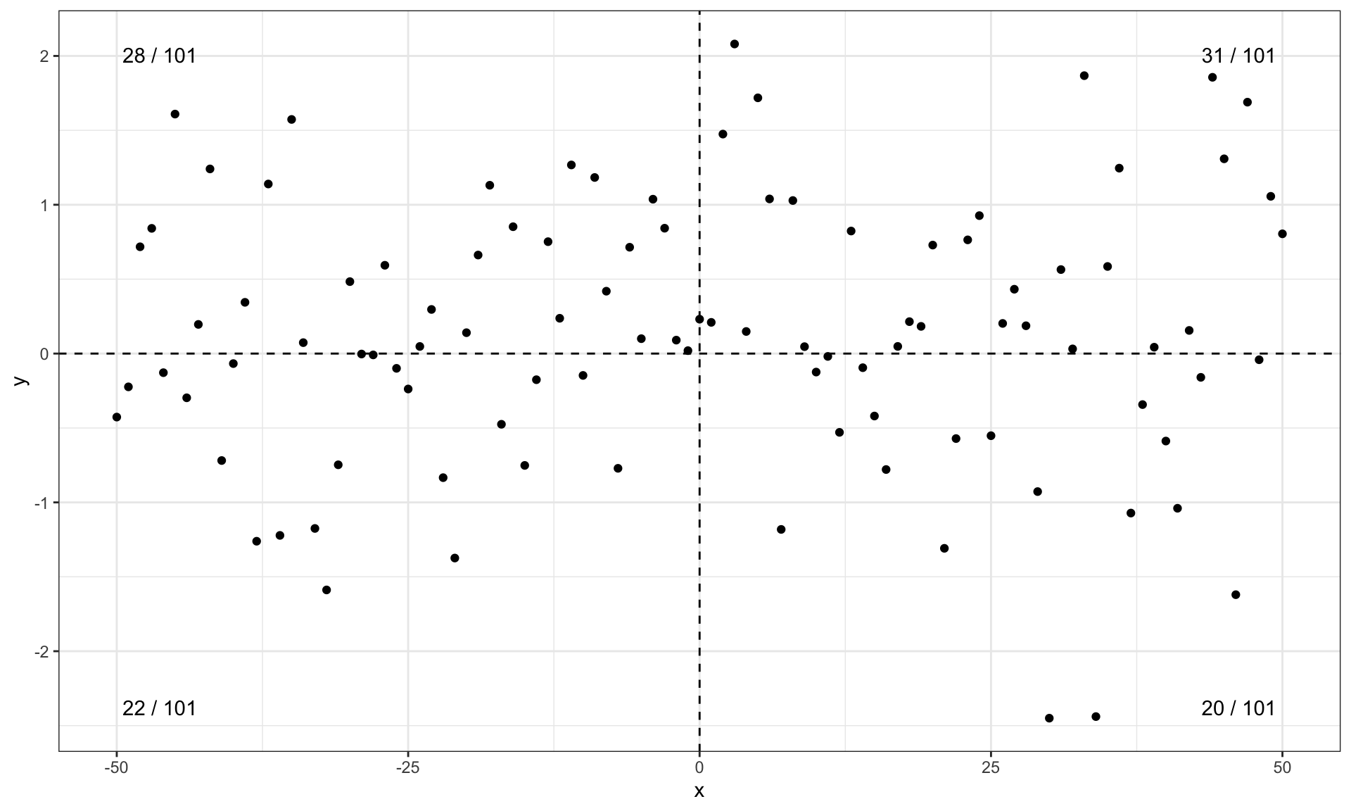
ggplot(my.data, aes(x, y)) +
  geom_point() +
  geom_quadrant_lines() +
  stat_quadrant_counts(aes(label = after_stat(dec.label)))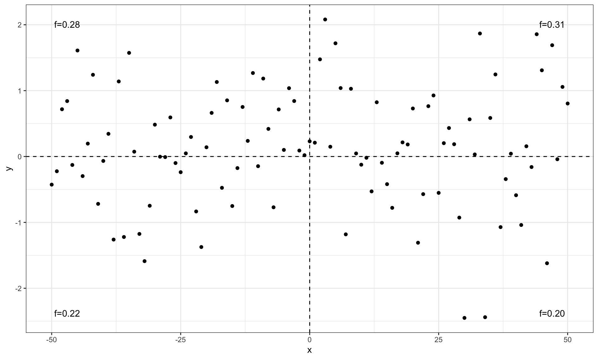
ggplot(my.data, aes(x, y)) +
 geom_point() +
  geom_quadrant_lines() +
  stat_quadrant_counts(aes(label = sprintf("%i observations", after_stat(count)))) +
  scale_y_continuous(expand = expansion(c(0.05, 0.15))) # reserve space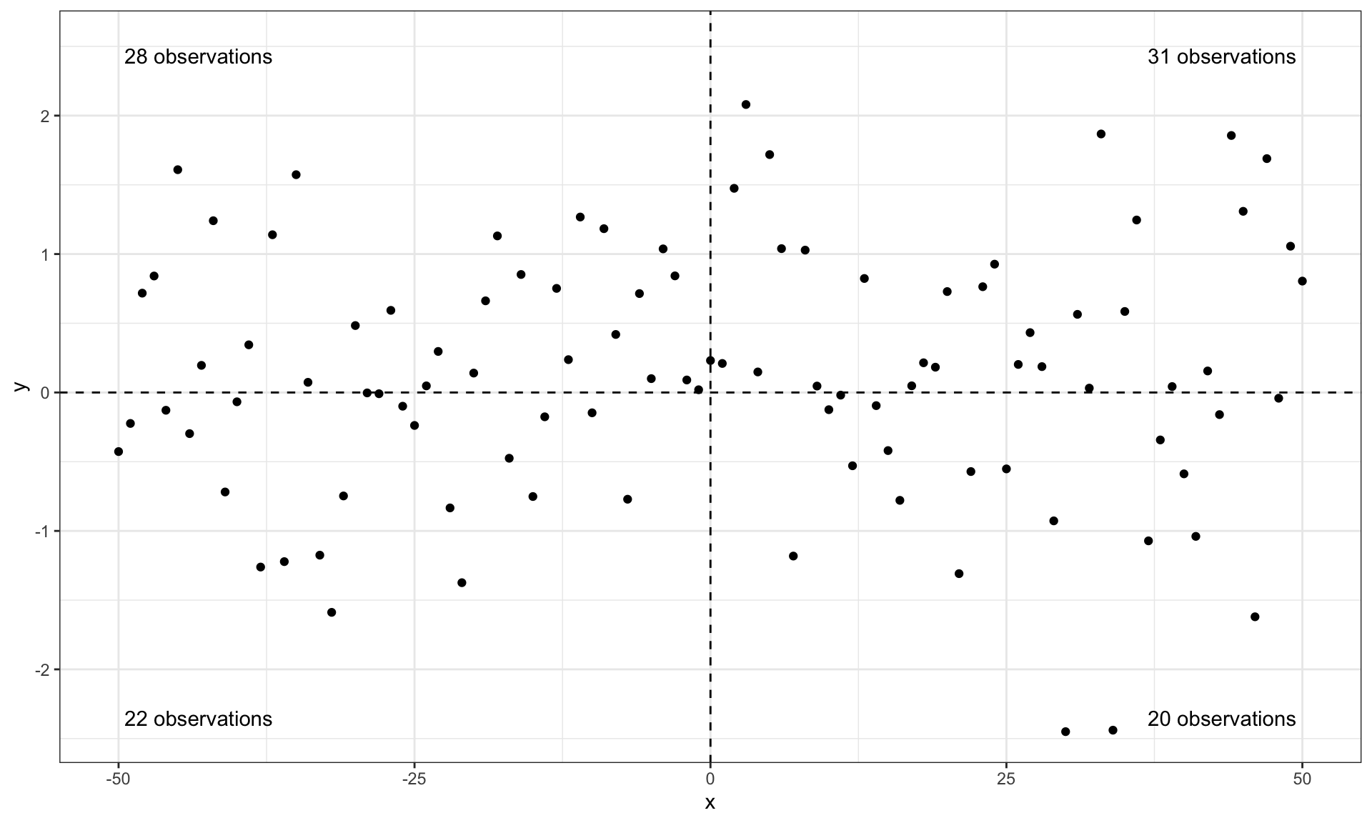
ggplot(my.data, aes(x, y)) +
  geom_quadrant_lines(colour = "blue", xintercept = 10, yintercept = -1) +
  stat_quadrant_counts(colour = "blue", xintercept = 10, yintercept = -1) +
  geom_point() +
  scale_y_continuous(expand = expansion(mult = 0.15))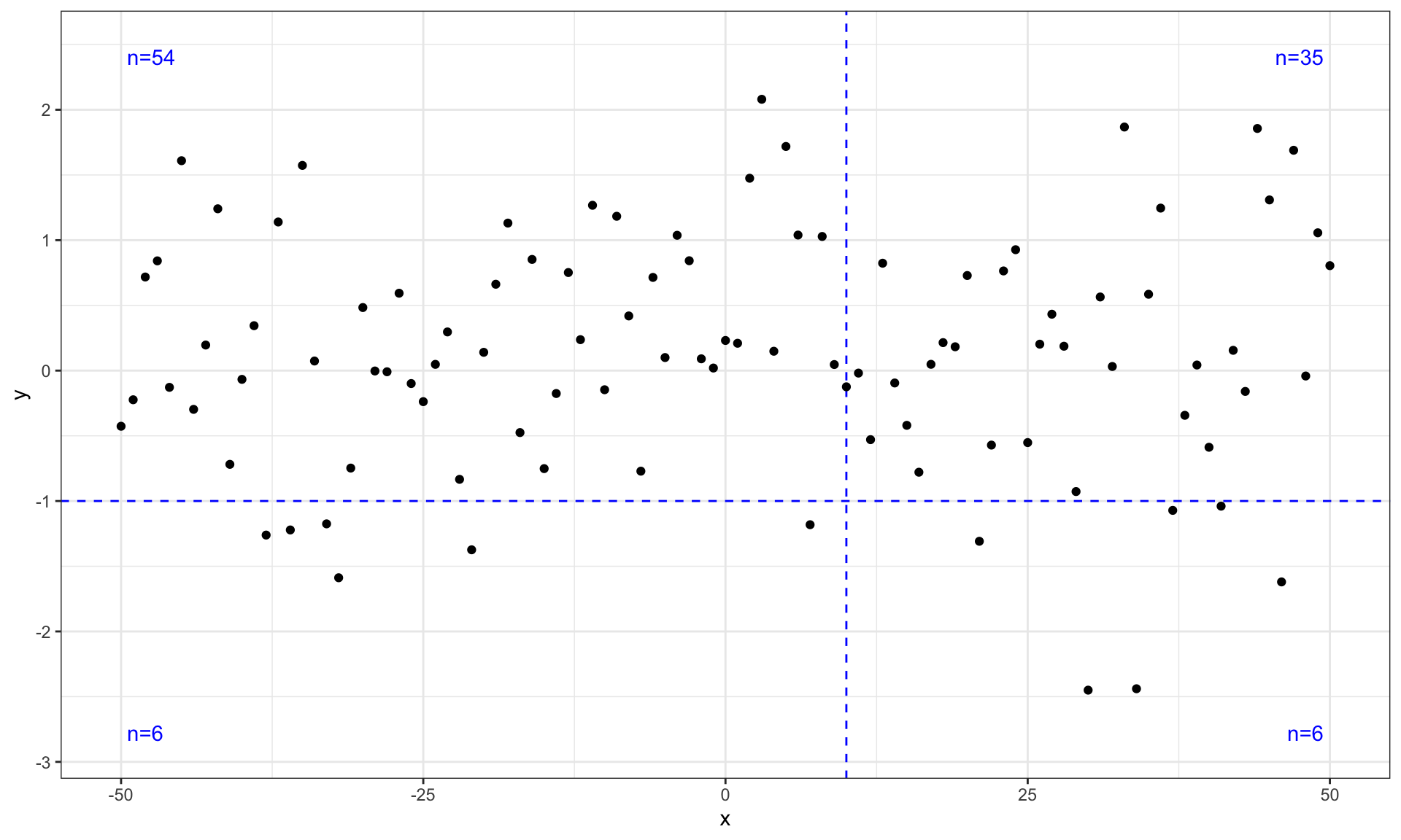
## grouped quadrants
ggplot(my.data, aes(x, y)) +
  geom_quadrant_lines(colour = "blue",
                      pool.along = "x") +
  stat_quadrant_counts(colour = "blue", label.x = "right",
                       pool.along = "x") +
  geom_point() +
  scale_y_continuous(expand = expansion(mult = 0.15))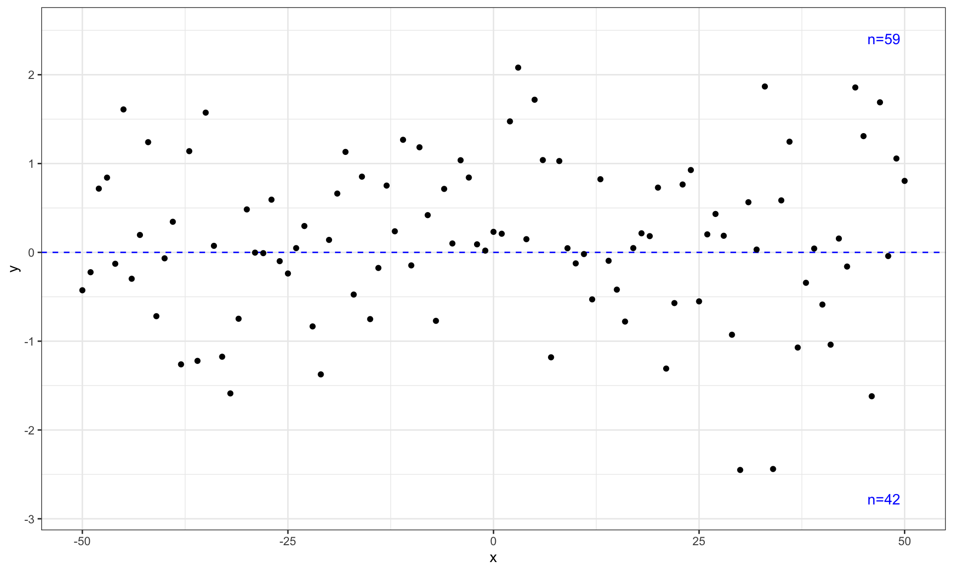
Grouping
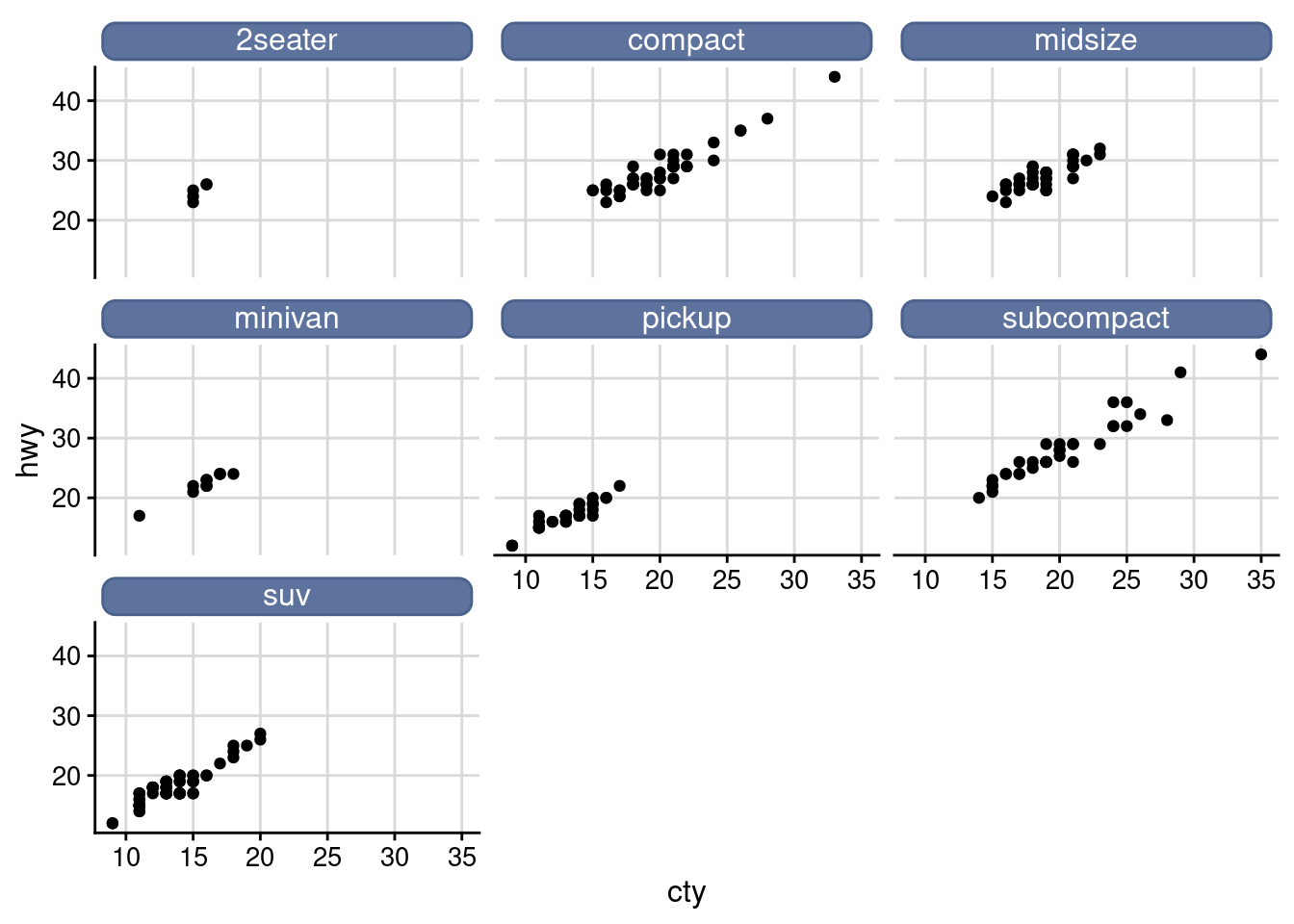
Facet
facet_wrap(), “winding facet”, only one standard can be applied to data classification, and the small shapes obtained from different sets of data are arranged in the order of “winding” from left to right and from top to bottom
facet_grid(), facet the drawing of the combination of two variables
ggplot(data = mpg) +
  geom_point(mapping = aes(x = displ, y = hwy)) +
  facet_wrap(.~ class, nrow = 2)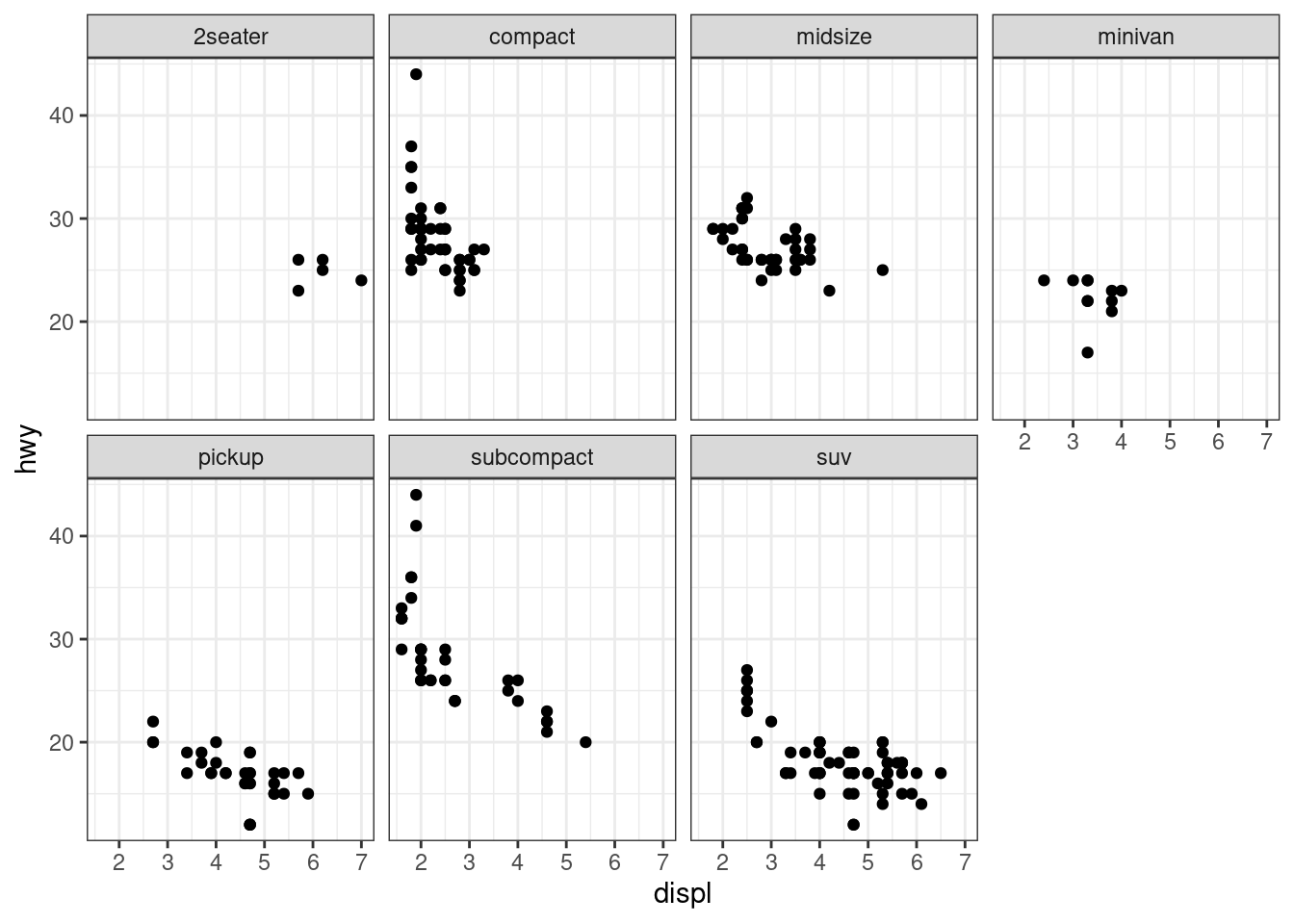
ggplot(data = mpg) +
  geom_point(mapping = aes(x = displ, y = hwy)) +
  facet_grid(.~ class)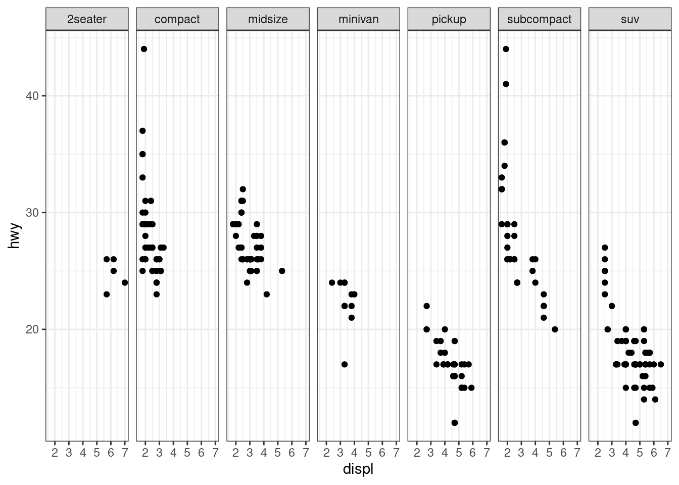
ggplot(data = mpg) +
  geom_point(mapping = aes(x = displ, y = hwy)) +
  facet_grid(drv ~ .)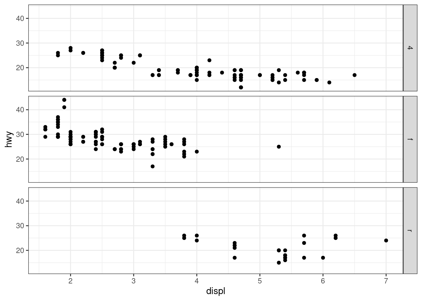
ggplot(data = mpg) +
  geom_point(mapping = aes(x = displ, y = hwy)) +
  facet_grid(drv ~ cyl)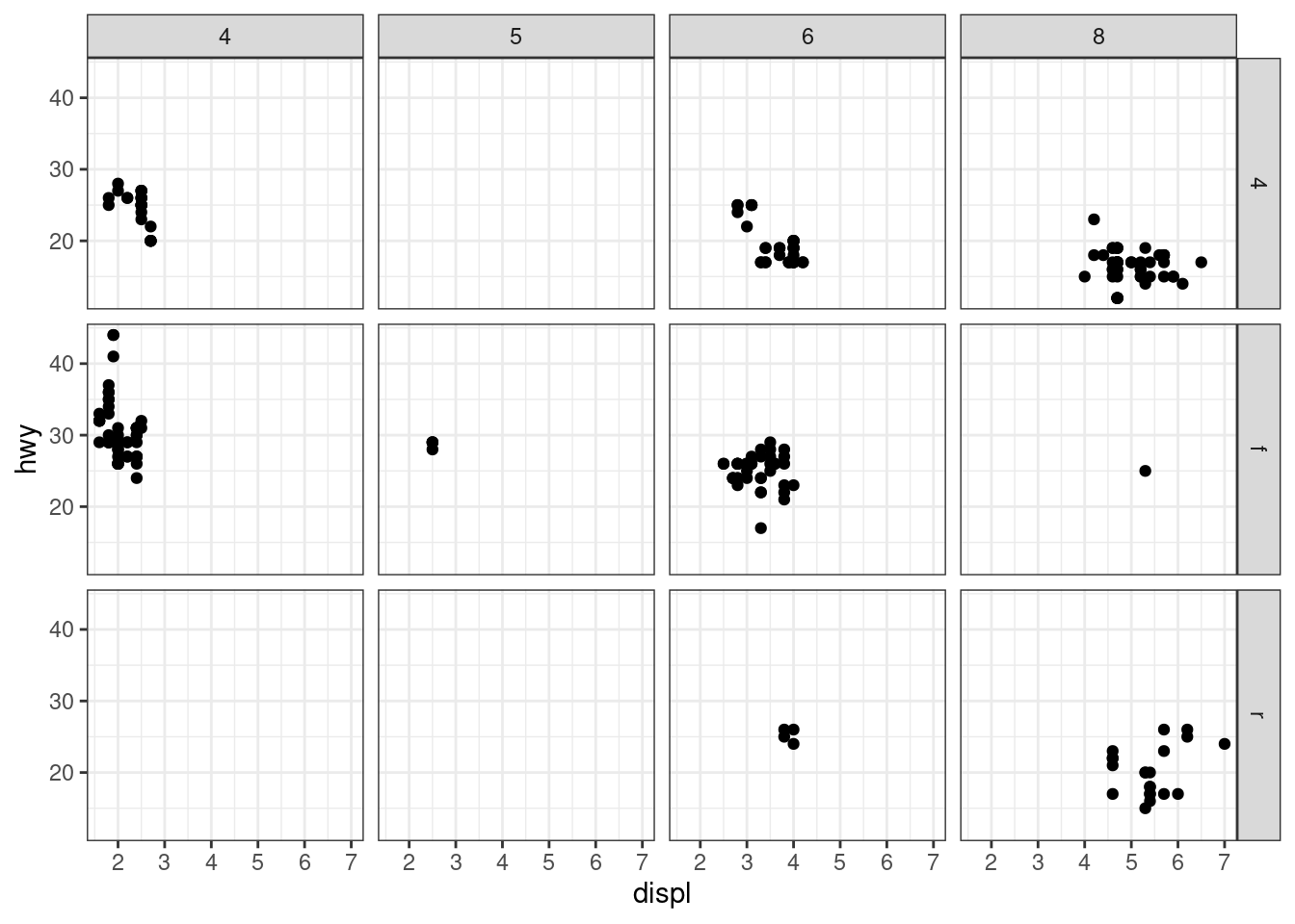
Replacing facet strips with text boxes using ggtext::
# library("cowplot")

ggplot(mpg, aes(cty, hwy)) +
  geom_point() +
  facet_wrap(~class) +
  theme_half_open(12) +
background_grid() 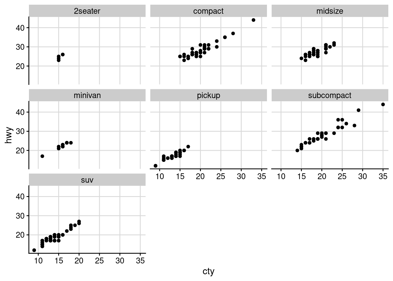
# library("ggtext")
ggplot(mpg, aes(cty, hwy)) +
  geom_point() +
  facet_wrap(~class) +
  theme_half_open(12) +
  background_grid() +
  theme(
    strip.background = element_blank(),
    strip.text = element_textbox(
      size = 12,
      color = "white", fill = "#5D729D", box.color = "#4A618C",
      halign = 0.5, linetype = 1, r = unit(5, "pt"), width = unit(1, "npc"),
      padding = margin(2, 0, 1, 0), margin = margin(3, 3, 3, 3)
    )
  )
XY plots
# library("lme4") # data sleepstudy
# library("lattice")

##------------------------------------------------------------------------
# str(sleepstudy)

xyplot(Reaction ~ Days | Subject, sleepstudy, aspect = "xy",
       layout = c(9, 2), type = c("g", "p", "r"),
       index.cond = function(x, y) coef(lm(y ~ x))[2],
       xlab = "Days of sleep deprivation",
       ylab = "Average reaction time (ms)",
       as.table = TRUE)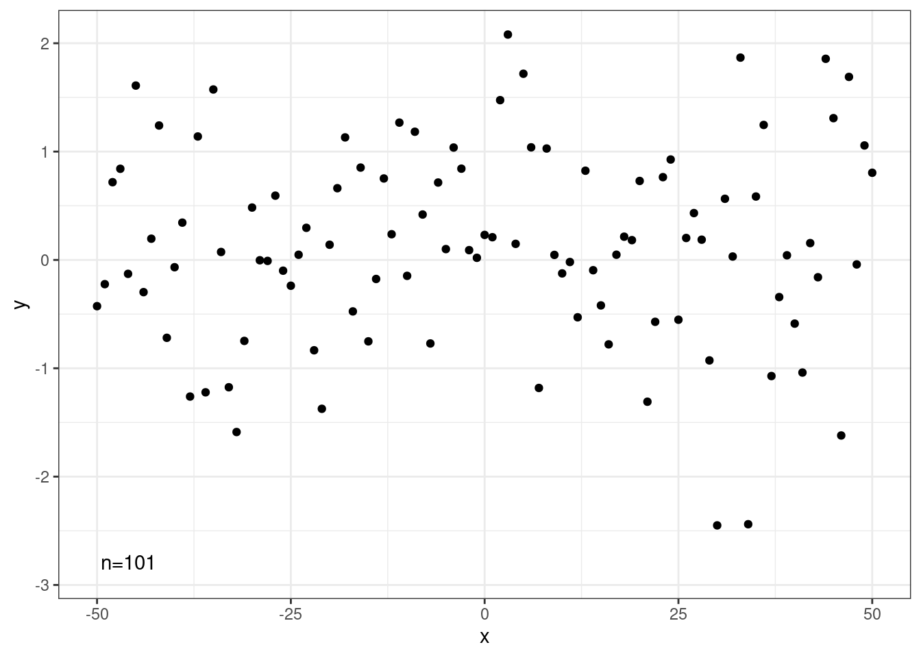
Text: ggrepel
There are two important functions in ggrepel R packages:
- geom_label_repel()
- geom_text_repel()
# library("ggrepel")
# Take a subset of 15 random points
set.seed(1234)
ss <- sample(1:32, 15)
df <- mtcars[ss, ]

# Create a scatter plot:
p <- ggplot(df, aes(wt, mpg)) +
  geom_point(color = 'red') +
  theme_classic(base_size = 10)

# Add text labels:
# Add text annotations using ggplot2::geom_text
p + geom_text(aes(label = rownames(df)),
              size = 3.5)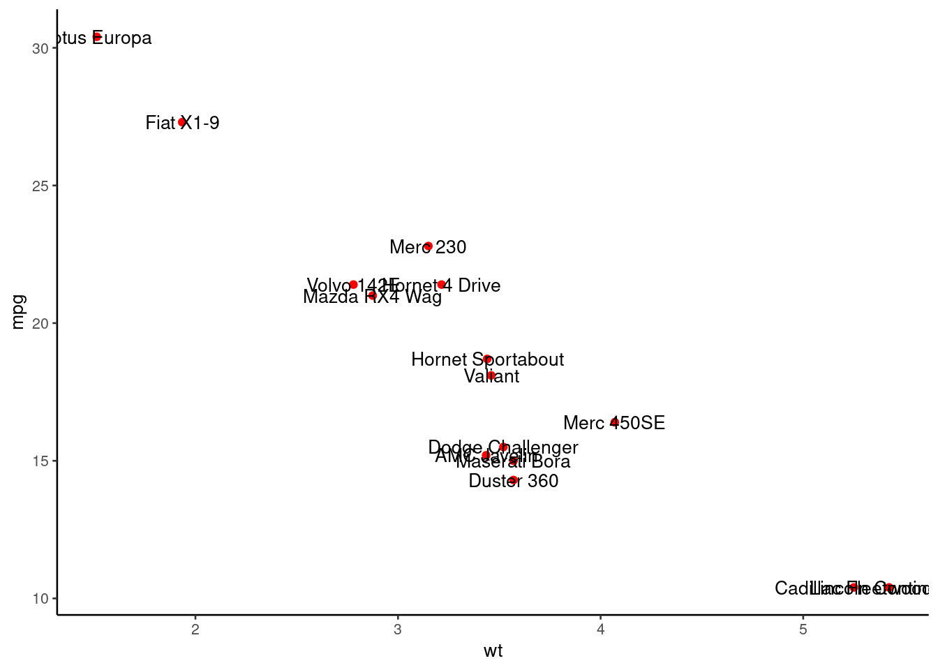
# Use ggrepel::geom_text_repel
require("ggrepel")
set.seed(42)
p + geom_text_repel(aes(label = rownames(df)),
size = 3.5) 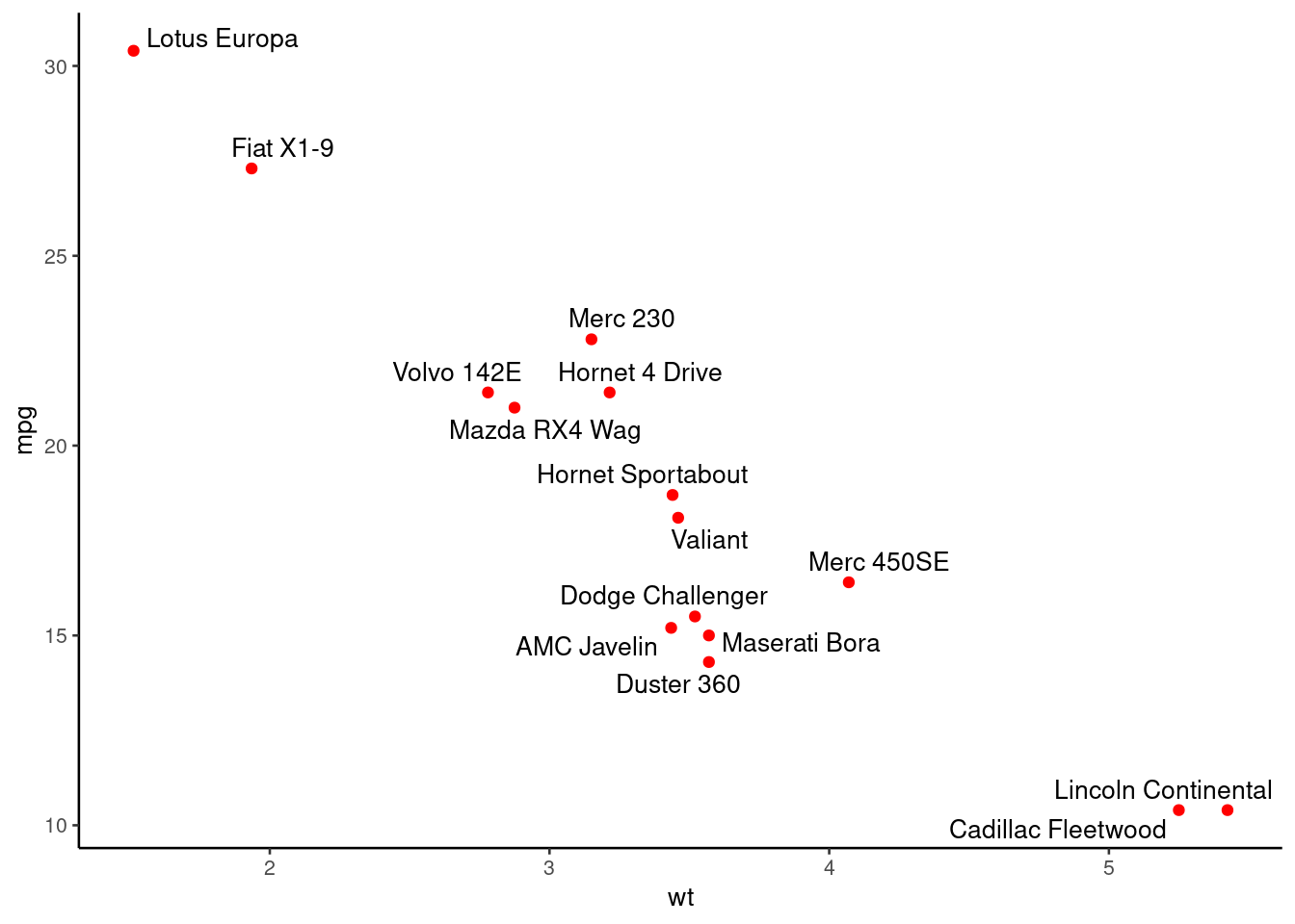
# Change color by groups
p + geom_label_repel(aes(label = rownames(df),
                    fill = factor(cyl)), color = 'white',
                    size = 3.5) +
   theme(legend.position = "bottom")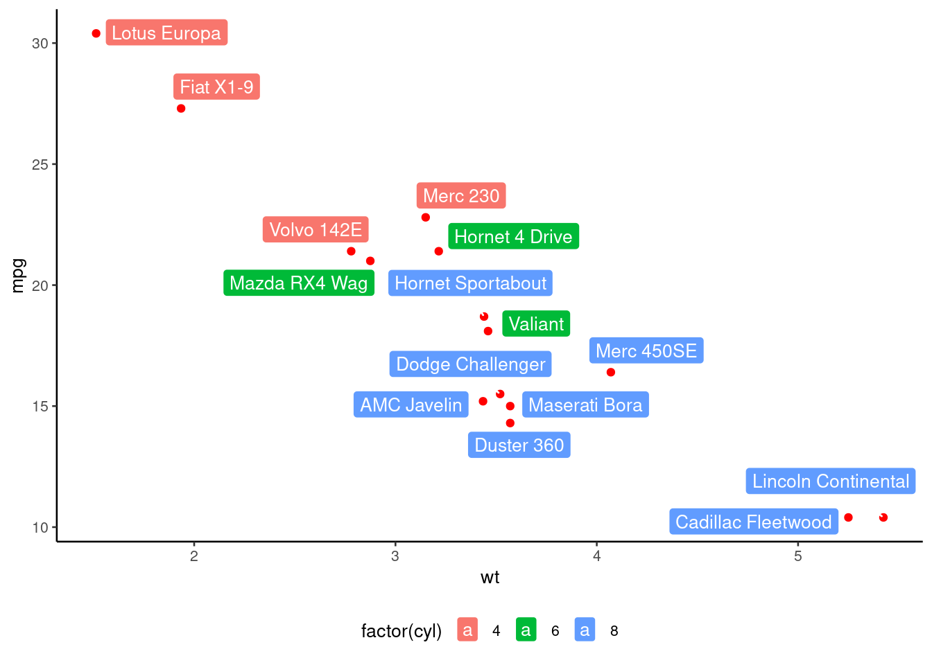
# With selection
# Data are available in the gapminder package
# library("gapminder")
data <- gapminder %>% filter(year=="2007") %>% select(-year)
# prepare data
tmp <- data %>%
  mutate( annotation = ifelse(gdpPercap > 5000 & lifeExp < 60, "yes", "no"))
# plot
tmp %>%
  ggplot( aes(x=gdpPercap, y=lifeExp, size = pop, color = continent)) +
    geom_point(alpha=0.7) +
    theme(legend.position="none") +
    geom_text_repel(data=tmp %>% filter(annotation=="yes"), aes(label=country), size=4 )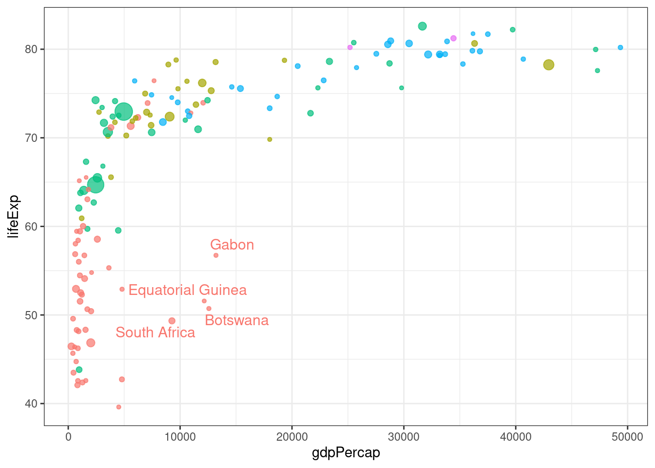
Dot Plot
Order fct_reorder: Modifying factor order
# library("forcats")
relig_summary <- gss_cat %>%
  group_by(relig) %>%
  summarise(
    age = mean(age, na.rm = TRUE),
    tvhours = mean(tvhours, na.rm = TRUE),
    n = n()
  )

ggplot(relig_summary, aes(tvhours, relig)) + geom_point()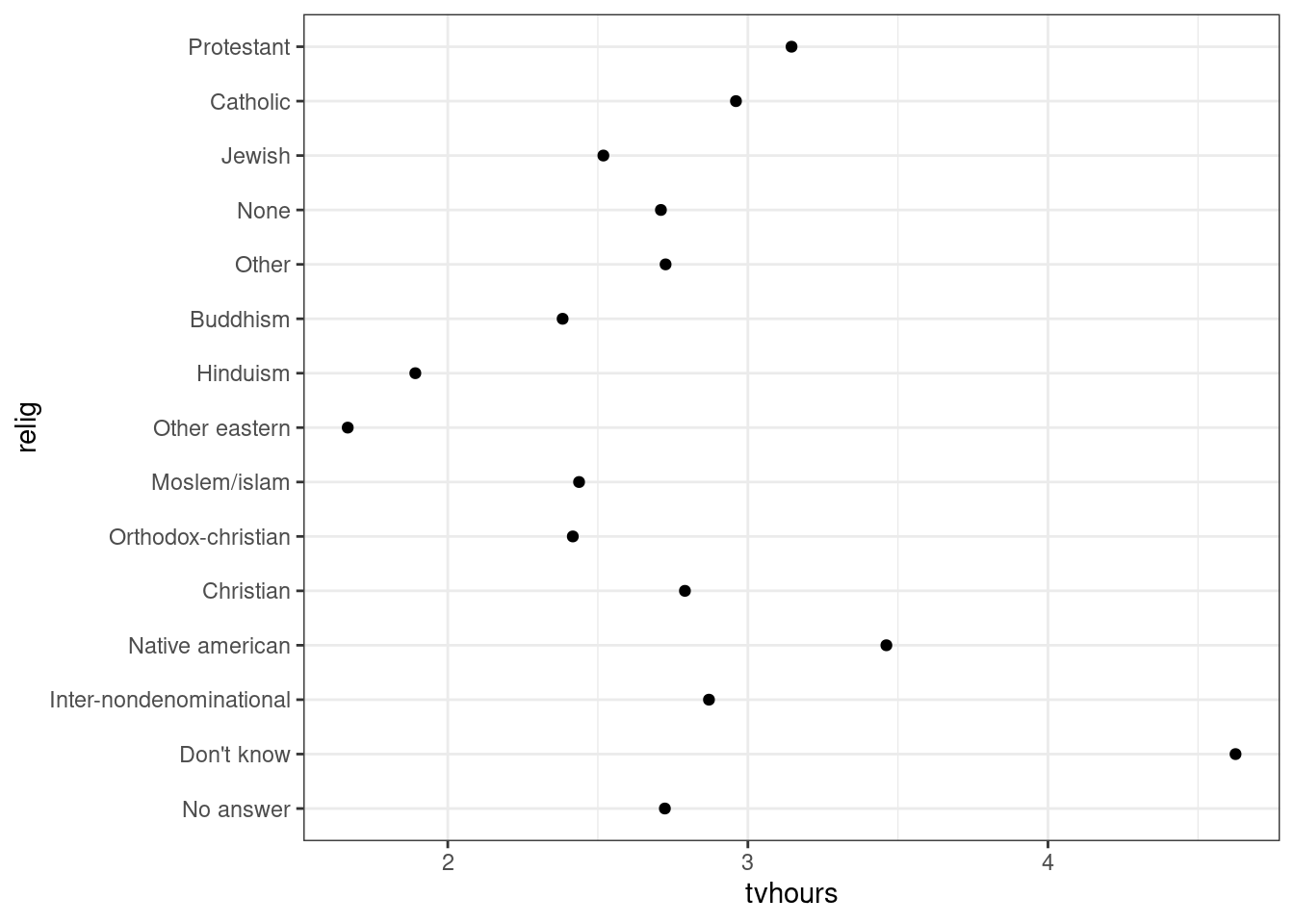
ggplot(relig_summary, aes(tvhours, fct_reorder(relig, tvhours))) +
  geom_point()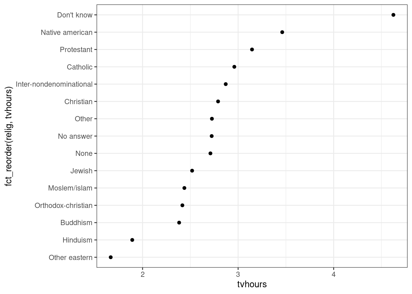
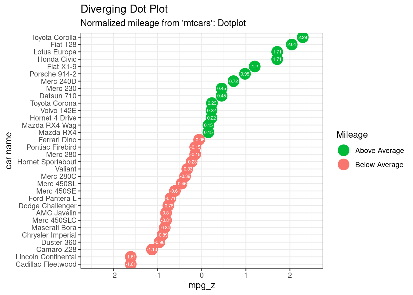
Diverging Dot Plot
# Data Prep
data("mtcars")  # load data
mtcars$`car name` <- rownames(mtcars)  # create new column for car names
mtcars$mpg_z <- round((mtcars$mpg - mean(mtcars$mpg))/sd(mtcars$mpg), 2)  # compute normalized mpg
mtcars$mpg_type <- ifelse(mtcars$mpg_z < 0, "below", "above")  # above / below avg flag
mtcars <- mtcars[order(mtcars$mpg_z), ]  # sort
mtcars$`car name` <- factor(mtcars$`car name`, levels = mtcars$`car name`)  # convert to factor to retain sorted order in plot.


ggplot(mtcars, aes(x=`car name`, y=mpg_z, label=mpg_z)) +
  geom_point(stat='identity', aes(col=mpg_type), size=6)  +
  scale_color_manual(name="Mileage",
                     labels = c("Above Average", "Below Average"),
                     values = c("above"="#00ba38", "below"="#f8766d")) +
  geom_text(color="white", size=2) +
  labs(title="Diverging Dot Plot",
       subtitle="Normalized mileage from 'mtcars': Dotplot") +
  ylim(-2.5, 2.5) +
  coord_flip()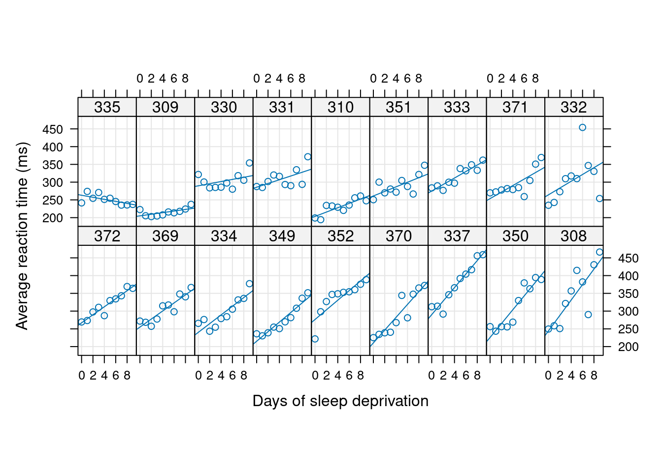
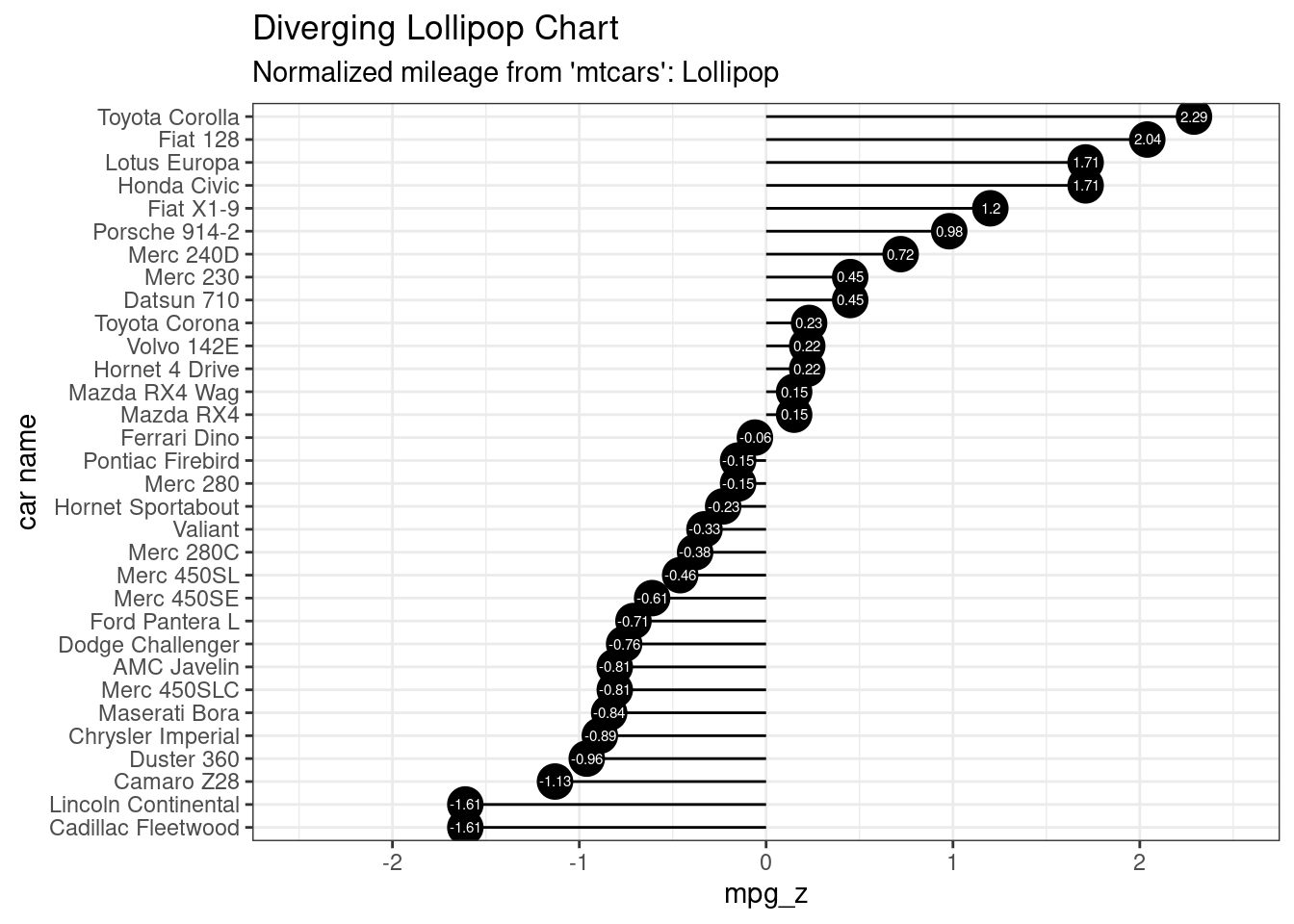
# Diverging Lollipop Chart
ggplot(mtcars, aes(x=`car name`, y=mpg_z, label=mpg_z)) +
  geom_point(stat='identity', fill="black", size=6)  +
  geom_segment(aes(y = 0,
                   x = `car name`,
                   yend = mpg_z,
                   xend = `car name`),
               color = "black") +
  geom_text(color="white", size=2) +
  labs(title="Diverging Lollipop Chart",
       subtitle="Normalized mileage from 'mtcars': Lollipop") +
  ylim(-2.5, 2.5) +
  coord_flip()
# Diverging Barcharts
ggplot(mtcars, aes(x=`car name`, y=mpg_z, label=mpg_z)) +
  geom_bar(stat='identity', aes(fill=mpg_type), width=.5)  +
  scale_fill_manual(name="Mileage",
                    labels = c("Above Average", "Below Average"),
                    values = c("above"="#00ba38", "below"="#f8766d")) +
  labs(subtitle="Normalised mileage from 'mtcars'",
       title= "Diverging Bars") +
  coord_flip() +
  theme_bw()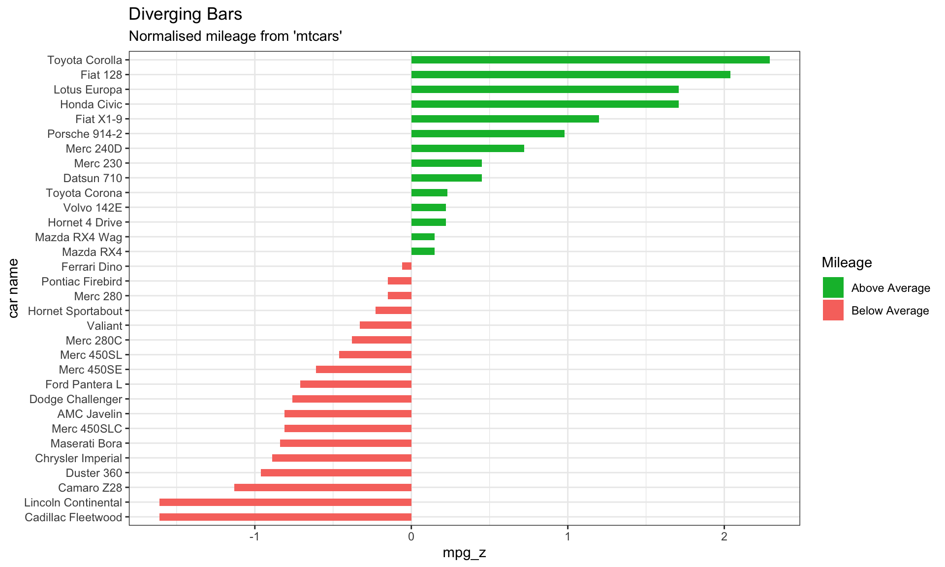
Alternative using ggbur
# library(ggpubr)
# https://rpkgs.datanovia.com/ggpubr/
data("mtcars")
dfm <- mtcars
# Convert the cyl variable to a factor
dfm$cyl <- as.factor(dfm$cyl)
# Add the name colums
dfm$name <- rownames(dfm)
dfm$mpg_z <- (dfm$mpg -mean(dfm$mpg))/sd(dfm$mpg)
dfm$mpg_grp <- factor(ifelse(dfm$mpg_z < 0, "low", "high"),
                     levels = c("low", "high"))

ggdotchart(dfm, x = "name", y = "mpg",
           color = "cyl",                                # Color by groups
           palette = c("#00AFBB", "#E7B800", "#FC4E07"), # Custom color palette
           sorting = "ascending",                        # Sort value in descending order
           add = "segments",                             # Add segments from y = 0 to dots
           ggtheme = theme_pubr()                        # ggplot2 theme
           )
ggdotchart(dfm, x = "name", y = "mpg",
           color = "cyl",                                # Color by groups
           palette = c("#00AFBB", "#E7B800", "#FC4E07"), # Custom color palette
           sorting = "descending",                       # Sort value in descending order
           add = "segments",                             # Add segments from y = 0 to dots
           rotate = TRUE,                                # Rotate vertically
           group = "cyl",                                # Order by groups
           dot.size = 6,                                 # Large dot size
           label = round(dfm$mpg),                        # Add mpg values as dot labels
           font.label = list(color = "white", size = 9,
                             vjust = 0.5),               # Adjust label parameters
           ggtheme = theme_pubr()                        # ggplot2 theme
           )
ggdotchart(dfm, x = "name", y = "mpg_z",
           color = "cyl",                                # Color by groups
           palette = c("#00AFBB", "#E7B800", "#FC4E07"), # Custom color palette
           sorting = "descending",                       # Sort value in descending order
           add = "segments",                             # Add segments from y = 0 to dots
           add.params = list(color = "lightgray", size = 2), # Change segment color and size
           group = "cyl",                                # Order by groups
           dot.size = 6,                                 # Large dot size
           label = round(dfm$mpg_z,1),                        # Add mpg values as dot labels
           font.label = list(color = "white", size = 9,
                             vjust = 0.5),               # Adjust label parameters
           ggtheme = theme_pubr()                        # ggplot2 theme
           )+
  geom_hline(yintercept = 0, linetype = 2, color = "lightgray")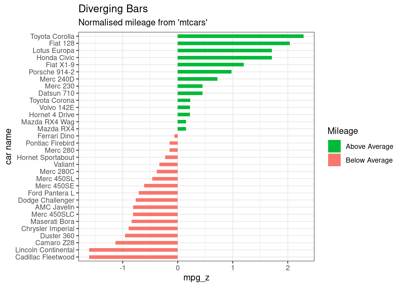
ggdotchart(dfm, x = "name", y = "mpg",
           color = "cyl",                                # Color by groups
           palette = c("#00AFBB", "#E7B800", "#FC4E07"), # Custom color palette
           sorting = "descending",                       # Sort value in descending order
           rotate = TRUE,                                # Rotate vertically
           dot.size = 2,                                 # Large dot size
           y.text.col = TRUE,                            # Color y text by groups
           ggtheme = theme_pubr()                        # ggplot2 theme
           )+
theme_cleveland() 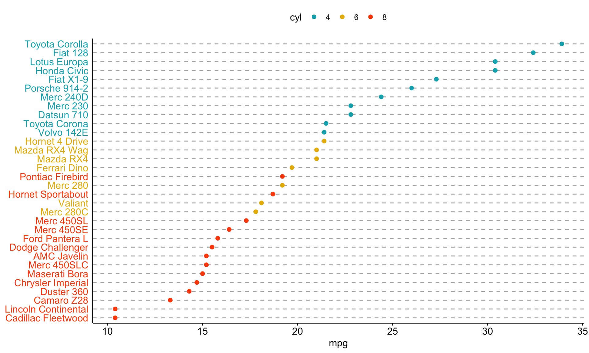
Residuals Plot
Residuals vs. Fitted Plot
#fit regression model
fit <- lm(mpg ~ qsec, data=mtcars)


par(mfrow = c(2, 2))
plot(fit)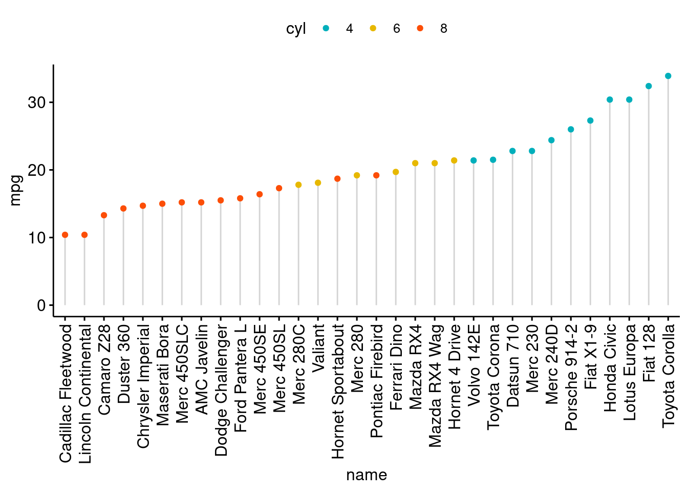
par(mfrow = c(1, 1))  # Return plotting panel to 1 section


# Create residuals vs fitted plot
p.fvr <- ggplot(fit, aes(x = .fitted, y = .resid)) +
  geom_point() +
  geom_hline(yintercept = 0, linetype = 2) +
  xlab("Fitted Values") +
  ylab("Residuals") +
  ggtitle("Residuals vs. Fitted Plot Created using ggplot2") +
  theme_bw()
p.fvr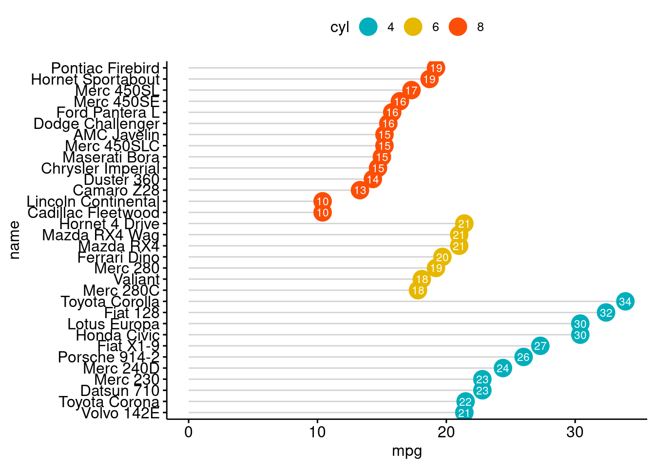
# Add a smoothed curve to the ggplot object:
p.fvr + geom_smooth(se = FALSE)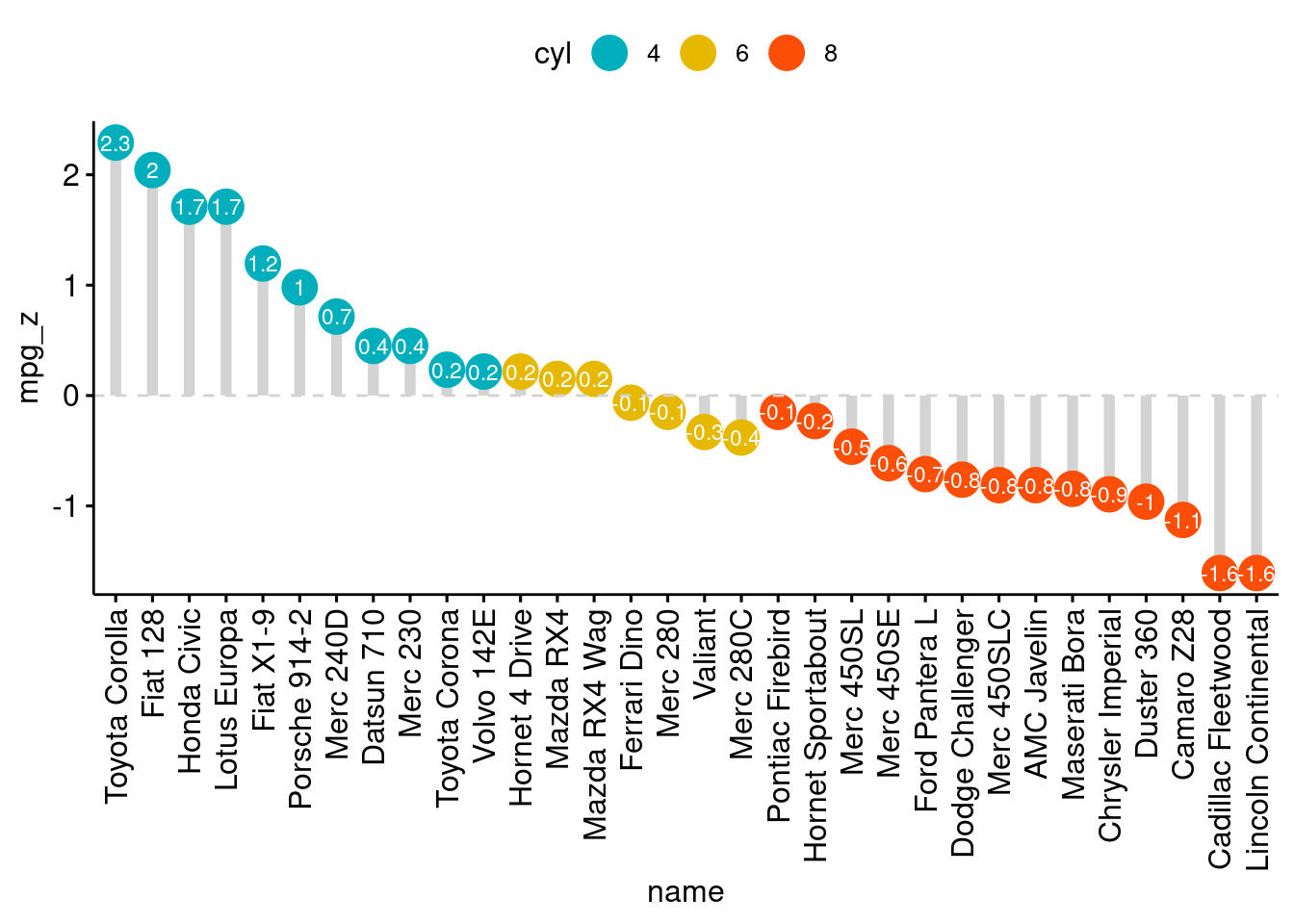
# Create standardised residuals vs fitted plot
ggplot(fit, aes(x = .fitted, y = .stdresid)) +
  geom_point() +
  geom_hline(yintercept = 0, linetype = 2) +
  xlab("Fitted Values") +
  ylab("Residuals") +
  ggtitle("Standardised residuals vs. Fitted Plot Created using ggplot2") +
  theme_bw()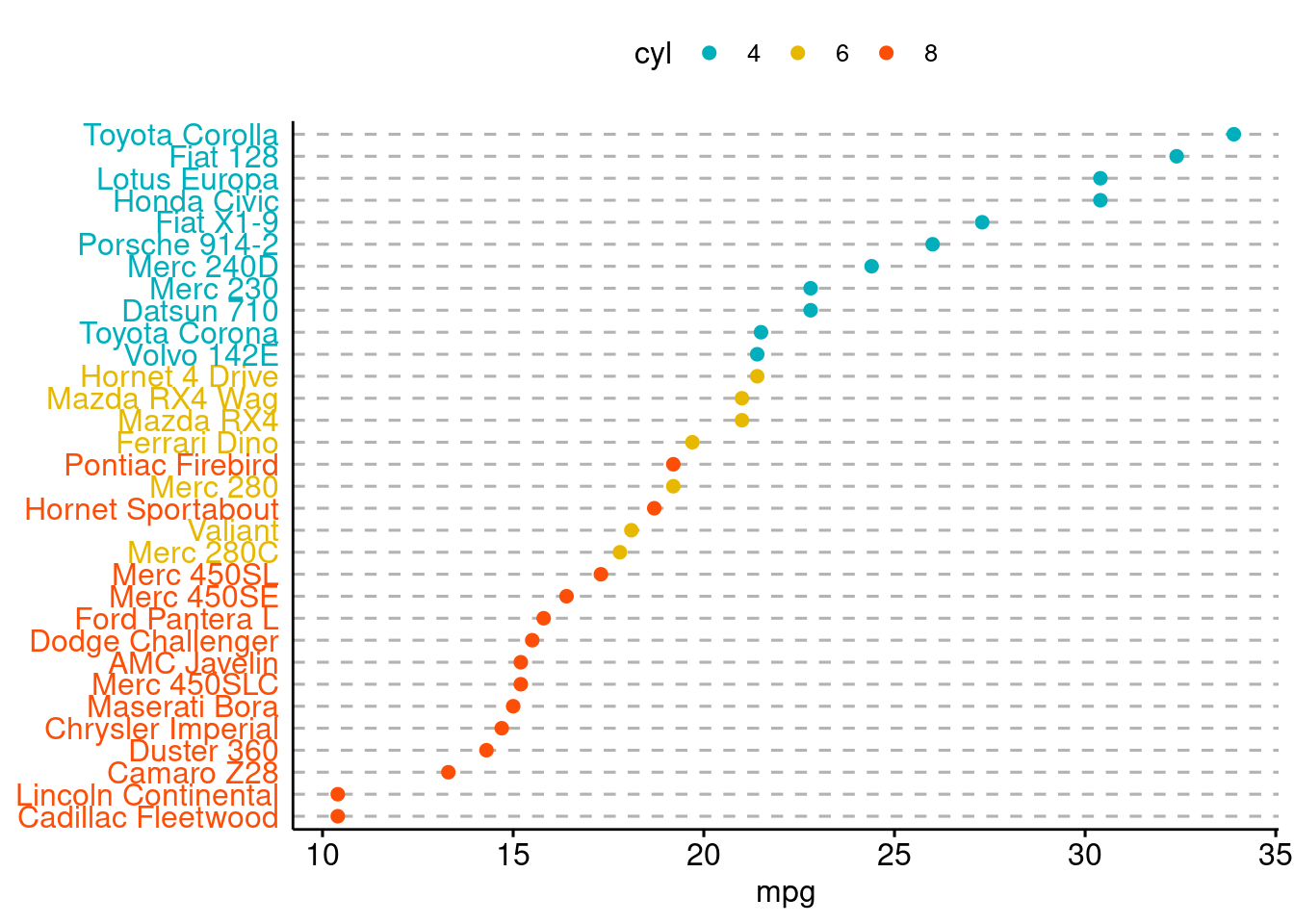
Plot actual and predicted values
#fit regression model
d <- mtcars
fit <- lm(mpg ~ hp, data = d)
d$predicted <- predict(fit)   # Save the predicted values
d$residuals <- residuals(fit) # Save the residual values

# d %>% select(mpg, predicted, residuals) %>% head()
ggplot(d, aes(x = hp, y = mpg)) +
  geom_smooth(method = "lm", se = FALSE,formula = y ~ x, color = "lightgrey") +  # Plot regression slope
  geom_segment(aes(xend = hp, yend = predicted), alpha = .2) +  # alpha to fade lines, connect the actual data points
  geom_point(aes(alpha = abs(residuals))) +  # Alpha mapped to abs(residuals)
  guides(alpha = "none") +  # Alpha legend removed
  geom_point(aes(y = predicted), shape = 1) +
theme_bw() 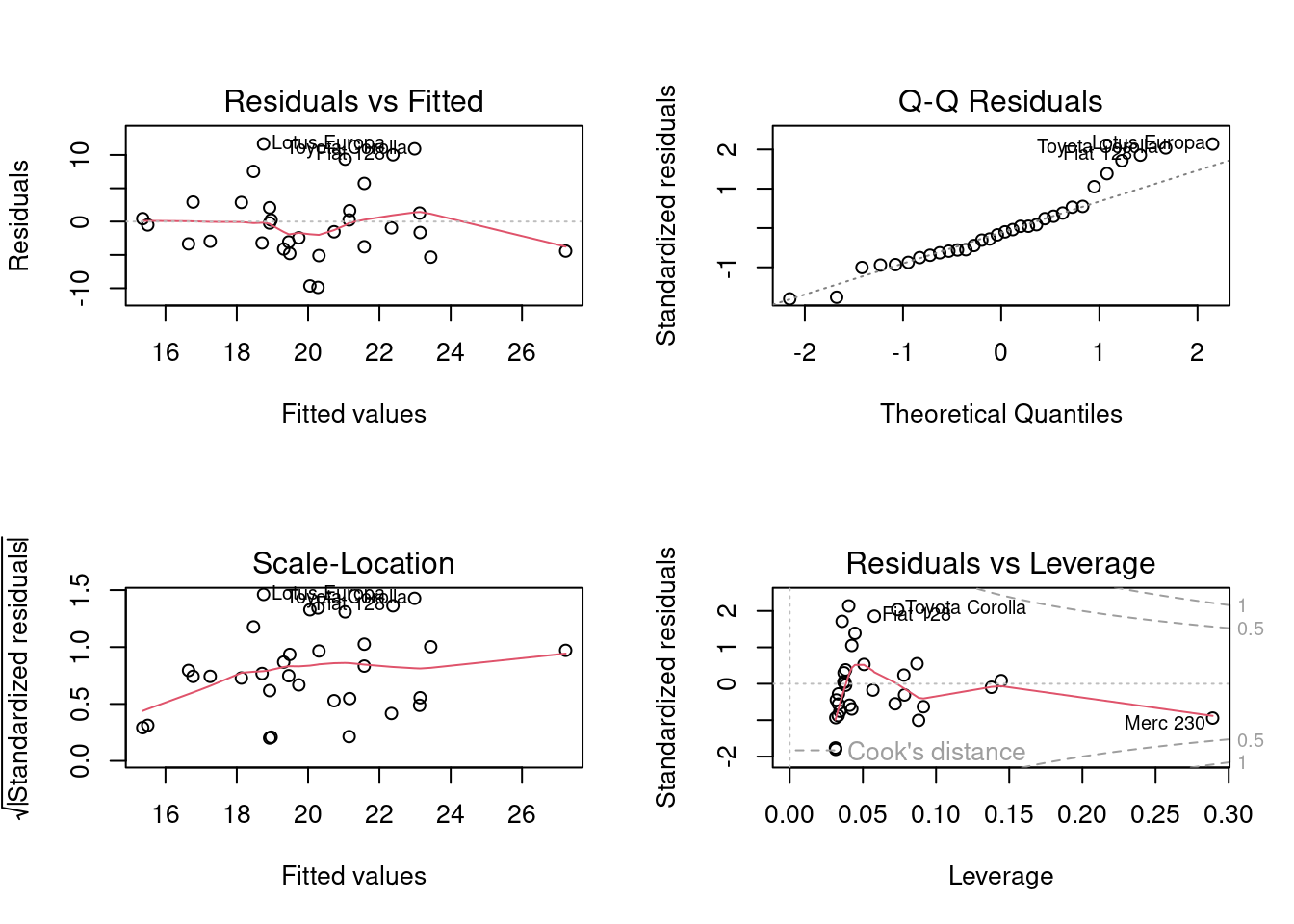
Color mapped to residual with sign taken into account. i.e., whether actual value is greater or less than predicted
ggplot(d, aes(x = hp, y = mpg)) +
  geom_smooth(method = "lm", se = FALSE, formula = y ~ x,color = "lightgrey") +
  geom_segment(aes(xend = hp, yend = predicted), alpha = .2) +
  # > Color adjustments made here...
  geom_point(aes(color = residuals)) +  # Color mapped here
  scale_color_gradient2(low = "blue", mid = "white", high = "red") +  # Colors to use here
  guides(color = FALSE) +
  # <
  geom_point(aes(y = predicted), shape = 1) +
  theme_bw()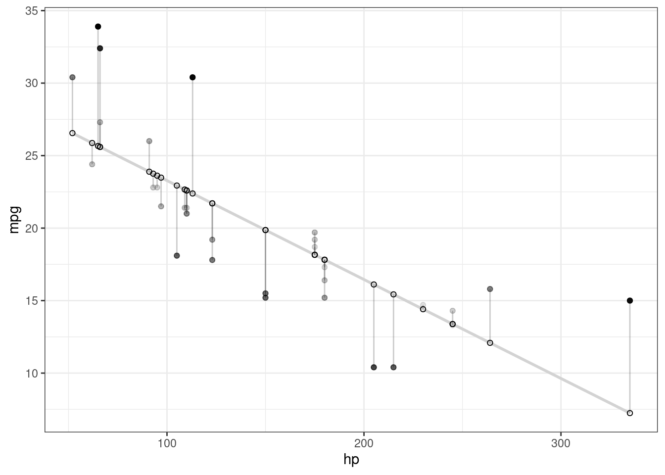
For more details see (here)[https://drsimonj.svbtle.com/visualising-residuals]
Normal Probability Plot
#fit regression model
fit <- lm(mpg ~ qsec, data=mtcars)

# Create Q-Q plot from residuals
qq_plot <- ggplot(fit, aes(sample = .resid)) +
  geom_qq() +
  geom_abline(slope = 1, intercept = 0, color =
                "red", linetype = "dashed") +
  xlab("Theoretical Quantiles") +
  ylab("Sample Quantiles") +
  ggtitle("Normal Q-Q Plot of Residuals") +
  theme_bw()

# Display plot
qq_plot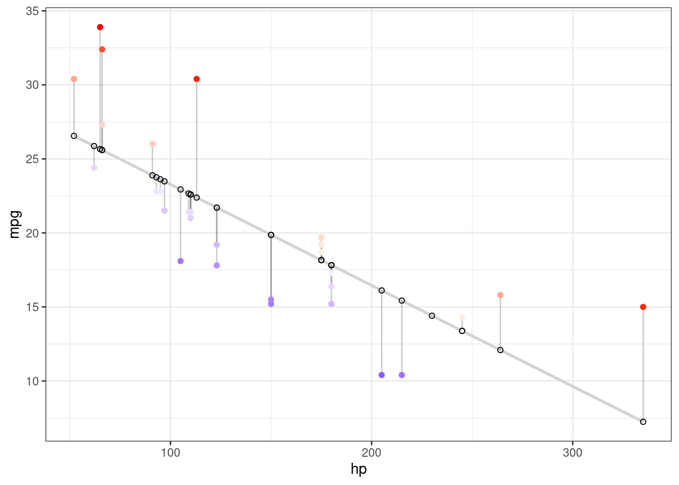
Histogram of Residuals
#fit regression model
fit <- lm(mpg ~ qsec, data=mtcars)

# Create a histogram of residuals using ggplot2
p.hist <- ggplot(fit, aes(x = .resid)) +
  geom_histogram(binwidth = 0.5, fill = "skyblue", color = "black") +
  xlab("Residuals") +
  ylab("Frequency") +
  ggtitle("Histogram of Residuals Created using ggplot2") +
  theme_bw()
p.hist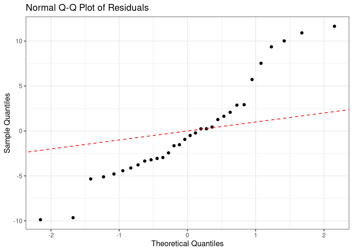
Bubble Plot
Basic
# The dataset is provided in the gapminder library
# library("gapminder")
data <- gapminder %>% filter(year=="2007") %>% dplyr::select(-year)

# Control circle size with scale_size()
# Set the size of the smallest and the biggest circles using the range argument.
# circles often overlap. To avoid having big circles on top of the chart you have to reorder your dataset first, as in the code below.
data %>%
  arrange(desc(pop)) %>%
  mutate(country = factor(country, country)) %>%
  ggplot(aes(x=gdpPercap, y=lifeExp, size=pop, color=continent)) +
    geom_point(alpha=0.5) +
    scale_size(range = c(.1, 18), name="Population (M)")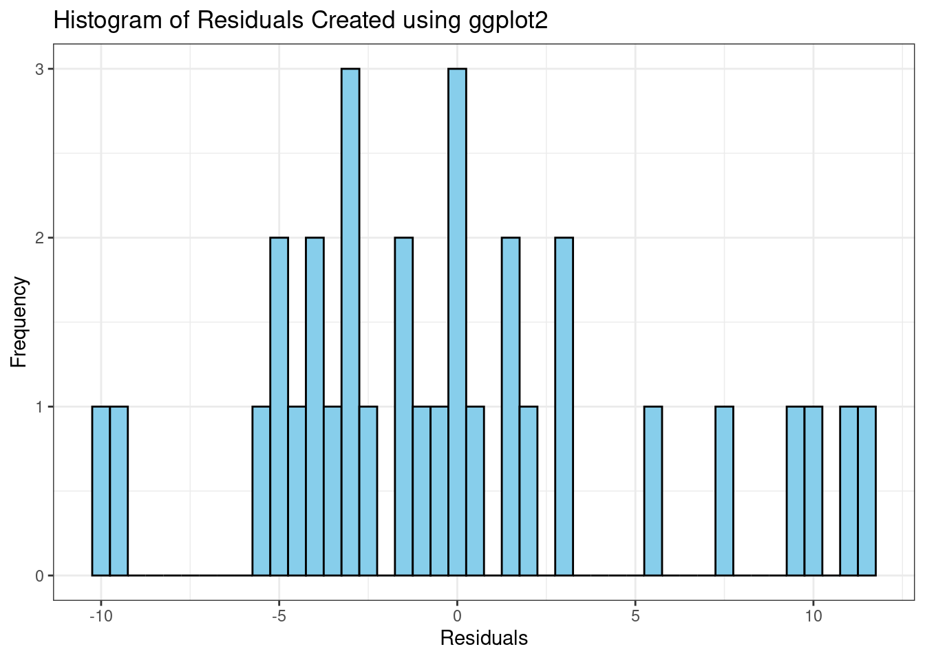
# use of the viridis package for nice color palette
# use of theme_ipsum() of the hrbrthemes package
# add stroke to circle: change shape to 21 and specify color (stroke) and fill

# library(hrbrthemes)
# library(viridis)

data %>%
  arrange(desc(pop)) %>%
  mutate(country = factor(country, country)) %>%
  ggplot(aes(x=gdpPercap, y=lifeExp, size=pop, fill=continent)) +
    geom_point(alpha=0.5, shape=21, color="black") +
    scale_size(range = c(.1, 18), name="Population (M)") +
    scale_fill_viridis(discrete=TRUE, guide=FALSE, option="A") +
    theme_ipsum() +
    theme(legend.position="none") +
    ylab("Life Expectancy") +
xlab("Gdp per Capita") 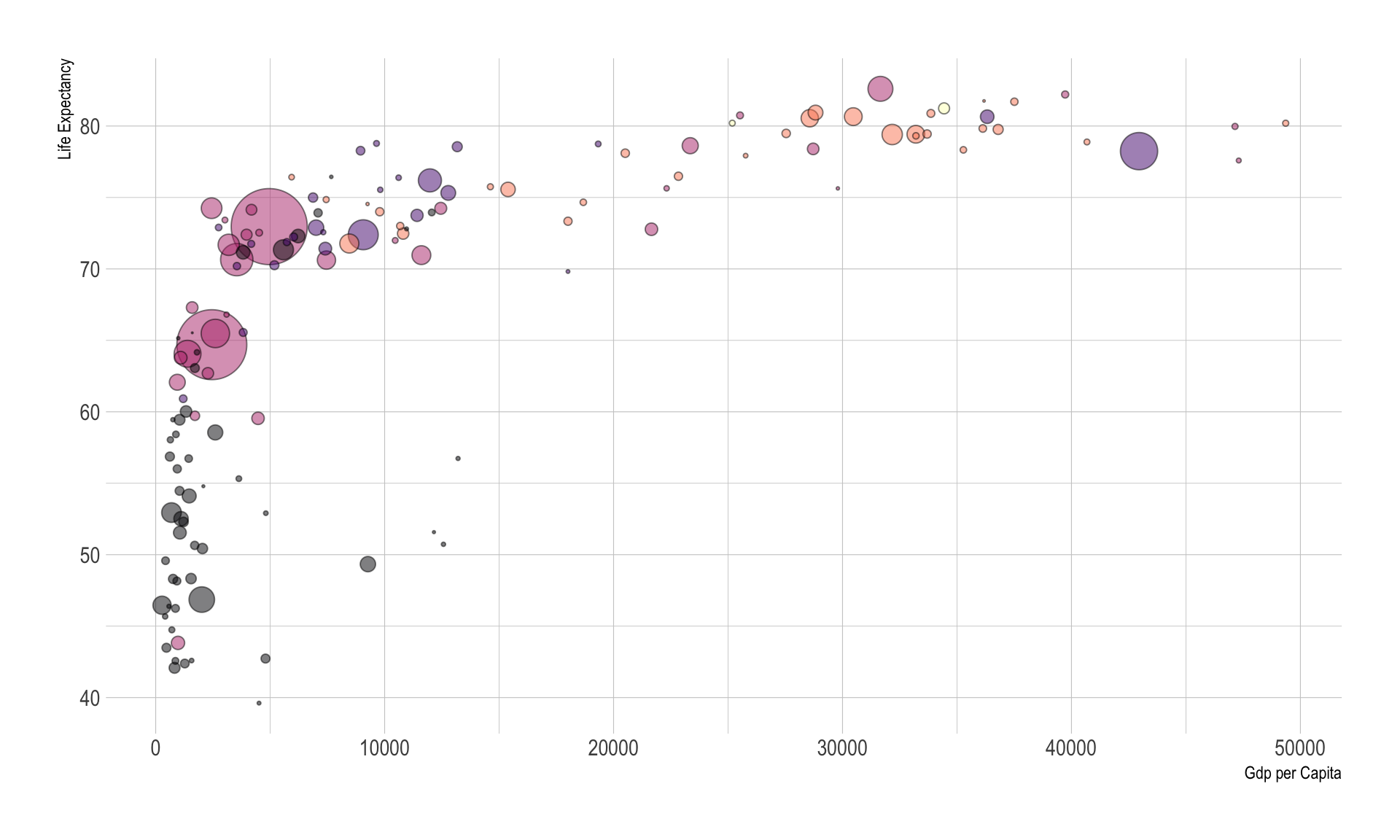
Interactive Version
# Libraries
# library(ggplot2)
# library(dplyr)
# library(plotly)
# library(viridis)
# library(hrbrthemes)
# library(gapminder)
# data <- gapminder %>% filter(year=="2007") %>% dplyr::select(-year)

p <- data %>%
  mutate(gdpPercap=round(gdpPercap,0)) %>%
  mutate(pop=round(pop/1000000,2)) %>%
  mutate(lifeExp=round(lifeExp,1)) %>%

  # Reorder countries to having big bubbles on top
  arrange(desc(pop)) %>%
  mutate(country = factor(country, country)) %>%

  # prepare text for tooltip
  mutate(text = paste("Country: ", country, "\nPopulation (M): ", pop, "\nLife Expectancy: ", lifeExp, "\nGdp per capita: ", gdpPercap, sep="")) %>%

  # Classic ggplot
  ggplot( aes(x=gdpPercap, y=lifeExp, size = pop, color = continent, text=text)) +
    geom_point(alpha=0.7) +
    scale_size(range = c(1.4, 19), name="Population (M)") +
    scale_color_viridis(discrete=TRUE, guide=FALSE) +
    theme_ipsum() +
    theme(legend.position="none")

# turn ggplot interactive with plotly
pp <- ggplotly(p, tooltip="text")
pp
# save the widget
# library(htmlwidgets)
# saveWidget(pp, file=paste0( getwd(), "/HtmlWidget/ggplotlyBubblechart.html"))Encircling
In geom_encircle(), set the data to a new data frame containing only points (rows) or points of interest. In addition, you can expand the curve so that it passes outside the point. The color and size (thickness) of the curve can also be modified.
# install 'ggalt' pkg
# devtools::install_github("hrbrmstr/ggalt")
options(scipen = 999)
# library(ggalt)
midwest_select <- midwest[midwest$poptotal > 350000 &
                            midwest$poptotal <= 500000 &
                            midwest$area > 0.01 &
                            midwest$area < 0.1, ]

# Plot
ggplot(midwest, aes(x=area, y=poptotal)) +
  geom_point(aes(col=state, size=popdensity)) +   # draw points
  geom_smooth(method="loess", se=F) +
  xlim(c(0, 0.1)) +
  ylim(c(0, 500000)) +   # draw smoothing line
  geom_encircle(aes(x=area, y=poptotal),
                data=midwest_select,
                color="red",
                size=2,
                expand=0.08) +   # encircle
  labs(subtitle="Area Vs Population",
       y="Population",
       x="Area",
       title="Scatterplot + Encircle",
       caption="Source: midwest")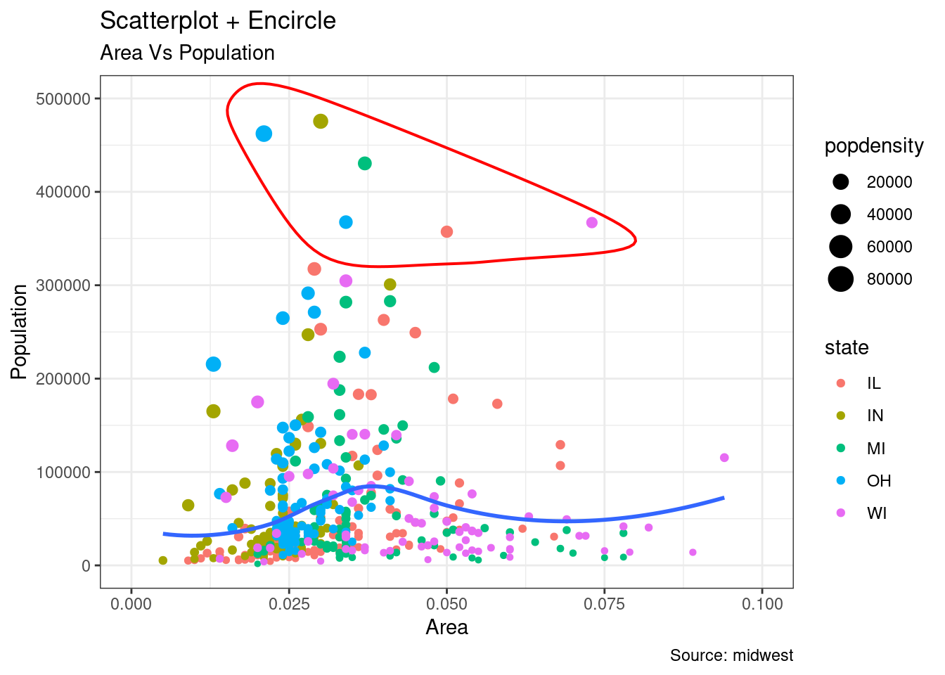
Dumbbell Plot
Dumbbell plot is used to visualize the relative position of two time points (increase or decrease), it could also be used to compare the distance between 2 categories. In order to get right orders of dumbbell, the variable \(Y\) should be treated as factor with conresponding orders shown in figure.
# library(ggalt)

health <- read.csv("./01_Datasets/health.csv")
health$Area <- factor(health$Area, levels=as.character(health$Area))  # for right ordering of the dumbells


options(warn=-1)
# health$Area <- factor(health$Area)
ggplot(health, aes(x=pct_2013, xend=pct_2014, y=Area, group=Area)) +
  geom_dumbbell(color="#a3c4dc",
                size=0.75,
                point.colour.l="#0e668b") +
  labs(x=NULL,
       y=NULL,
       title="Dumbbell Chart",
       subtitle="Pct Change: 2013 vs 2014",
       caption="Source: https://github.com/hrbrmstr/ggalt") +
  theme_classic()+
  theme(plot.title = element_text(hjust=0.5, face="bold"),
        plot.background=element_rect(fill="#f7f7f7"),
        panel.background=element_rect(fill="#f7f7f7"),
        panel.grid.minor=element_blank(),
        panel.grid.major.y=element_blank(),
        panel.grid.major.x=element_line(),
        axis.ticks=element_blank(),
        legend.position="top",
        panel.border=element_blank())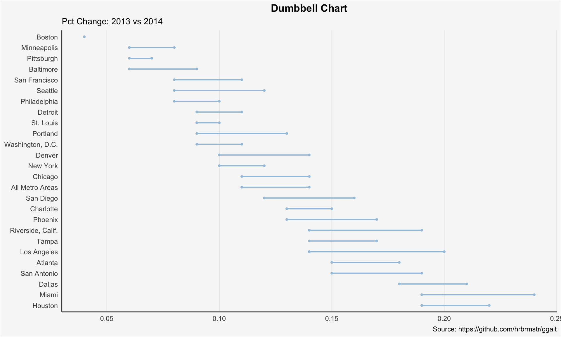
options(warn=0)Beeswarm Plot
General
# Read excel data
# library("readxl")
Cepheid_D01 <- read_excel("./01_Datasets/lab_figure.xlsx")

# Data management
Cepheid_D01 <-  Cepheid_D01 %>%
  mutate(ER_central = factor(ER_central, levels = c(0,1), labels = c("negative", "positive")),
         PgR_central = factor(PgR_central, levels = c(0,1), labels = c("negative", "positive")),
         HER2_central = factor(HER2_central, levels = c(0,1), labels = c("negative", "positive")),
         Ki67_central = factor(Ki67_central, levels = c(0,1), labels = c("negative", "positive")),
         Ki67_3groups = factor(Ki67_3groups, levels = c("low: <=10%","intermediate: >10-20%","high: >=20%")),
         ER_3groups = factor(ER_3groups, levels = c("negative: 0-<1%","low: 1-<10%","high: >=10%")),
         PgR_3groups = factor(PgR_3groups, levels = c("negative: 0-<1%","low: 1-<10%","high: >=10%"))
         )
# suppress warnings globally
options(warn=-1)

# library("ggbeeswarm")
PgR_Overall_3group <- ggplot(Cepheid_D01, aes(x = PgR_3groups, y = PR_Cepheid, color = PgR_3groups)) +
  geom_beeswarm(cex = 2) +
  geom_boxplot(varwidth=T, alpha=0.1) +
  geom_hline(aes(yintercept=-3.5), color = "#090226", linetype = "dashed", linewidth = 0.5)+
  geom_hline(aes(yintercept=-1.7), color = "#ff5050", linetype = "dashed", linewidth = 0.5)+
  # annotate("text", x=0.7, y=-3.25, label="Cut Off -3.5") +
  # geom_text(aes( x=0, y=1, label = "Reference value 1", hjust = 0, vjust = -1), size = 3, color = "#090226") +
  theme_classic()+
  # scale_fill_manual(values=c("negative","positive"))+
  theme(legend.title =element_blank(),
        legend.position = "bottom")+
  labs(title="Beeswarm Plot - PgR Overall (Cutoff -3.5, Exploratory Cutoff -1.7)",
       subtitle="PgR dCt values vs. 3 grouped PgR central pathology",
       y="PgR dCt",
       x="PgR central pathology")
PgR_Overall_3group
# suppress warnings globally
options(warn=-1)

# # Beeswarm Plot ER
# png('G:/Statistik/Studien/GeparX/Cepheid TraFo/Statistical_Analysis_V2/Output/Figure/F01_Beeswarm_ER_Overall_Bin.png',width=5, height=5,unit="in", res=300)
# ER_Overall_Bin
# dev.off()

# Save as png
# png('./02_Plots/Visualization/Scatter/F01_Beeswarm_PgR.png',width=5, height=5,unit="in", res=300)
# PgR_Overall_3group
# dev.off()

# Save as emf
# library(devEMF)
# emf(file = "./02_Plots/Visualization/Scatter/F01_Beeswarm_PgR.emf")
# PgR_Overall_3group
# dev.off()
By Subgroup
# Beeswarm HER2 by ER Status
ER_central.labs <- c("ER status: negative","ER status: positive")
names(ER_central.labs) <- c("negative", "positive")

HER2_Bin <- ggplot(Cepheid_D01, aes(x = HER2_central, y = Her2_Cepheid, color = HER2_central)) +
  geom_beeswarm(cex = 1.5) +
  geom_boxplot(varwidth=T, alpha=0.1) +
  facet_wrap(.~ ER_central, nrow = 1, labeller = labeller(ER_central= ER_central.labs)) +
  geom_hline(aes(yintercept=-1), color = "#090226", linetype = "dashed", size = 0.5)+
  geom_hline(aes(yintercept=-0.25), color = "#ff5050", linetype = "dashed", linewidth = 0.5)+
  # geom_text(aes( x=0, y=1, label = "Reference value 1", hjust = 0, vjust = -1), size = 3, color = "#090226") +
  theme_classic()+
  scale_fill_manual(values=c("negative","positive"))+
  theme(legend.title =element_blank(),
        legend.position = "bottom")+
  labs(title="Beeswarm Plot - HER2 by ER status (Cutoff -1.0, Exploratory Cutoff -0.25)",
       subtitle="HER2 dCt values vs. binary HER2 central pathology",
       y="HER2 dCt",
       x="HER2 central pathology")
HER2_Bin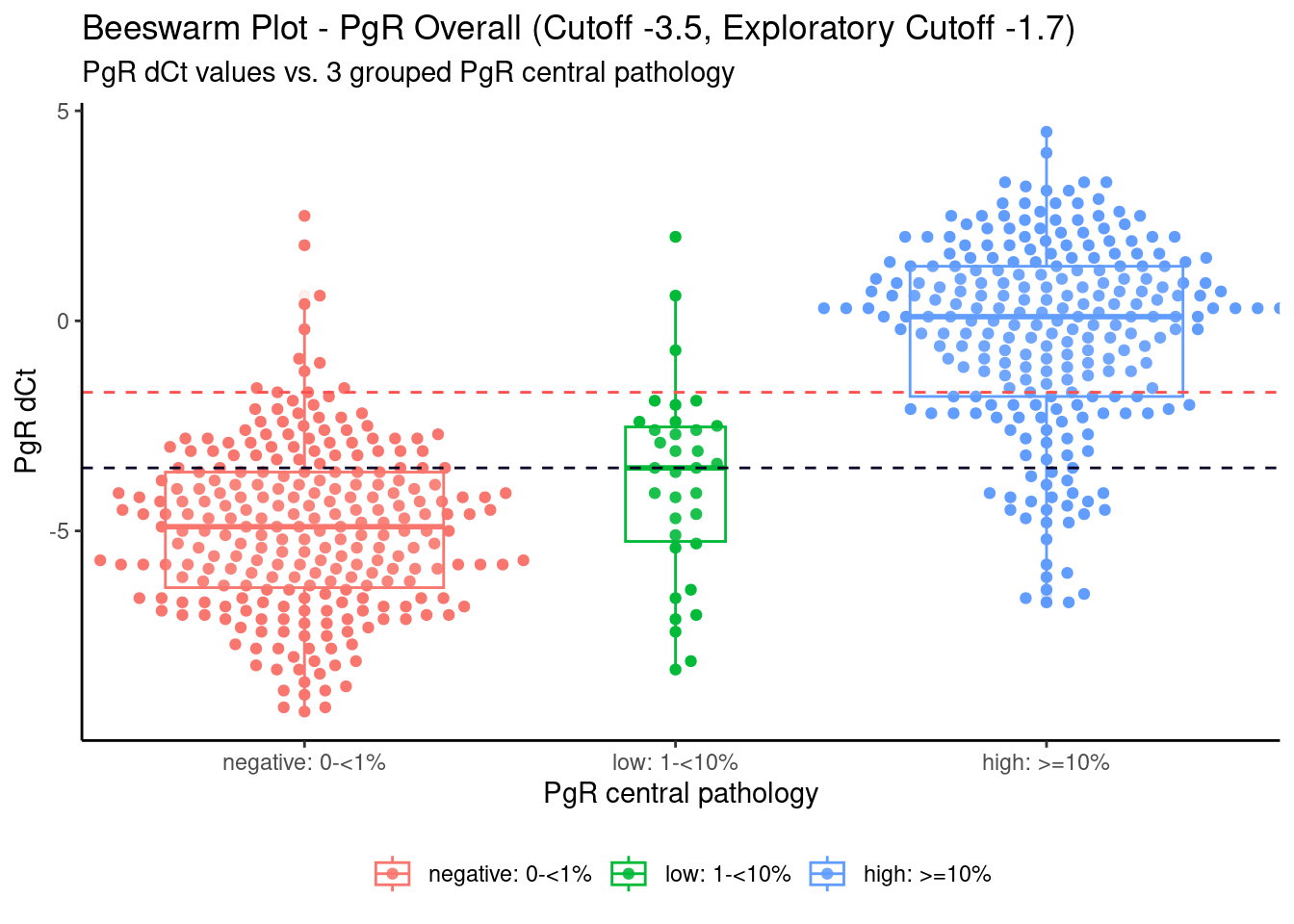
Mean Effect Comparing Groups
There was a recently publication of a trial on treatment of patients with hyperkalemia.
SIG (2025, June 11). VIS-SIG Blog: Wonderful Wednesday June 2025 (63). Retrieved from https://graphicsprinciples.github.io/posts/2025-06-11-wonderful-wednesday-june-2025
Summary Level
dat <- read.csv(paste0("./01_Datasets/","fig2data.csv"))
# dat <- read.csv("https://raw.githubusercontent.com/VIS-SIG/Wonderful-Wednesdays/refs/heads/master/data/2025/2025-05-14/fig2data.csv")

dat2 <- dat[,c(-1,-4)] # remove unnecessary columns
names(dat2)[c(1,2)] <- c("visitNum","serumK_exact")
Line Graph
## dat2 列: visitNum, serumK_exact, stat (mean/llc/ulc), treat (SZC group/SPS group)

jitter  <- 0.1
week    <- c(0, 1, 2, 4, 6, 8)
x_szc   <- week - jitter
x_sps   <- week + jitter

szc <- subset(dat2, treat == "SZC group")
sps <- subset(dat2, treat == "SPS group")

szc_mean <- szc$serumK_exact[szc$stat == "mean"]
szc_llc  <- szc$serumK_exact[szc$stat == "llc"]
szc_ulc  <- szc$serumK_exact[szc$stat == "ulc"]

sps_mean <- sps$serumK_exact[sps$stat == "mean"]
sps_llc  <- sps$serumK_exact[sps$stat == "llc"]
sps_ulc  <- sps$serumK_exact[sps$stat == "ulc"]

## Plot SZC
plot(x_szc, szc_mean,
     type = "l",
     xlab = "Week", xaxt = "n",
     ylab = "Serum K (mEq/l)",
     xlim = c(-0.5, 8.5), ylim = c(0, 6),
     col = "orange", lwd = 2)

points(x_szc, szc_mean, col = "orange", pch = 16)

arrows(x0 = x_szc, y0 = szc_ulc,
       x1 = x_szc, y1 = szc_llc,
       angle = 90, code = 3, lwd = 2,
       length = 0.025, col = "orange")

## Plot SPS
lines(x_sps, sps_mean, col = "blue", lwd = 2)
points(x_sps, sps_mean, col = "blue", pch = 16)

arrows(x0 = x_sps, y0 = sps_ulc,
       x1 = x_sps, y1 = sps_llc,
       angle = 90, code = 3, lwd = 2,
       length = 0.025, col = "blue")


abline(h = 5, col = "black")
text(2, 4, "Normokalemia",  col = "black")
text(2, 6, "Hyperkalemia", col = "black")

## x Axis
axis(1,
     at     = week,
     labels = c("Baseline", "1", "2", "4", "6", "8"),
     xlim   = c(-0.5, 8.5))

legend("bottomleft",
       legend = c("SZC group (N = 60) (mean and 95% CI)",
                  "SPS group (N = 60) (mean and 95% CI)"),
       col    = c("orange", "blue"),
       lwd    = 2, bty = "n")

title(expression(bold(paste(phantom("SZC"),
                            " treatment resolves Hyperkalemia faster and more effective"))),
      line = 3)
title(main = expression(bold(paste("SZC",
                                   phantom(" treatment resolves Hyperkalemia faster and more effective")))),
      col.main = "orange", line = 3)

title(expression(paste("Mean serum potassium levels were significantly lower in the ",
                       phantom("SZC"), " compared to ", phantom("SPS"),
                       " group (p < 0.05)")),
      line = 2, cex.main = 0.8)
title(expression(paste(phantom("Mean serum potassium levels were significantly lower in the "),
                       "SZC", phantom(" compared to SPS group (p < 0.05)"))),
      line = 2, cex.main = 0.8, col.main = "orange")
title(expression(paste(phantom("Mean serum potassium levels were significantly lower in the SZC compared to "),
                       "SPS", phantom(" group (p < 0.05)"))),
      line = 2, cex.main = 0.8, col.main = "blue")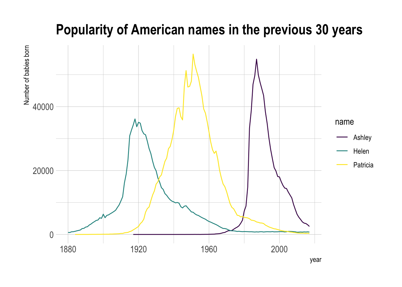
Bar chart
datChange <- cbind(dat2,dat2$serumK - 5)
names(datChange) <- c(names(dat2),"change")
datChange$visitNum2 <- c()
datChange$visitNum2[datChange$visit == "Baseline"] <- 0
datChange$visitNum2[datChange$visit == "1st week"] <- 1
datChange$visitNum2[datChange$visit == "2nd week"] <- 2
datChange$visitNum2[datChange$visit == "4th week"] <- 4
datChange$visitNum2[datChange$visit == "6th week"] <- 6
datChange$visitNum2[datChange$visit == "8th week"] <- 8

ggplot(datChange[datChange$stat == "mean",], aes(x = visitNum2, y = change, fill = treat)) +
  geom_bar(stat = "identity", position = "dodge") +
  scale_fill_manual(name = "Group",values = c("SPS group" =  "blue", "SZC group" =  "orange")) +
  labs(title = "SZC treatment resolves Hyperkalemia (> 5 mEq/l) faster and more effective", x = "Week", y = "Serum K (mEq/l)") +
  scale_x_continuous(
    breaks = c(0,1,2,4,6,8),
    labels = c("Baseline","1","2","4","6","8"),
    minor_breaks = NULL,
    limits = c(-0.5,8.5)
  )  +
  scale_y_continuous(
    breaks = seq(-1,1,0.25),
    labels = seq(4,6,0.25),
    minor_breaks = NULL,
    limits = c(-1, 1)
  ) +
  geom_hline(yintercept = 0, color = "black", linetype = "solid", linewidth = 1) +
  geom_vline(xintercept = 2, color = "orange", linetype = "dashed", linewidth = 1) +
  annotate("text", x = 2.5, y = -0.5, label = "SZC group reaches Normokalemia at 2 weeks", colour = "orange") +
  geom_vline(xintercept = 6, color = "blue", linetype = "dashed", linewidth = 1) +
  annotate("text", x = 5.5, y = -0.75, label = "SPS group reaches Normokalemia at 6 weeks", colour = "blue") +
  theme_minimal()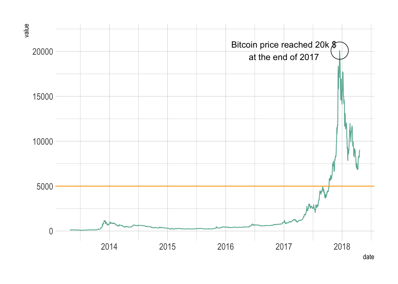
Confidence bands
data_wide_summary <- dat %>%
  select(visit, treat, stat, serumK) %>%
  pivot_wider(
    id_cols = c(visit, treat),    # Columns that uniquely identify each row in the new wide format
    names_from = stat,            # The column whose values ("llc", "ulc", "mean") will become new column names
    values_from = serumK)

data_wide_summary
# plot
ggplot(data_wide_summary, aes(x = factor(visit, level = c("Baseline", "1st week","2nd week","4th week","6th week","8th week")),
y = mean,
group = treat,
color = treat)) +
geom_ribbon(aes(ymin=llc, ymax=ulc, fill = treat), alpha = 0.3, linetype = 0) +
geom_line(size = 1.5) +
geom_hline(yintercept = 5, linetype = "dashed", color = "gray", size = 1) +
labs(
title = "Serum potassium changes. Comparison of two treatments for hyperkalemia.",
subtitle = "Data from Elsayed et al. (2025)",
caption = "Plotted by Melisa Castellanos for ~Wonderful Wednesday Challenge~ by PSI.
SCZ = sodium zirconium cyclosilicate. SPS = sodium polystyrene sulfonate.
LLC = lower limit of confidence. ULC = Upper limit of confidence.
In this new visualization, the treatment arms are shown within the same plot making comparison easier.",
x = "Visit",
y = "Serum K (mEq/L)",
fill = "LLC - ULC",
color = "Treatment Arm Mean"
) +
theme_minimal() +
scale_color_manual(values = c("SZC group" = "darkblue", # Line of treatment 1
"SPS group" = "darkgreen")) + # line treatment 2
scale_fill_manual(values = c("SZC group" = "lightblue", # A lighter shade of blue for SZC group's band
"SPS group" = "lightgreen")) # A lighter shade of red for SPS group's band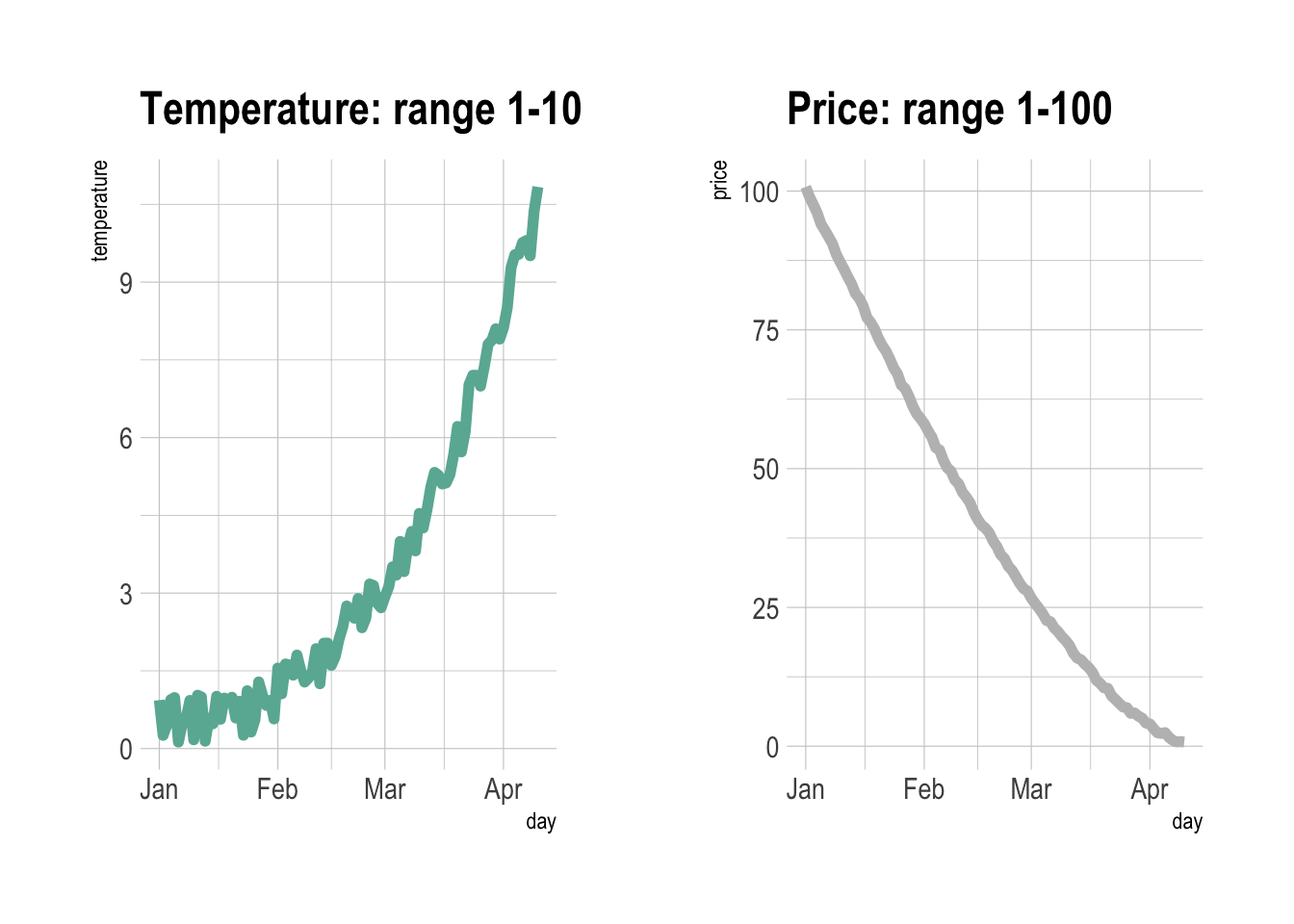
Patient Level
SIG (2025, July 9). VIS-SIG Blog: Wonderful Wednesday July 2025 (64). Retrieved from https://graphicsprinciples.github.io/posts/2025-07-09-wonderful-wednesday-july-2025/ https://rpubs.com/thomas-weissensteiner/1334093
HyKal_simData <-
  read.csv("./01_Datasets/serum_potassium_study_data.csv") %>%
  # Avoid confusion with the function "group"
  rename(., Treatment = Group)
Weekly measurements of serum potassium levels in patients receiving SPS or SZC
# Normal serum K[+] as defined in reference 2
normokalemia <- c(4, 4.9)

# K_threshold is set based on results in chunk 3
K_threshold <- 5.2

# Number of patients in each treatment group
N_group <-
  HyKal_simData %>%
  group_by(Treatment) %>%
  dplyr::summarize(., N = unique(Patient_ID) %>% length )

HyKal_simData %>%
  # Add a column showing whether baseline levels were below or above K_threshold
  mutate(
    K_base = case_when(
      Serum_Potassium_mEq_L < K_threshold & Time_Point == "Baseline"
        ~ paste0(Treatment, ".K_low"),
      Serum_Potassium_mEq_L >= K_threshold & Time_Point == "Baseline"
        ~ paste0(Treatment, ".K_high"),
      .default = NA_character_
      ) %>% factor()
    ) %>%
  group_by(Patient_ID) %>%
  fill(K_base, .direction = "downup") %>%
  # Add patient numbers in each treatment group, and a column showing whether serum K[+] levels were normal at any time during treatment
  left_join(., N_group) %>%
  mutate(
    hyKal = ifelse(
      Serum_Potassium_mEq_L <= max(normokalemia),
      Week, NA),
    hyKal = if (all(is.na(hyKal[-1]))) "Yes" else "No",
    color = paste(K_base, hyKal, sep = "_") %>% factor(),
    Treatment = paste0(Treatment, " (N = ", N, ")")
    ) %>%
  ungroup() %>%

  ggplot(
    aes(
      x = Week,
      y = Serum_Potassium_mEq_L,
      group = Patient_ID,
      color = color,
      size = K_base
      )
    ) +
  geom_ribbon(
    inherit.aes = FALSE,
    aes(
      x = Week,
      ymin = min(normokalemia),
      ymax = max(normokalemia)),
      fill = "lightgrey",
      alpha = 0.7
      ) +
  geom_line() +
  annotate(
    "text",
    label = "Normal range",
    size = 3,
    x = 0.3,
    y = range(normokalemia) %>% sum()/2,
    angle = 90
    ) +
  scale_color_manual(
    values = c(
      SPS.K_low_No = "#27C8F5", SPS.K_high_No = "#4795A8",
      SPS.K_low_Yes = "#551182", SPS.K_high_Yes = "#CC2DB7",
      SZC.K_high_No = "#F58E27", SZC.K_low_No = "#A34018"
      # Levels that do not exist in this data set:
      # SZC.K_low_Yes = "#551182", SZC.K_high_Yes = "#CC2DB7",
      )
    ) +
  scale_size_manual(values = c(0.7 ,1.4 , 0.7, 1.4) ) +
  scale_y_continuous(
    breaks = c(4:6, K_threshold),
    minor_breaks = NULL,
    ) +
  facet_wrap(.~Treatment) +
  labs(
    title = "Serum potassium levels vs. week of treatment in individual patients receiving SPS or SZC",
    y = "Serum K[+] (mEq/L)",
    caption = paste("Darker and thicker lines represent patients with a baseline serum K[+] below the", K_threshold, "mEq/L threshold (purple y-axis tick label). \nPurple lines indicate patients who never achieved normokalemia. See the following figures for an explanation.")
    ) +
  theme_light() +
  theme(
    plot.title = element_text(hjust = 0.5),
    axis.text.y = element_text(
      face = c("plain", "plain", "plain", "bold"),
      color = c("black", "black", "black", "#CC2DB7")),
    strip.background = element_blank(),
    strip.text.x = element_text(
      color = "black",
      size = 11
      ),
    plot.caption = element_text(hjust = 0, size = 8),
    legend.position = "none"
) 
Defining the outcomes to be visualised
At the previous PSI webinar, it was noted that patients treated with SPS required on average approximately five weeks to reach normokalemia, whereas those receiving SZC achieved normokalemia after about 1.5 weeks. Highlighting these time points was suggested as a potential improvement to the figure. Accordingly, the analysis estimates the time at which each individual first entered the normal serum K[+] range and compares the mean times between treatment groups.
However, the first crossing into the normal range depends not only on the treatment effect but also on the patient’s baseline serum K[+] level. Baseline levels of serum K[+] may also act as a covariate associated with the type and/or magnitude of the treatment response. Therefore, treatment response is evaluated as a separate outcome and modelled as a linear function of serum K[+] over time. Although change from baseline could also be considered, with only one baseline measurement per patient, the “rate of change” appears to be a more suitable metric for quantifying the efficacy of each drug in lowering serum K[+] concentrations.
Serum K[+] measurements in individual patients fluctuated substantially over time, particularly in the SPS group. Consequently, estimates of the response rate or the time at which normokalemia is reached are uncertain and may even be unsuitable for comparing the two treatment groups. A more clinically meaningful outcome may therefore be the total duration during the trial in which patients remain within the normokalemic range.
For more details, please check
Line Plot
Multi groups line chart
library(babynames) # provide the dataset: a dataframe called babynames
# library(hrbrthemes)
# library(viridis)

# Keep only 3 names
don <- babynames::babynames
don <- don %>%
  dplyr::filter(name %in% c("Ashley", "Patricia", "Helen")) %>%
  dplyr::filter(sex=="F")

# Plot
don %>%
  ggplot( aes(x=year, y=n, group=name, color=name)) +
    geom_line() +
    scale_color_viridis(discrete = TRUE) +
    ggtitle("Popularity of American names in the previous 30 years") +
    theme_ipsum() +
    ylab("Number of babies born")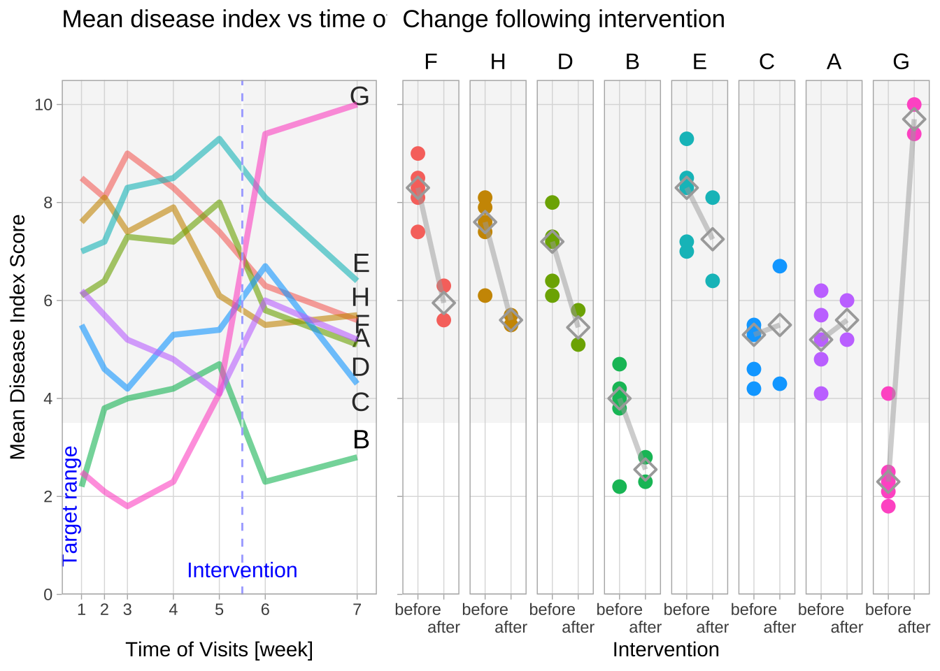
Line chart annotation
# Reference: https://r-graph-gallery.com/line_chart_annotation.html
# library(plotly)
# library(hrbrthemes)

# Load dataset from github
data <- read.table("./01_Datasets/TwoNumOrdered.csv", header=T)
data$date <- as.Date(data$date)

# plot
data %>%
  ggplot( aes(x=date, y=value)) +
    geom_line(color="#69b3a2") +
    ylim(0,22000) +
    annotate(geom="text", x=as.Date("2017-01-01"), y=20089,
             label="Bitcoin price reached 20k $\nat the end of 2017") +
    annotate(geom="point", x=as.Date("2017-12-17"), y=20089, size=10, shape=21, fill="transparent") +
    geom_hline(yintercept=5000, color="orange", size=.5) +
    theme_ipsum()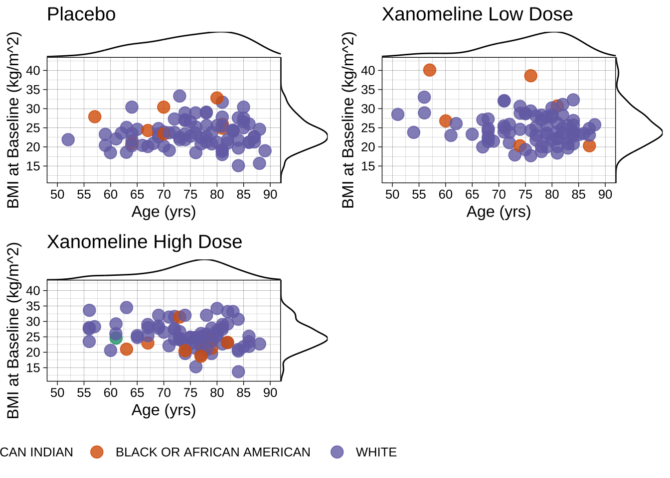
Dual Y axis
# library(patchwork) # To display 2 charts together
# library(hrbrthemes)

# Build dummy data
data <- data.frame(
  day = as.Date("2019-01-01") + 0:99,
  temperature = runif(100) + seq(1,100)^2.5 / 10000,
  price = runif(100) + seq(100,1)^1.5 / 10
)

# Most basic line chart
p1 <- ggplot(data, aes(x=day, y=temperature)) +
  geom_line(color="#69b3a2", size=2) +
  ggtitle("Temperature: range 1-10") +
  theme_ipsum()

p2 <- ggplot(data, aes(x=day, y=price)) +
  geom_line(color="grey",size=2) +
  ggtitle("Price: range 1-100") +
  theme_ipsum()

# Display both charts side by side thanks to the patchwork package
p1 + p2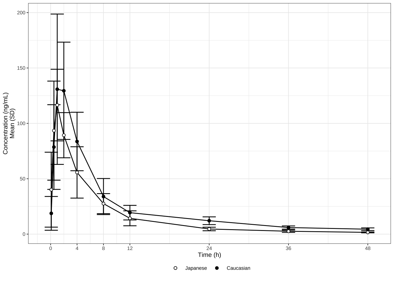
# Value used to transform the data
coeff <- 10

# A few constants
temperatureColor <- "#69b3a2"
priceColor <- "grey"

ggplot(data, aes(x=day)) +
  geom_line( aes(y=temperature), size=2, color=temperatureColor) +
  geom_line( aes(y=price / coeff), size=2, color=priceColor) +
  scale_y_continuous(
    # Features of the first axis
    name = "Temperature (Celsius °)",
    # Add a second axis and specify its features
    sec.axis = sec_axis(~.*coeff, name="Price ($)")
  ) +
  theme_ipsum() +
  theme(
    axis.title.y = element_text(color = temperatureColor, size=13),
    axis.title.y.right = element_text(color = priceColor, size=13)
  ) +
  ggtitle("Temperature down, price up")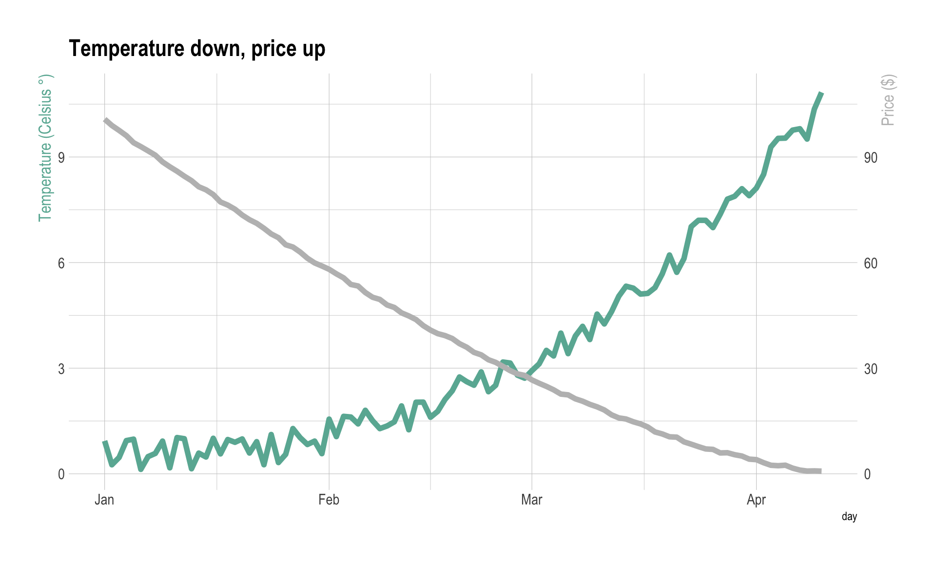
Advanced Theme Setting
# Reference https://r-graph-gallery.com/web-line-chart-with-labels-at-end-of-line.html
# Load packages
# library(ggrepel)
# library(ggtext)

# library(showtext)
font_add_google("Lato")
showtext_auto()

# Load and prepare the dataset
df_mac_raw <- readr::read_csv('./01_Datasets/big-mac.csv')

df_mac <- df_mac_raw %>%
  # Extract year
  mutate(year = lubridate::year(date)) %>%
  # Subset variables
  select(date, year, iso_a3, currency_code, name, dollar_price) %>%
  # If there is more than one record per year/country, use the mean
  group_by(iso_a3, name, year) %>%
  summarize(price = mean(dollar_price)) %>%
  # Keep countries/regions with records for the last 21 years
  # (from 2000 to 2020 inclusive)
  group_by(iso_a3) %>%
  filter(n() == 21)

# Also define the group of countries that are going to be highlighted
highlights <- c("EUZ", "CHE", "DNK", "SWE", "BRA", "ARG", "GBR", "USA")
n <- length(highlights)

countries <- df_mac %>%
  filter(year == 2008) %>%
  pull(iso_a3)

df_mac_indexed_2008 <- df_mac %>%
  # Keep countries that have a record for 2008, the index year.
  group_by(iso_a3) %>%
  filter(iso_a3 %in% countries) %>%
  # Compute the `price_index`
  mutate(
    ref_year = 2008,
    price_index = price[which(year == 2008)],
    price_rel = price - price_index,
    # Create 'group', used to color the lines.
    group = if_else(iso_a3 %in% highlights, iso_a3, "other"),
    group = as.factor(group)
  ) %>%
  mutate(
    group = fct_relevel(group, "other", after = Inf),
    name_lab = if_else(year == 2020, name, NA_character_)
  ) %>%
  ungroup()

# Theme definition
# This theme extends the 'theme_minimal' that comes with ggplot2.
# The "Lato" font is used as the base font. This is similar
# to the original font in Cedric's work, Avenir Next Condensed.
theme_set(theme_minimal(base_family = "Lato"))


theme_update(
  # Remove title for both x and y axes
  axis.title = element_blank(),
  # Axes labels are grey
  axis.text = element_text(color = "grey40"),
  # The size of the axes labels are different for x and y.
  axis.text.x = element_text(size = 20, margin = margin(t = 5)),
  axis.text.y = element_text(size = 17, margin = margin(r = 5)),
  # Also, the ticks have a very light grey color
  axis.ticks = element_line(color = "grey91", size = .5),
  # The length of the axis ticks is increased.
  axis.ticks.length.x = unit(1.3, "lines"),
  axis.ticks.length.y = unit(.7, "lines"),
  # Remove the grid lines that come with ggplot2 plots by default
  panel.grid = element_blank(),
  # Customize margin values (top, right, bottom, left)
  plot.margin = margin(20, 40, 20, 40),
  # Use a light grey color for the background of both the plot and the panel
  plot.background = element_rect(fill = "grey98", color = "grey98"),
  panel.background = element_rect(fill = "grey98", color = "grey98"),
  # Customize title appearence
  plot.title = element_text(
    color = "grey10",
    size = 28,
    face = "bold",
    margin = margin(t = 15)
  ),
  # Customize subtitle appearence
  plot.subtitle = element_markdown(
    color = "grey30",
    size = 16,
    lineheight = 1.35,
    margin = margin(t = 15, b = 40)
  ),
  # Title and caption are going to be aligned
  plot.title.position = "plot",
  plot.caption.position = "plot",
  plot.caption = element_text(
    color = "grey30",
    size = 13,
    lineheight = 1.2,
    hjust = 0,
    margin = margin(t = 40) # Large margin on the top of the caption.
  ),
  # Remove legend
  legend.position = "none"
)

# Basic chart
plt <- ggplot(
  # The ggplot object has associated the data for the highlighted countries
  df_mac_indexed_2008 %>% filter(group != "other"),
  aes(year, price_rel, group = iso_a3)
) +
  # Geometric annotations that play the role of grid lines
  geom_vline(
    xintercept = seq(2000, 2020, by = 5),
    color = "grey91",
    size = .6
  ) +
  geom_segment(
    data = tibble(y = seq(-4, 3, by = 1), x1 = 2000, x2 = 2020),
    aes(x = x1, xend = x2, y = y, yend = y),
    inherit.aes = FALSE,
    color = "grey91",
    size = .6
  ) +
  geom_segment(
    data = tibble(y = 0, x1 = 2000, x2 = 2020),
    aes(x = x1, xend = x2, y = y, yend = y),
    inherit.aes = FALSE,
    color = "grey60",
    size = .8
  ) +
  geom_vline(
    aes(xintercept = ref_year),
    color = "grey40",
    linetype = "dotted",
    size = .8
  ) +
  # Lines for the non-highlighted countries
  geom_line(
    data = df_mac_indexed_2008 %>% filter(group == "other"),
    color = "grey75",
    size = .6,
    alpha = .5
  ) +
  # Lines for the highlighted countries.
  # It's important to put them after the grey lines
  # so the colored ones are on top
  geom_line(
    aes(color = group),
    size = .9
  )
plt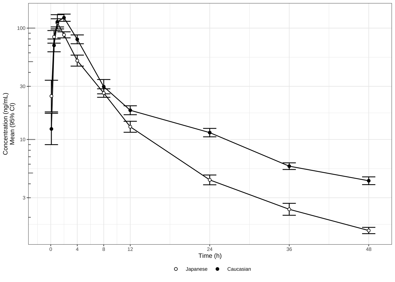
plt <- plt +
  annotate(
    "text", x = 2008.15, y = -3.35,
    label = "2008",
    family = "Lato",
    size = 8,
    color = "grey40",
    hjust = 0
  ) +
  geom_text_repel(
    aes(color = group, label = name_lab),
    family = "Lato",
    fontface = "bold",
    size = 8,
    direction = "y",
    xlim = c(2020.8, NA),
    hjust = 0,
    segment.size = .7,
    segment.alpha = .5,
    segment.linetype = "dotted",
    box.padding = .4,
    segment.curvature = -0.1,
    segment.ncp = 3,
    segment.angle = 20
  ) +
  # coordinate system + scales
  coord_cartesian(
    clip = "off",
    ylim = c(-4, 3)
  ) +
  scale_x_continuous(
    expand = c(0, 0),
    limits = c(2000, 2023.5),
    breaks = seq(2000, 2020, by = 5)
  ) +
  scale_y_continuous(
    expand = c(0, 0),
    breaks = seq(-4, 3, by = 1),
    labels = glue::glue("{format(seq(-4, 3, by = 1), nsmall = 2)}$")
  )
plt 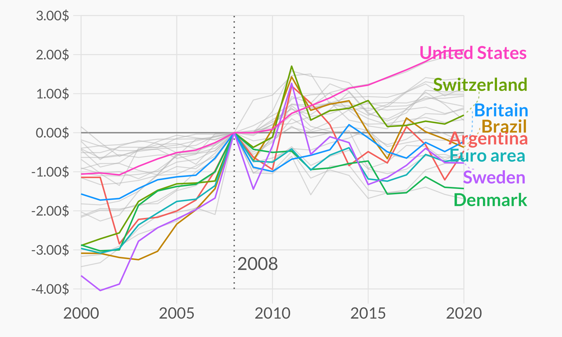
Combined Line Plots
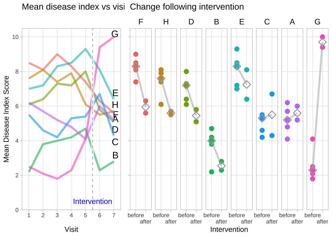
Disease activiy across consecutive visits, and before and after the intervention
“Mean Disease Index vs Visit” (left subplot)
Disease activity varied widely between groups and visits, in the periods
before and after the intervention. There was a sharp rise in disease
activity in group “G” after the intervention, and a notable drop in
group “F”. However, both of these trends seemed to have started already
at visits 4 and 5.
“Change following Intervention” (right subplot)
Nevertheless, I added a summary of mean disease index scores before and
after intervention. My assumption was that visits 1-5 were meant to
establish a baseline value, to which levels at visits 6 and 7 were to be
compared. Treatment groups are shown in the order of their change in
median values of their mean disease indices before and after
intervention, from greatest decrease (group “F”, left) to greatest
increase (group “G”, right).
# library(dplyr)        # version 1.1.4  # general grammar
# library(purrr)        # version 1.0.2  # set_names, list_rbind
# library(tidyr)        # version 1.3.1  # pivot_longer, pivot_wider
# library(ggpubr)       # version 0.6.0, includes ggplot2 3.4.0 # stat_compare_means, ggtexttable, ggarrange
# library(ggrepel)      # version 0.9.6  # geom_text_repel

exampleData <- read.csv("./01_Datasets/WW_Nov2024.csv")
# exampleData <- read.csv("https://raw.githubusercontent.com/VIS-SIG/Wonderful-Wednesdays/refs/heads/master/data/2024/2024-10-09/WW_Nov2024.csv")


exampleData_int <-
  exampleData %>%
  set_names(
    "Treatment",
    paste(c(1:7), sep = ", " )
    ) %>%

# Add a column with differences between the medians of disease activity at visits before and after the intervention
  mutate(
    Change_intervention =
      apply(., 1, function(row) {
        median(row[c("6", "7")]) -
        median(row[c("1", "2", "3", "4", "5")])
        }
      )
    ) %>%

# Optional: replace treatment numbers with letters, to differentiate from the index for visits
  mutate(
    Treatment = LETTERS[1:8]
  ) %>%

# Re-arrange dataframe
  arrange (Change_intervention) %>%

  pivot_longer(
      cols = paste(1:7),
      names_to = "Visit",
      values_to = "Mean_Disease_Index"
      ) %>%
  mutate(.after = Visit,
    Visit = as.numeric(Visit),
    Intervention = ordered(
      rep(
        c(rep("before", 5), rep("after", 2)),
        8),
      levels = c("before", "after")
      ),
   Treatment = factor(
     Treatment,
     levels = unique(Treatment)
     )
    )


# Plot

p_visits <-
  exampleData_int %>%
  mutate(facet_strip = "") %>%   # Empty facet label for aligning the y-axis scales of the two subplots
    ggplot(
    aes(
      x = Visit,
      y = Mean_Disease_Index,
      color = Treatment
      )
    ) +
  geom_text_repel(
    data = subset(
      exampleData_int,
      Visit == "7" & (Treatment %in% LETTERS[1:8] )
      ),
    aes(label = Treatment),
    nudge_x = 0.5,
    color = "black",
    size = 5
  ) +
  facet_grid(.
      ~ facet_strip
      ) +
  geom_line (lwd = 1.5, alpha = 0.6) +
  scale_x_continuous(
    breaks = 1:7,
    minor_breaks = NULL,
    expand = c(0, 0), limits = c(0.5, 7.5),
    labels = c(paste(1:6), "7\n")
    ) +
  scale_y_continuous(
    breaks = seq(0, 10, 2),
    minor_breaks = NULL,
    expand = c(0, 0), limits = c(0, 10.5)
    ) +
  geom_vline(
    aes( xintercept = 5.5),
    linetype = "dashed",
    col = "blue"
    ) +
  annotate(
    "rect",
    xmin = 5.4, xmax = 5.6,
    ymin = -Inf, ymax=Inf,
    fill="white", alpha=0.6) +
  annotate(
    "text",
    x = 5.5, y = 0.5,
    label = "Intervention",
    size = 4,
    color = "blue"
    ) +
  theme_light() +
  theme(
    legend.position = "none",
    strip.background = element_blank(),
    strip.text.x=element_text(
      colour="black",
      size = 12
      ),
    ) +
  labs(
    y = "Mean Disease Index Score",
    title = "Mean disease index vs visit",
    vjust = -0.1
    )


p_intervention <-
  exampleData_int %>%
  ggplot(
    aes(
      x = Intervention,
      y = Mean_Disease_Index,
      color = Treatment,
      )
    ) +
  scale_y_continuous(         # Same for both subplots
    breaks = seq(0, 10, 2),
    minor_breaks = NULL,
    expand = c(0, 0),
    limits = c(0, 10.5)
    ) +
  scale_x_discrete(
    labels = c("before", "\nafter")
    )+
  facet_grid(.
      ~ Treatment
      ) +
  geom_point(
    size = 3
    ) +
  stat_summary(
    fun = median,
    shape = 5,
    size = 0.8,
    color = "darkgrey"
    ) +
  stat_summary(
    fun = median,
    group = 1,
    geom = "path",
    color = "darkgrey", alpha = 0.5,
    lwd = 1.3
    ) +
  theme_light() +
  theme(
    axis.title.y = element_blank(),
    axis.text.y = element_blank(),
    strip.background = element_blank(),
    strip.text.x=element_text(
      colour="black",
      size = 12
      ),
    legend.position = "none"
    ) +
  labs(
    title = "Change following intervention",
    vjust = -0.1
    )

ggarrange(
   p_visits,
   p_intervention,
   ncol = 2,
   widths = c(0.6, 1)
) 
Disease activiy vs. time of visits, highlighting the target range
In this version of the figure, I added two parameters that were not supplied with the example data but which might improve the figure.
The first was a hypothetical target range for the disease index. The aim of treatment/intervention in this scenario would have been to keep index scores below the values in the shaded areas of the plots. For the assumed target here, the intervention achieved a meaningful benefit only in group “B”, whereas group “G” became significantly worse.
My second additional parameter were the intervals at which the visits were scheduled. This should give a better impression of the variability of the disease index over time, in particular if the visits were not evenly spaced.
# Intervals at which visits 1-7 took place (e.g. weeks)
visitIntervals <- c(0, 2, 4, 8, 12, 16, 24)
interventionTime <- mean (c(visitIntervals[5], visitIntervals[6]))

# Clinically meaningful target for mean disease index score
diseaseScore_target <- 3.5


## Plot

exampleData_int <-
  exampleData_int %>%
  mutate(
    Time_of_visits = rep(visitIntervals, 8)
    )

p_visits <-
  exampleData_int %>%
  mutate(facet_strip = "") %>%   # Empty facet label for aligning the y-axis scales of the two subplots
    ggplot(
    aes(
      x = Time_of_visits,
      y = Mean_Disease_Index,
      color = Treatment
      )
    ) +
  geom_text_repel(
    data = subset(
      exampleData_int,
      Time_of_visits == max(visitIntervals) & (Treatment %in% LETTERS[1:8] )
      ),
    aes(label = Treatment),
    nudge_x = 0.5,
    color = "black",
    size = 5
  ) +
  annotate(
    "rect",
    xmin = -Inf, xmax = Inf,
    ymin = diseaseScore_target, ymax=Inf,
    fill="lightgrey", alpha=0.2) +
    facet_grid(.
      ~ facet_strip
      ) +
  geom_line (lwd = 1.5, alpha = 0.6) +
  scale_x_continuous(
    breaks = visitIntervals,
    minor_breaks = NULL,
    expand = c(0, 0),
    limits =
      range(visitIntervals) +
      max(visitIntervals)/14 * c(-1, 1),
    labels = c(paste(1:6), "7\n")
        ) +
  scale_y_continuous(
    breaks = seq(0, 10, 2),
    minor_breaks = NULL,
    expand = c(0, 0), limits = c(0, 10.5)
    ) +
  geom_vline(
    aes(xintercept = interventionTime ),
    linetype = "dashed",
    col = "blue"
    ) +
  annotate(
    "text",
    x = 0.65 - max(visitIntervals)/14,
    y = 1.8,
    label = "Target range",
    size = 4,
    angle = 90,
    color = "blue"
    ) +
  annotate(
    "rect",
    xmin = interventionTime - 0.1,
    xmax = interventionTime + 0.1,
    ymin = -Inf, ymax=Inf,
    fill="white", alpha=0.6) +
  annotate(
    "text",
    x = interventionTime,
    y = 0.5,
    label = "Intervention",
    size = 4,
    color = "blue"
    ) +
  theme_light() +
  theme(
    legend.position = "none",
    strip.background = element_blank(),
    strip.text.x=element_text(
      colour="black",
      size = 12
      ),
    ) +
  labs(
    y = "Mean Disease Index Score",
    x = "Time of Visits [week]",
    title = "Mean disease index vs time of visit",
    vjust = -0.1
    )


p_intervention <-
  exampleData_int %>%
  ggplot(
    aes(
      x = Intervention,
      y = Mean_Disease_Index,
      color = Treatment,
      )
    ) +
  annotate(
    "rect",
    xmin = -Inf, xmax = Inf,
    ymin = 3.5, ymax=Inf,
    fill="lightgrey", alpha=0.2) +
  scale_y_continuous(                  # Same for both subplots
    breaks = seq(0, 10, 2),
    minor_breaks = NULL,
    expand = c(0, 0),
    limits = c(0, 10.5)
    ) +
  scale_x_discrete(
    labels = c("before", "\nafter")
    )+
  facet_grid(.
      ~ Treatment
      ) +
  geom_point(
    size = 3
    ) +
  stat_summary(
    fun = median,
    shape = 5,
    size = 0.8,
    color = "darkgrey"
    ) +
  stat_summary(
    fun = median,
    group = 1,
    geom = "path",
    color = "darkgrey", alpha = 0.5,
    lwd = 1.3
    ) +
  theme_light() +
  theme(
    axis.title.y = element_blank(),
    axis.text.y = element_blank(),
    strip.background = element_blank(),
    strip.text.x=element_text(
      colour="black",
      size = 12
      ),
    legend.position = "none"
    ) +
  labs(
    title = "Change following intervention",
    vjust = -0.1
    )

ggarrange(
   p_visits,
   p_intervention,
   ncol = 2,
   widths = c(0.7, 1)
) 
Scatter Plots and Densities
# library(haven)
# library(dplyr)
# library(tidyr)
# library(ggplot2)
# library(grid)
# library(gridExtra)
# library(readxl)
# library(cowplot)

# Placebo

bl0 <- read_csv("./01_Datasets/adsl.csv") %>%
  filter(TRT01PN == 0)

base0 <- ggplot(bl0) +
  geom_jitter(aes(x=AGE, y=as.numeric(BMIBL), color=factor(RACE)),  size=4, width=0.03, height=0, alpha=0.8) +
  scale_x_continuous(limits=c(50, 90), breaks=c(50, 55, 60, 65, 70, 75, 80, 85, 90)) +
  scale_y_continuous(limits=c(12, 42), breaks=c(15, 20, 25, 30, 35, 40, 45)) +
  scale_color_manual("Race", values=c("#d95f02", "#7570b3")) +
  ylab("BMI at Baseline (kg/m^2)") +
  xlab("Age (yrs)") +
  ggtitle("Placebo") +
  theme_minimal() +
  theme_linedraw() +
  theme(text = element_text(size=12)) +
  theme(legend.position = "none")

xdens0 <- axis_canvas(base0, axis="x") +
  geom_density(data=bl0, aes(AGE))

ydens0 <- axis_canvas(base0, axis="y", coord_flip = TRUE) +
  geom_density(data=bl0, aes(as.numeric(BMIBL))) +
                 coord_flip()

p10 <- insert_xaxis_grob(base0, xdens0, position="top")
p20 <- insert_yaxis_grob(p10, ydens0, position="right")

#############################################################################
# Low Dose

bl_lo <- read_csv("./01_Datasets/adsl.csv") %>%
  filter(TRT01PN == 54)

base_lo <- ggplot(bl_lo) +
  geom_jitter(aes(x=AGE, y=as.numeric(BMIBL), color=factor(RACE)),  size=4, width=0.03, height=0, alpha=0.8) +
  scale_x_continuous(limits=c(50, 90), breaks=c(50, 55, 60, 65, 70, 75, 80, 85, 90)) +
  scale_y_continuous(limits=c(12, 42), breaks=c(15, 20, 25, 30, 35, 40, 45)) +
  scale_color_manual("Race", values=c("#d95f02", "#7570b3")) +
  ylab("BMI at Baseline (kg/m^2)") +
  xlab("Age (yrs)") +
  ggtitle("Xanomeline Low Dose") +
  theme_minimal() +
  theme_linedraw() +
  theme(text = element_text(size=12)) +
  theme(legend.position = "none")

xdens_lo <- axis_canvas(base_lo, axis="x") +
  geom_density(data=bl_lo, aes(AGE))

ydens_lo <- axis_canvas(base_lo, axis="y", coord_flip = TRUE) +
  geom_density(data=bl_lo, aes(as.numeric(BMIBL))) +
  coord_flip()

p1_lo <- insert_xaxis_grob(base_lo, xdens_lo, position="top")
p2_lo <- insert_yaxis_grob(p1_lo, ydens_lo, position="right")
#############################################################################
# High Dose

bl_hi <- read_csv("./01_Datasets/adsl.csv") %>%
  filter(TRT01PN == 81)

base_hi <- ggplot(bl_hi) +
  geom_jitter(aes(x=AGE, y=as.numeric(BMIBL), color=factor(RACE)),  size=4, width=0.03, height=0, alpha=0.8) +
  scale_x_continuous(limits=c(50, 90), breaks=c(50, 55, 60, 65, 70, 75, 80, 85, 90)) +
  scale_y_continuous(limits=c(12, 42), breaks=c(15, 20, 25, 30, 35, 40, 45)) +
  scale_color_manual("Race", labels=c("AMERICAN INDIAN", "BLACK OR AFRICAN AMERICAN","WHITE"),values=c("#1b9e77", "#d95f02", "#7570b3")) +
  ylab("BMI at Baseline (kg/m^2)") +
  xlab("Age (yrs)") +
  ggtitle("Xanomeline High Dose") +
  theme_minimal() +
  theme_linedraw() +
  theme(text = element_text(size=12)) +
  theme(legend.position = "bottom") +
  theme(legend.title=element_blank())

xdens_hi <- axis_canvas(base_hi, axis="x") +
  geom_density(data=bl_hi, aes(AGE))

ydens_hi <- axis_canvas(base_hi, axis="y", coord_flip = TRUE) +
  geom_density(data=bl_hi, aes(as.numeric(BMIBL))) +
  coord_flip()

p1_hi <- insert_xaxis_grob(base_hi, xdens_hi, position="top")
p2_hi <- insert_yaxis_grob(p1_hi, ydens_hi, position="right")


#############################################################################

p <- grid.arrange(arrangeGrob(p20, ncol=1, nrow=1),
                  arrangeGrob(p2_lo, ncol=1, nrow=1),
                  arrangeGrob(p2_hi, ncol=1, nrow=1),
                  heights = c(1,1.1))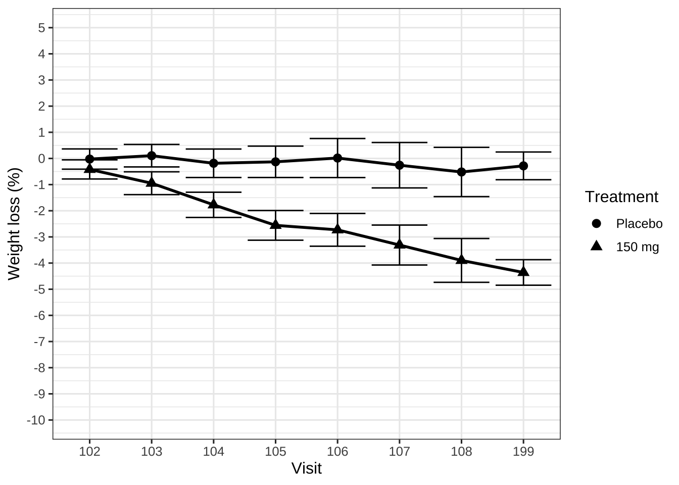
title <- ggdraw() + draw_label("BMI, Age and Race are Well Balanced Between Treatment Groups. \nParticipants Were Predominantly White.\n", size = 18)

p2 <- plot_grid(title, p, ncol=1, rel_heights = c(1, 10))
p2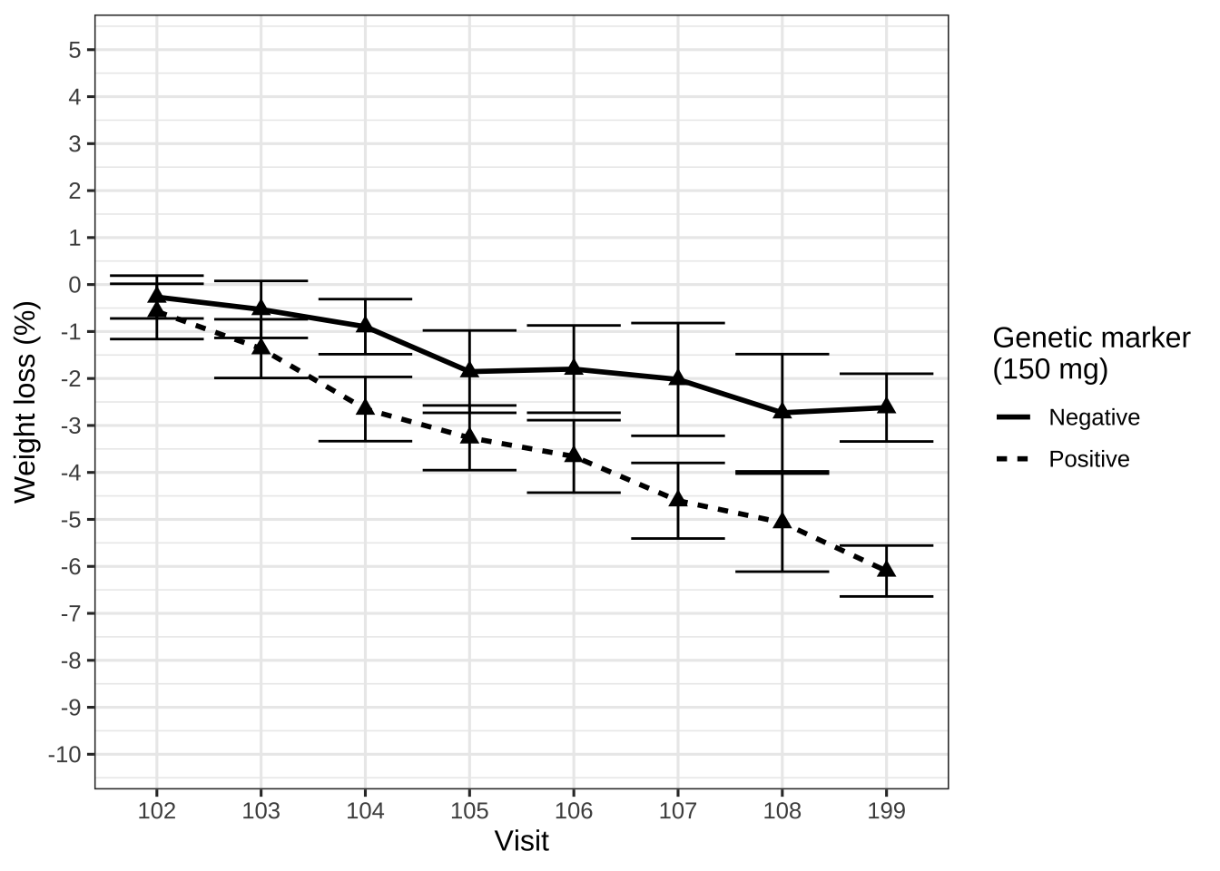
# ggsave("/shared/175/arenv/arwork/gsk1278863/mid209676/present_2020_01/code/baseline/baseline_SM.png", p2, width=12, height=8, dpi=300)Pharmacokinetic exposure
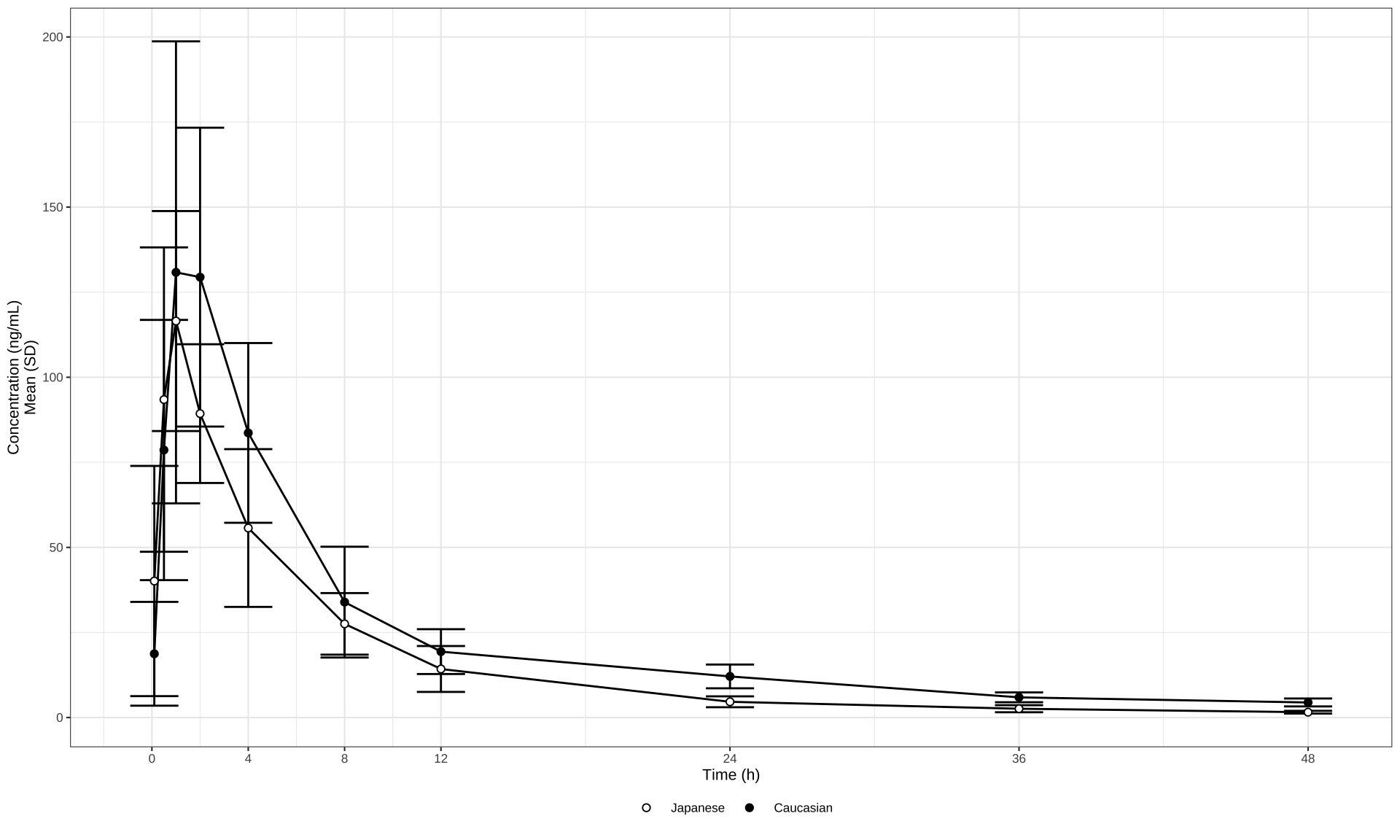
Linear Scala
my_data <- read_csv("./01_Datasets/402_case2_PKdataset.csv") %>%
  filter(CMT == 2 & DOSE == 300 & PART == 1 & STUDY == 1) %>%
  mutate(
    TRTACT = factor(TRTACT, levels = rev(unique(TRTACT[order(DOSE)]))),
    ETHN = factor(ETHN),
    ETHN = factor(ETHN, levels = rev(levels(ETHN)))
  )

# Plot mean and error bars (SD) on a linear scale
my_data %>%
  ggplot(aes(
    x = NOMTIME,
    y = LIDV,
    group = interaction(ETHN, CYCLE)
  )) +
  stat_summary(
    geom = "errorbar",
    width = 2,
    fun.data = mean_sdl,
    fun.args = list(mult = 1)
  ) +
  stat_summary(geom = "line", size = 0.5,
               fun.y = mean) +
  stat_summary(
    aes(fill = ETHN),
    geom = "point",
    size = 1.5,
    fun.y = mean,
    stroke = 0.5,
    shape = 21
  ) +
  scale_fill_manual(values = c("white", "black")) +
  scale_x_continuous(breaks = c(0, 4, 8, 12, 24, 36, 48, 72)) +
  xlab("Time (h)") +
  ylab("Concentration (ng/mL)\nMean (SD)") +
  theme_bw(base_size = 8) +
  theme(
    legend.title = element_blank(),
    legend.position = "bottom",
    legend.box.spacing = unit(0, "mm")
  )
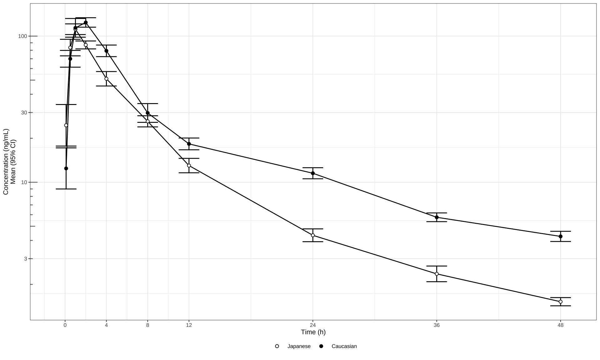
Log Scale
# Mean (95% CI) error bars, log scale
my_data %>%
  ggplot(aes(
    x = NOMTIME,
    y = LIDV,
    group = interaction(ETHN, CYCLE)
  )) +
  stat_summary(
    geom = "errorbar",
    width = 2,
    fun.data = mean_cl_normal,
    fun.args = list(mult = 1)
  ) +
  stat_summary(geom = "line", size = 0.5,
               fun.y = mean) +
  stat_summary(
    aes(fill = ETHN),
    geom = "point",
    size = 1.5,
    fun.y = mean,
    stroke = 0.5,
    shape = 21
  ) +
  scale_fill_manual(values = c("white", "black")) +
  scale_x_continuous(breaks = c(0, 4, 8, 12, 24, 36, 48, 72)) +
  xlab("Time (h)") + ylab("Concentration (ng/mL)\nMean (95% CI)") +
  guides(color = guide_legend(title = "Dose")) +
  scale_y_log10() +
  annotation_logticks(base = 10,
                      sides = "l",
                      color = rgb(0.5, 0.5, 0.5)) +
  theme_bw(base_size = 8) +
  theme(
    legend.title = element_blank(),
    legend.position = "bottom",
    legend.box.spacing = unit(0, "mm")
  )
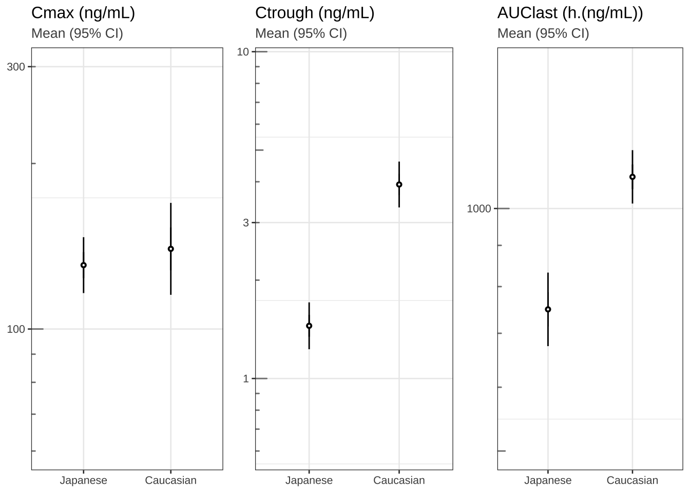
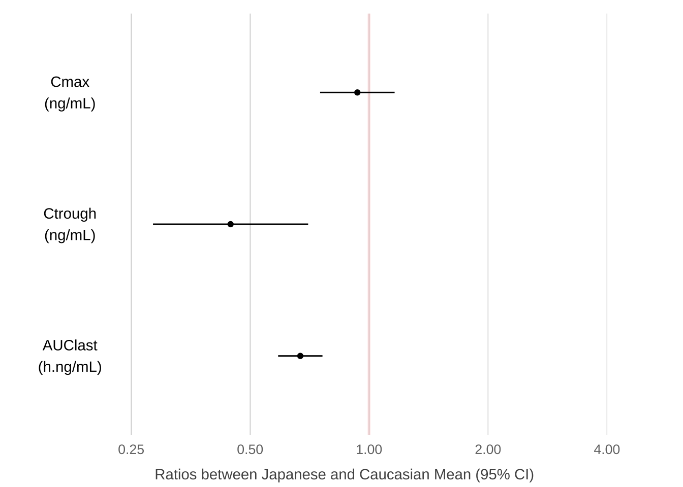
Cmax, Ctrough and AUClast
theme_set(theme_bw(base_size = 10))

# Plot cmax, ctrough, AUClast dots (95% CI) in separate panels
Cmax <- my_data %>%
  filter(!is.na(LIDV))  %>%
  group_by(ID, ETHN) %>%
  summarize(Cmax = max(LIDV),
            Ctrough = min(LIDV))

Ctrough <- my_data %>%
  filter(!is.na(LIDV))  %>%
  group_by(ID, ETHN) %>%
  summarize(Ctrough = min(LIDV))

AUClast <- my_data %>%
  filter(!is.na(LIDV))

library("pracma")
AUClast <-
  data.frame(stack(sapply(split(AUClast, AUClast$ID), function(df)
    trapz(df$TIME, df$LIDV))))
names(AUClast) <- c("AUC", "ID")

AUClast$ID <- as.numeric(as.character(AUClast$ID))
AUClast <- AUClast[order(AUClast$ID),]
AUClast <-
  merge(AUClast, unique(my_data[c("ID", "ETHN")]), by = "ID")


gg1 <- Cmax %>%
  ggplot(aes(x = ETHN, y = Cmax, group = ETHN)) +
  stat_summary(fun.data = mean_cl_normal,
               geom = "errorbar",
               width = 0) +
  stat_summary(shape = 21, fill = "white", size = 0.2) +
  labs(title = "Cmax (ng/mL)", subtitle = "Mean (95% CI)") +
  scale_y_log10(breaks = c(0.3, 1, 3, 10, 30, 100, 300, 1000, 3000),
                limits = c(60, 300)) +   annotation_logticks(base = 10,
                                                             sides = "l",
                                                             color = rgb(0.5, 0.5, 0.5)) +
  theme(
    axis.title.x = element_blank(),
    axis.title.y = element_blank(),
    plot.subtitle = element_text(color = rgb(0.3, 0.3, 0.3))
  )

gg2 <- gg1 %+% #Cmax %+%
  aes(x = ETHN, y = Ctrough) +
  labs(title = "Ctrough (ng/mL)") +
  scale_y_log10(breaks = c(0.3, 1, 3, 10, 30, 100, 300, 1000, 3000),
                limits = c(0.6, 9))


gg3 <- gg1 %+% AUClast %+% aes(x = ETHN, y = AUC) +
  labs(title = "AUClast (h.(ng/mL))") +
  scale_y_log10(breaks = c(0.3, 1, 3, 10, 30, 100, 300, 1000, 3000),
                limits = c(500, 1500))

grid.arrange(arrangeGrob(gg1, gg2, gg3, nrow = 1), nrow = 1)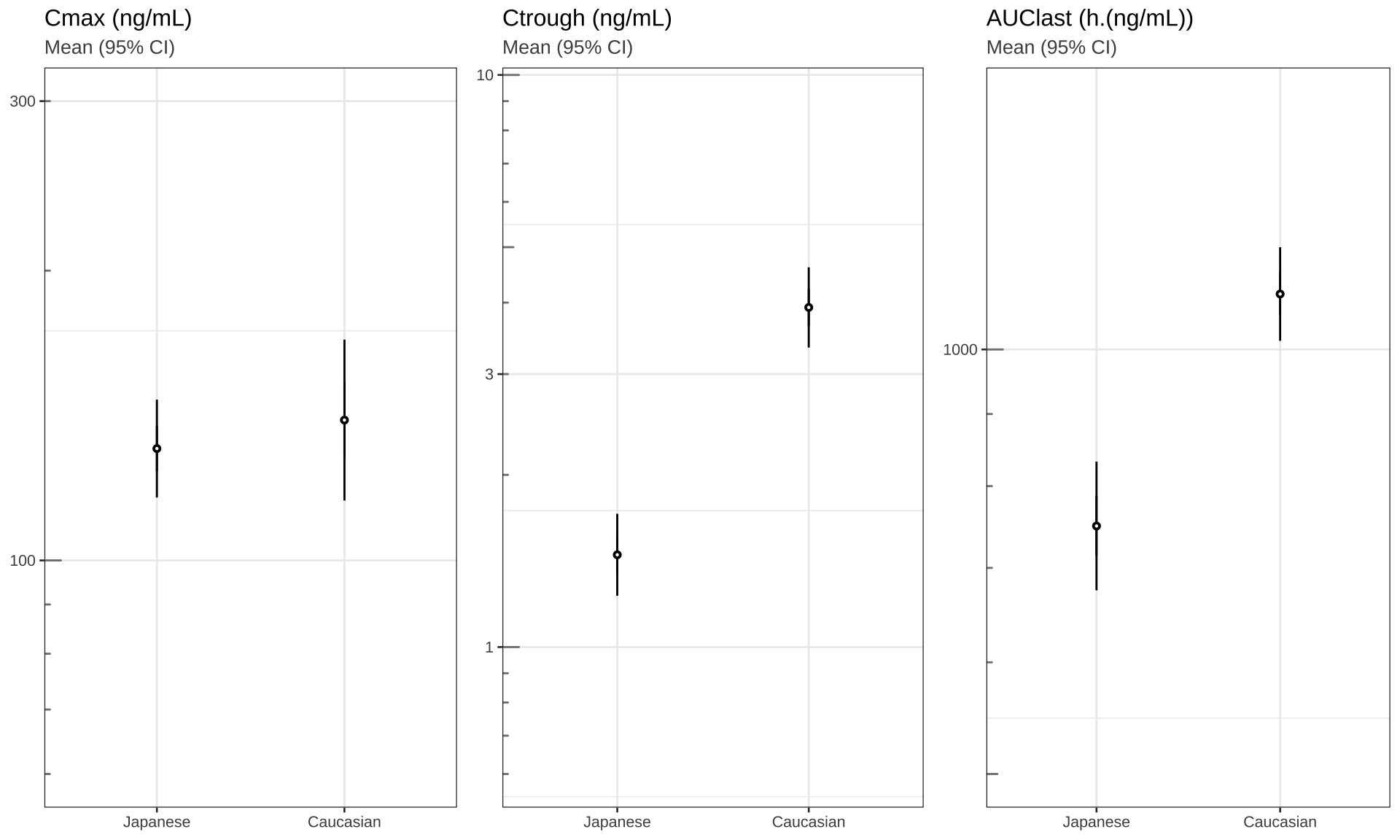
Cmax2  <- Cmax %>%
  mutate(DV = Cmax,
         logDV = log(Cmax),
         LABEL = "Cmax") %>%
  select(c("ID", "ETHN", "DV", "logDV", "LABEL"))

results <- t.test(logDV ~ ETHN, Cmax2)

PKmetrics <- data.frame(
  y2.5 = exp(results$conf.int[1]),
  y97.5 = exp(results$conf.int[2]),
  ymean = exp(as.numeric(results$estimate[1] - results$estimate[2])),
  var = "Cmax",
  unit = "ng/mL"
)

Ctrough2 <- Ctrough %>%
  mutate(DV = Ctrough,
         logDV = log(Ctrough),
         LABEL = "Ctrough") %>%
  select(c("ID", "ETHN", "DV", "logDV", "LABEL"))

results <- t.test(logDV ~ ETHN, Ctrough2)

PKmetrics <- rbind(
  PKmetrics,
  data.frame(
    y2.5 = exp(results$conf.int[1]),
    y97.5 = exp(results$conf.int[2]),
    ymean = exp(as.numeric(results$estimate[1] - results$estimate[2])),
    var = "Ctrough",
    unit = "ng/mL"
  )
)

AUClast2 <- AUClast %>%
  mutate(DV = AUC,
         logDV = log(AUC),
         LABEL = "AUClast") %>%
  select(c("ID", "ETHN", "DV", "logDV", "LABEL"))

results <- t.test(logDV ~ ETHN, AUClast2)

PKmetrics <- rbind(
  PKmetrics,
  data.frame(
    y2.5 = exp(results$conf.int[1]),
    y97.5 = exp(results$conf.int[2]),
    ymean = exp(as.numeric(results$estimate[1] - results$estimate[2])),
    var = "AUClast",
    unit = "h.ng/mL"
  )
)

PKmetrics$var <-
  factor(PKmetrics$var, levels = c("AUClast", "Ctrough", "Cmax"))

PKmetrics %>%
  ggplot(aes(
    x = var,
    y = ymean,
    ymin = y2.5,
    ymax = y97.5
  )) +
  paper_theme() +
  geom_hline(
    yintercept = 1,
    size = 1,
    colour = "red",
    alpha = 0.1
  ) +
  scale_y_log10(breaks = c(0.25, 0.5, 1, 2, 4)) +
  geom_point() +
  geom_errorbar(width = 0) +
  xlab("") +
  scale_x_discrete(breaks = NULL, labels = NULL) +
  ylab("Ratios between Japanese and Caucasian Mean (95% CI)") +
  geom_text(aes(
    x = var,
    y = 0.175,
    label = paste0(var, "\n(", unit, ")")
  )) +
  theme(
    panel.grid.major.x = element_line(color = "gray", size = 0.2),
    panel.grid.major.y = element_blank(),
    panel.border = element_blank(),
    axis.title.x = element_text(size = 11, vjust = -1.25),
    axis.title.y = element_blank()
  ) +
coord_flip(ylim = c(0.15, 5)) 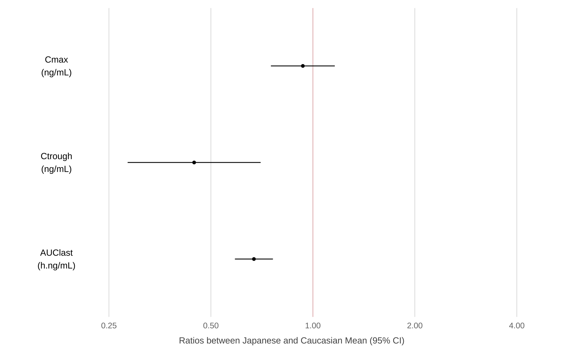
Post-hoc subgroup analyses
# Read in data and define order for factors.
# Dervie visit time in weeks from hours
# Define informative label for plotting subgroups
my_data <- read.csv("./01_Datasets/PKPDdataset2.csv") %>%
  filter(CMT == 3 & DOSE %in% c(0, 150) & PART == 1 & STUDY == 1) %>%
  mutate(
    TRTACT = factor(TRTACT, levels = unique(TRTACT[order(DOSE)])),
    Treatment = factor(TRTACT, levels = levels(TRTACT)),
    Visit = factor(
      plyr::mapvalues(
        round(NOMTIME),
        sort(unique(round(NOMTIME))),
        c(101,102,103,104,105,106,107,108,199))
      ),
    NOMTIME = NOMTIME/24/7,
    Biomarker = ifelse(subgroup == 0, "Negative", "Positive")
  )

# Obtain baseline measurement
base_data <-
  my_data %>%
  filter(PROFDAY == 0) %>%
  mutate(BASE = LIDV) %>%
  select(ID, BASE)

# Derive change and percent change from baseline
data_to_plot <-
  my_data %>%
  filter(PROFDAY != 0) %>%
  left_join(base_data) %>%
  mutate(
    CHG = LIDV - BASE,
    PCHG = 100 * (LIDV - BASE)/LIDV
    )


data_to_plot %>%
  ggplot(aes(x = Visit,
             y = PCHG,
             group = Treatment,
             shape = Treatment,
             fill = Treatment)
         ) +
  theme_bw(base_size = 12) +
  stat_summary(fun.data = "mean_cl_normal", geom = "errorbar") +
  stat_summary(geom = "line", size = 1, fun.y = mean) +
  stat_summary(geom = "point", size = 2.5, fun.y = mean, stroke = 1) +
  scale_y_continuous(breaks = seq(-20,20,1)) +
  coord_cartesian(ylim = (c(-10, 5))) +
  labs(x = "Visit", y = "Weight loss (%)")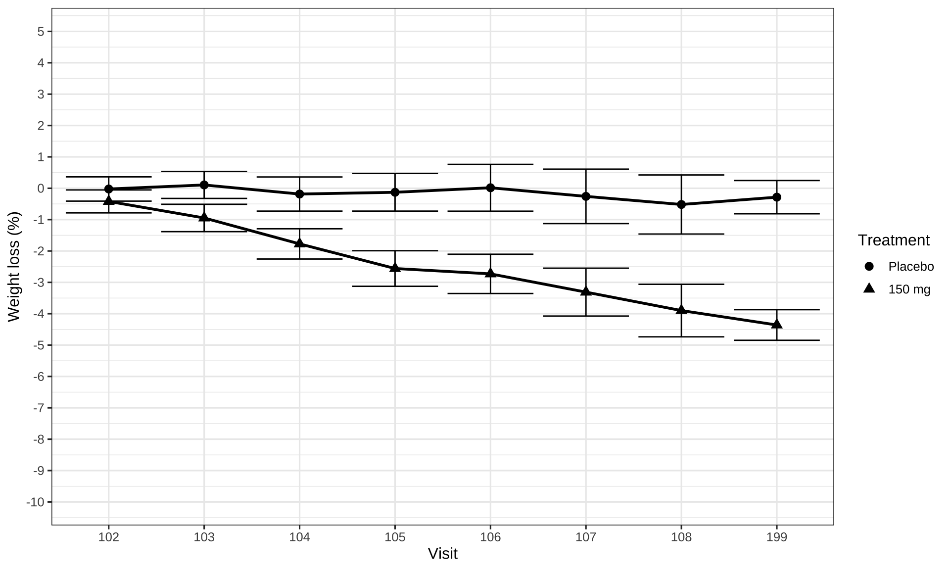
data_to_plot %>%
  filter(DOSE > 0) %>%
  ggplot(aes(x = Visit,
             y = PCHG,
             group = Biomarker
             )
         ) +
  theme_bw(base_size = 12) +
  stat_summary(fun.data = "mean_cl_normal", geom = "errorbar") +
  stat_summary(fun.y = mean, geom = "line",
               aes(linetype = Biomarker), size = 1) +
  stat_summary(fun.y = mean, geom = "point", size = 2.5, shape = 17) +
  scale_y_continuous(breaks = seq(-20,20,1)) +
  coord_cartesian(ylim = (c(-10, 5))) +
  labs(x = "Visit",
       y = "Weight loss (%)",
       linetype = "Genetic marker\n(150 mg)")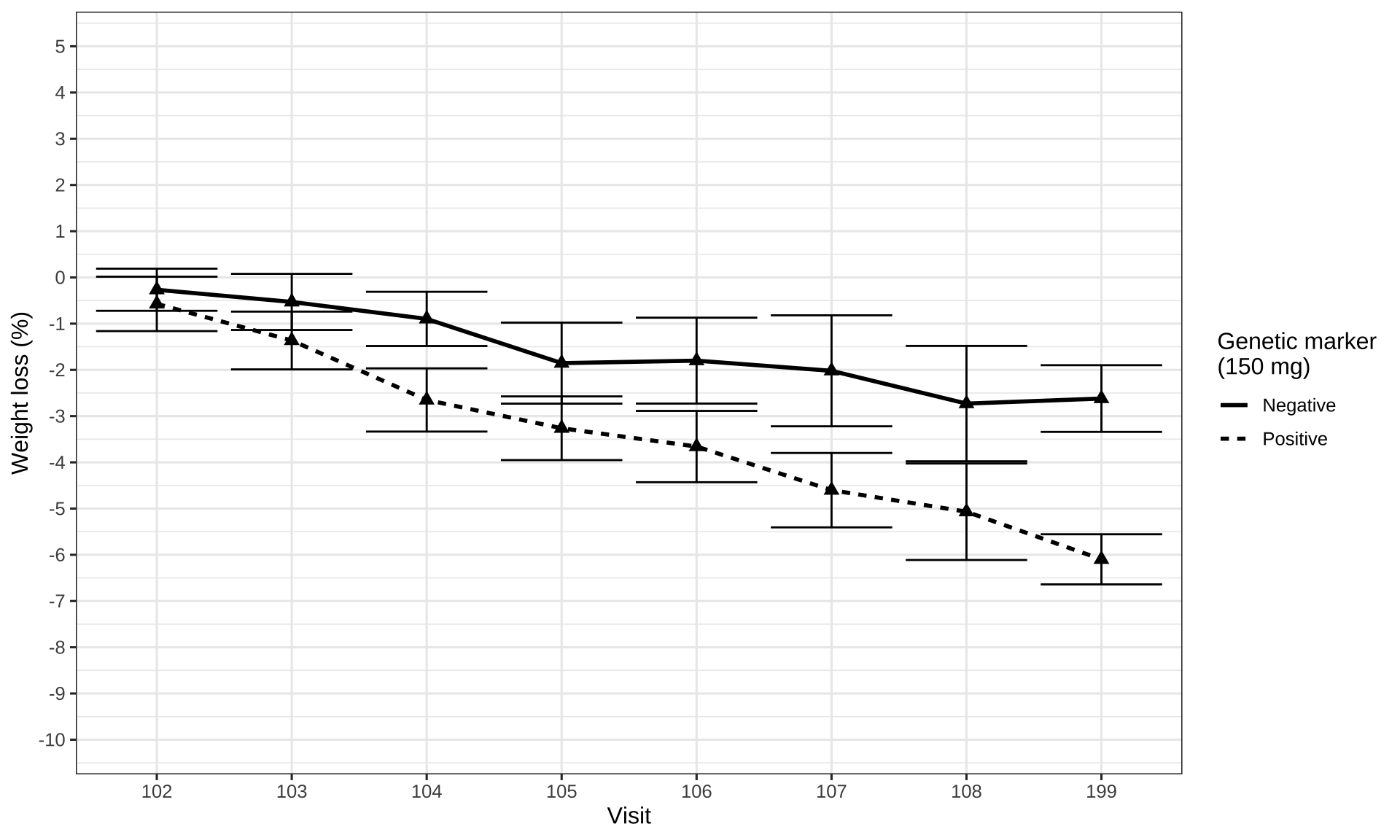
data_to_plot %>%
  ggplot(aes(x = NOMTIME,
             y = PCHG,
             group = interaction(Biomarker,Treatment),
             fill = Treatment
             )
         ) +
  theme_bw(base_size = 12) +
  stat_summary(fun.data = "mean_cl_normal", geom = "errorbar", width = 0) +
  stat_summary(fun.y = mean, geom = "line",
               aes(linetype = Biomarker), size = 1) +
  stat_summary(fun.y = mean, geom = "point", size = 2.5, shape = 21) +
  scale_fill_manual(values = c("white", "black")) +
  scale_y_continuous(breaks = seq(-20,20,1)) +
  scale_x_continuous(breaks = c(0,1,2,3,4,6,8,10,12), minor_breaks = NULL) +
  coord_cartesian(ylim = (c(-10, 5))) +
  labs(x = "Visit",
       y = "Weight loss (%)\nMean (95% CI)",
linetype = "Genetic marker") 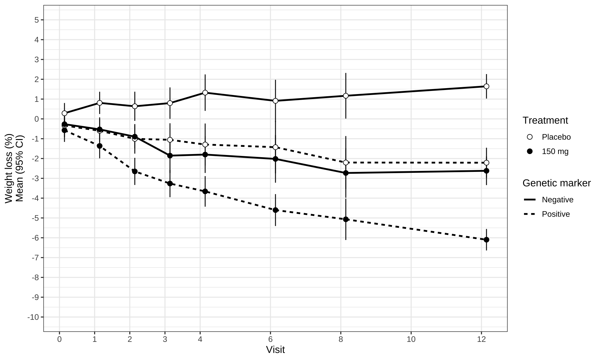
Interactive Plot
# load data
# library("gapminder")
data <- gapminder %>% filter(year=="2007") %>% select(-year)

# Interactive version
# library("plotly")
p <- data %>%
  mutate(myText=paste("This country is: " ,country )) %>%
  ggplot( aes(x=gdpPercap, y=lifeExp, size = pop, color = continent, text=myText)) +
    geom_point(alpha=0.7)

ggplotly(p, tooltip="text")
Reference
SIG (2025, July 9). VIS-SIG Blog: Wonderful Wednesday July 2025 (64). Retrieved from https://graphicsprinciples.github.io/posts/2025-07-09-wonderful-wednesday-july-2025/
SIG (2025, June 11). VIS-SIG Blog: Wonderful Wednesday June 2025 (63). Retrieved from https://graphicsprinciples.github.io/posts/2025-06-11-wonderful-wednesday-june-2025/
Statistics notes:
Analysing controlled trials with baseline and follow up
measurements.
Vickers AJ, Altman DG. BMJ. 2001 Nov 10;323(7321):1123-4.
SIG (2024, Nov. 13). VIS-SIG Blog: Wonderful Wednesdays November 2024. Retrieved from https://graphicsprinciples.github.io/posts/2024-12-01-wonderful-wednesdays-november-2024/